
July 5, 2019
When creating a piece of content, particularly an infographic, it’s important to have the correct data that fits the piece you are designing. What’s equally as important is having a good idea of how you want to portray that information to the person that will be reading and digesting it.
Infographics can be effective and powerful tools for marketers to leverage (you can read more about that here), but without a perfect marriage of data and design, you will most likely end up with something that doesn't pack the punch you hoped it would.
Here are 10 cool examples of infographics that design with lots of data.
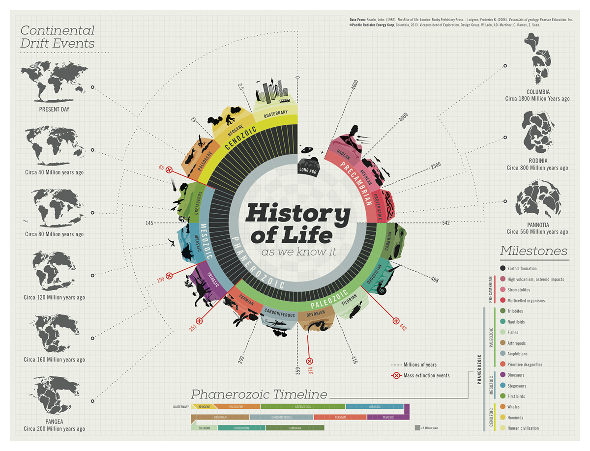
This infographic is impressive for a number of reasons. First off, life is an extremely broad topic that you would think has too much data to show in the form of an infographic. But what’s really impressive here is that everything is within the reader’s view without scrolling. All of the important data is here, and it’s easy to read because, along with breaking the data out into chunks, it connects everything together (even down to mass extinction events!). You can picking your own starting point and follow from there.
2. How addicted are we to our phones?
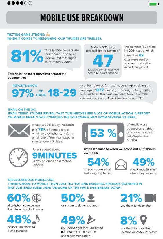
Just the topic of this one is enough to entice people to click, but the main thing that this infographic does right is call out all of the important statistics. My eyes gravitated toward those large, bold, blue stats and the way it is structured guides your eye through the entire infographic. There are lots of great snippets of information, and because of the way it is broken down, you are not likely to miss any of them.
3. How much $1 used to get you
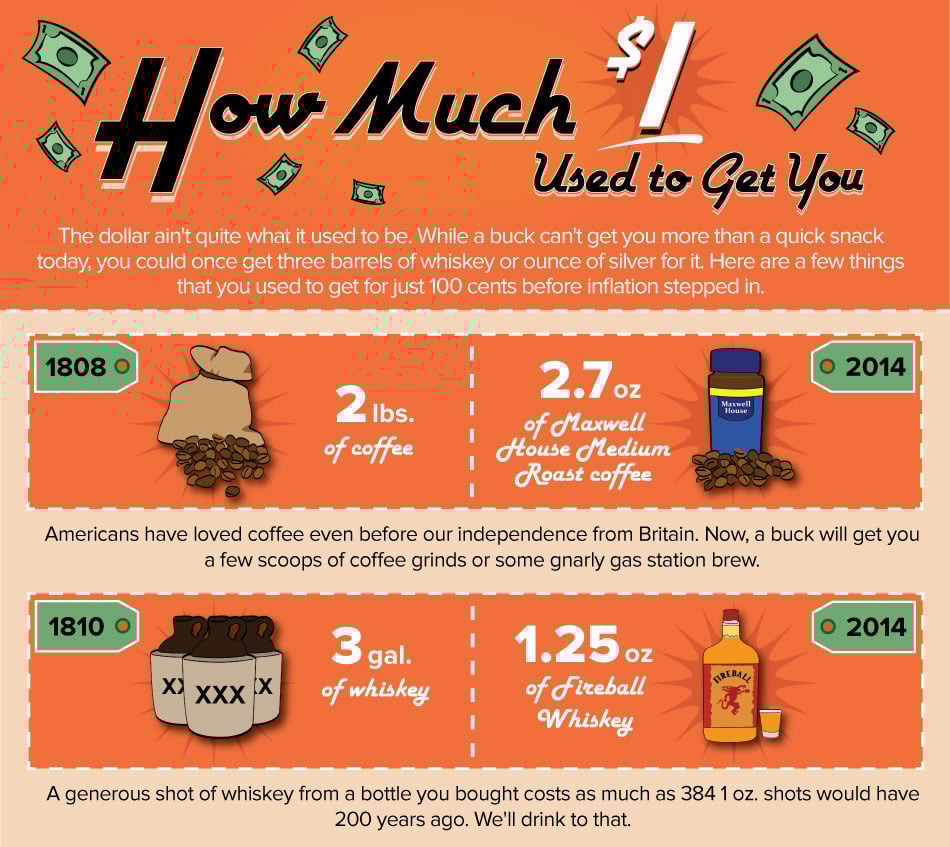
What this infographic does really well is provide comparison data for the items that are being discussed, so you are getting a like-for-like comparison, rather than coffee being compared to silver, for example. Also, the illustrations help bring the data to life. The scary part? How $1 in 1998 could get you a gallon of gas while today it would buy you an air freshener! Yikes!
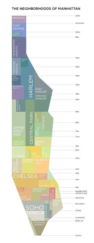
This one has a simple aesthetic, but I found it really informative, mainly in the way the data was presented. The neighborhood locations are paired with street numbers, so not only can you visualize where each neighborhood is, but having that avenue pairing is also very useful to the reader so they can have an idea of where each neighborhood is.

5. Which Star Wars planet should you vacation to?
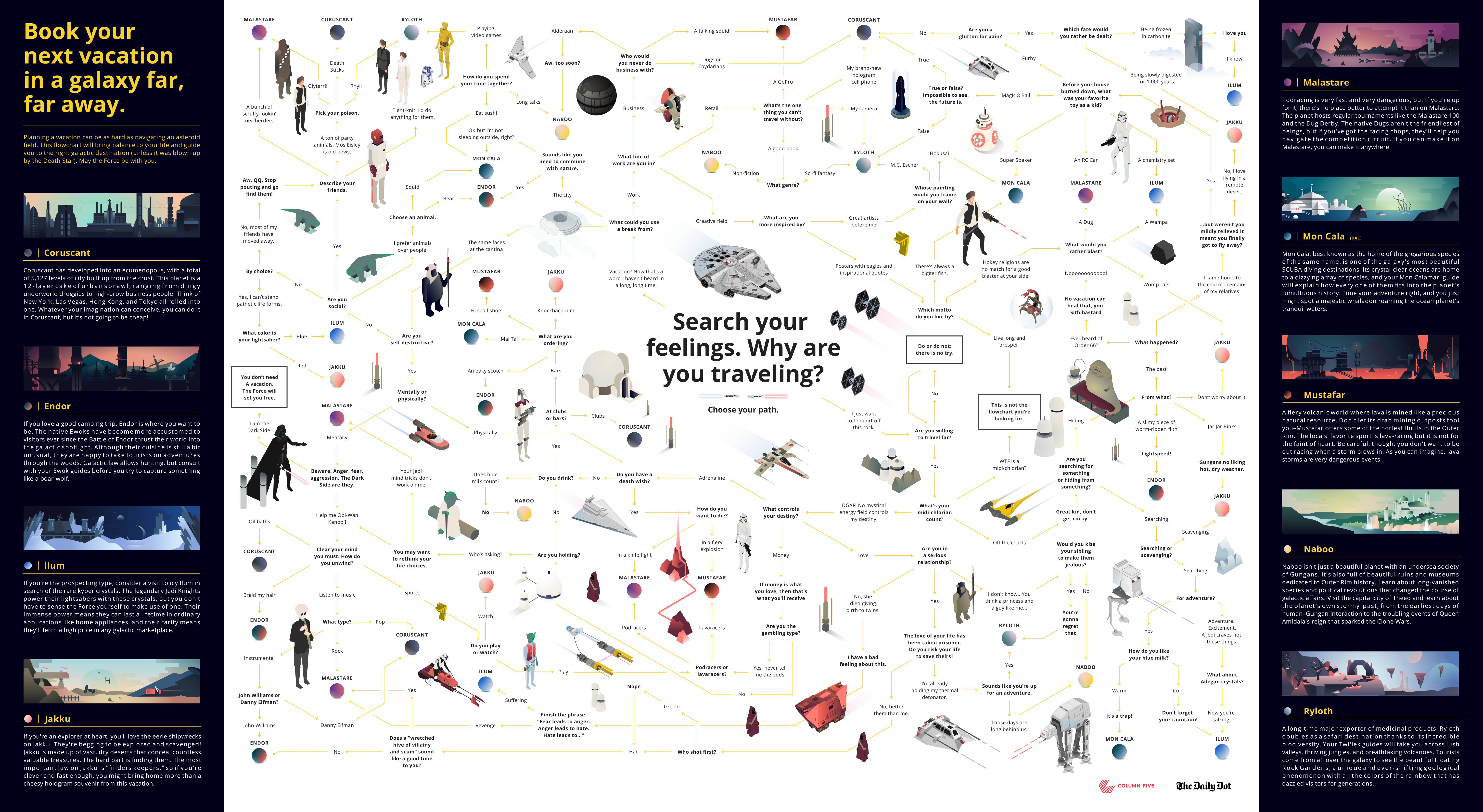
Being a huge Star Wars fan, I found this infographic and its use of data (albeit fictional) very impressive. These types of flowchart/decision-making infographics are naturally interactive and engaging. Starting in the middle, the reader follows the directional arrows and makes decisions. At each stop, there are surrounding graphics and illustrations to keep it engaging. Once you reach your final destination and the planet of your choice, you can find the description of the place, which goes over things like types of activities, climate, and history.
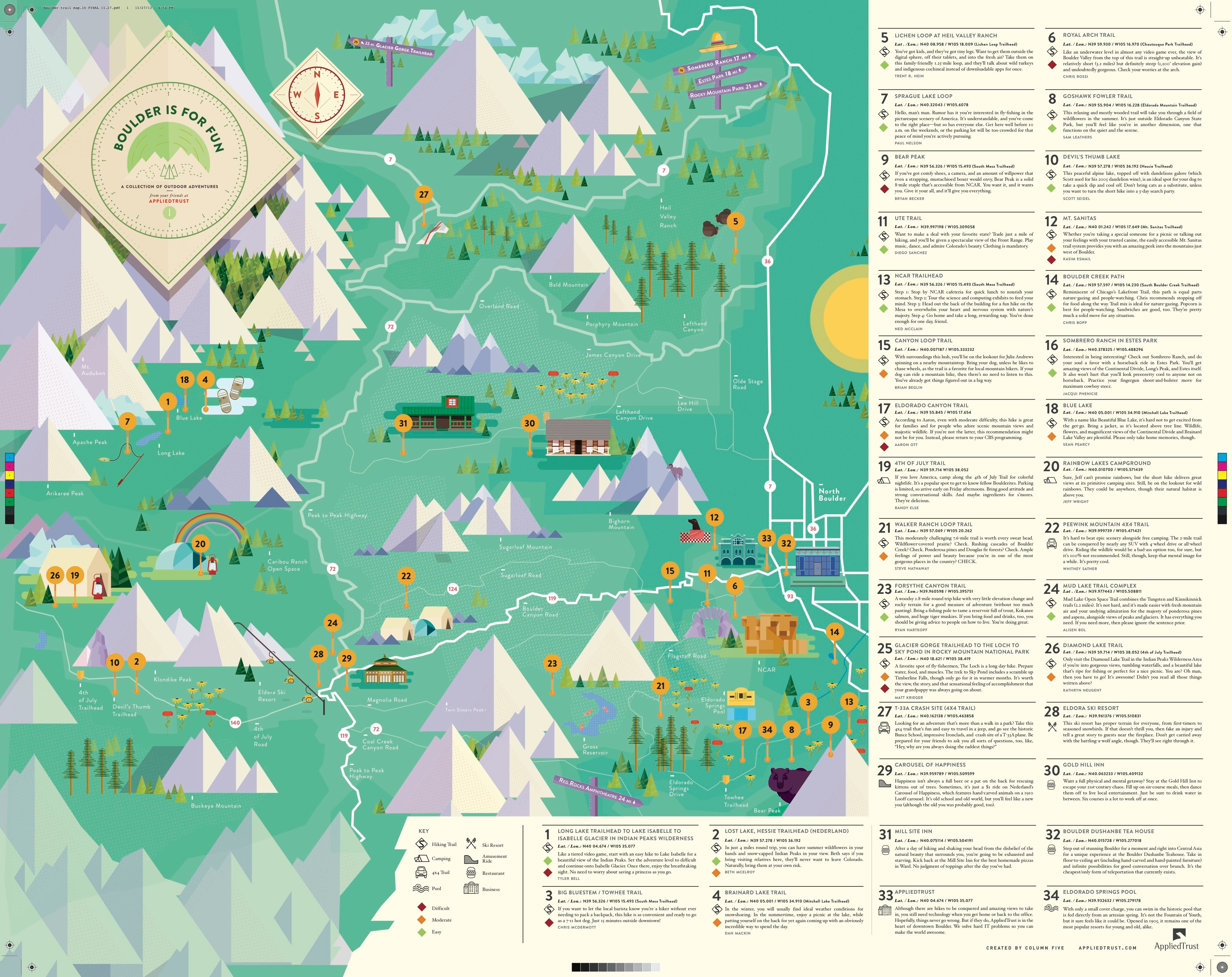
It can be tempting when designing these map-style infographics to try and fit all of the information about a location directly on top of the location. What’s great about this example is that it uses the entire canvas and trusts the reader (and its own legend/key system) to make sure that it doesn’t feel cluttered. This one is as simple as matching the numbers to the content at the side, where you will find important facts and information about the area. The iconography fits really well with the old explorer aesthetic, but it’s the amount of information here that is impressive. I could actually see myself printing this one and using it as a guide of what to do in Boulder!
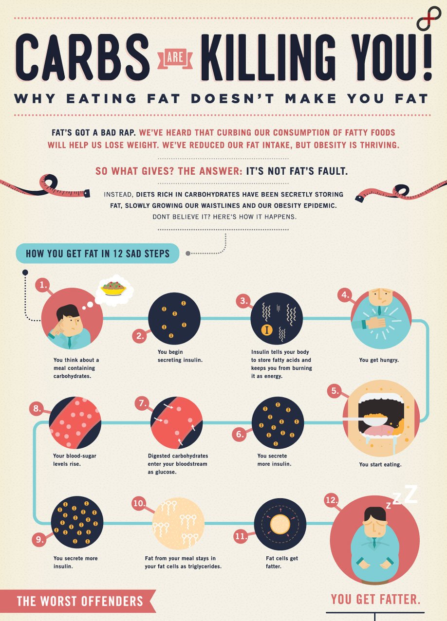
For what can be a very complex topic with an almost endless amount of data, this infographic does a great job picking out the highlights and guiding you through as you read. Everything you would want to know—and more—is presented here, and the data highlights for each section are broken out into diagrams and charts to give it a clinical feel while also having a visual representation.
8. Bridge Over Troubled Waters
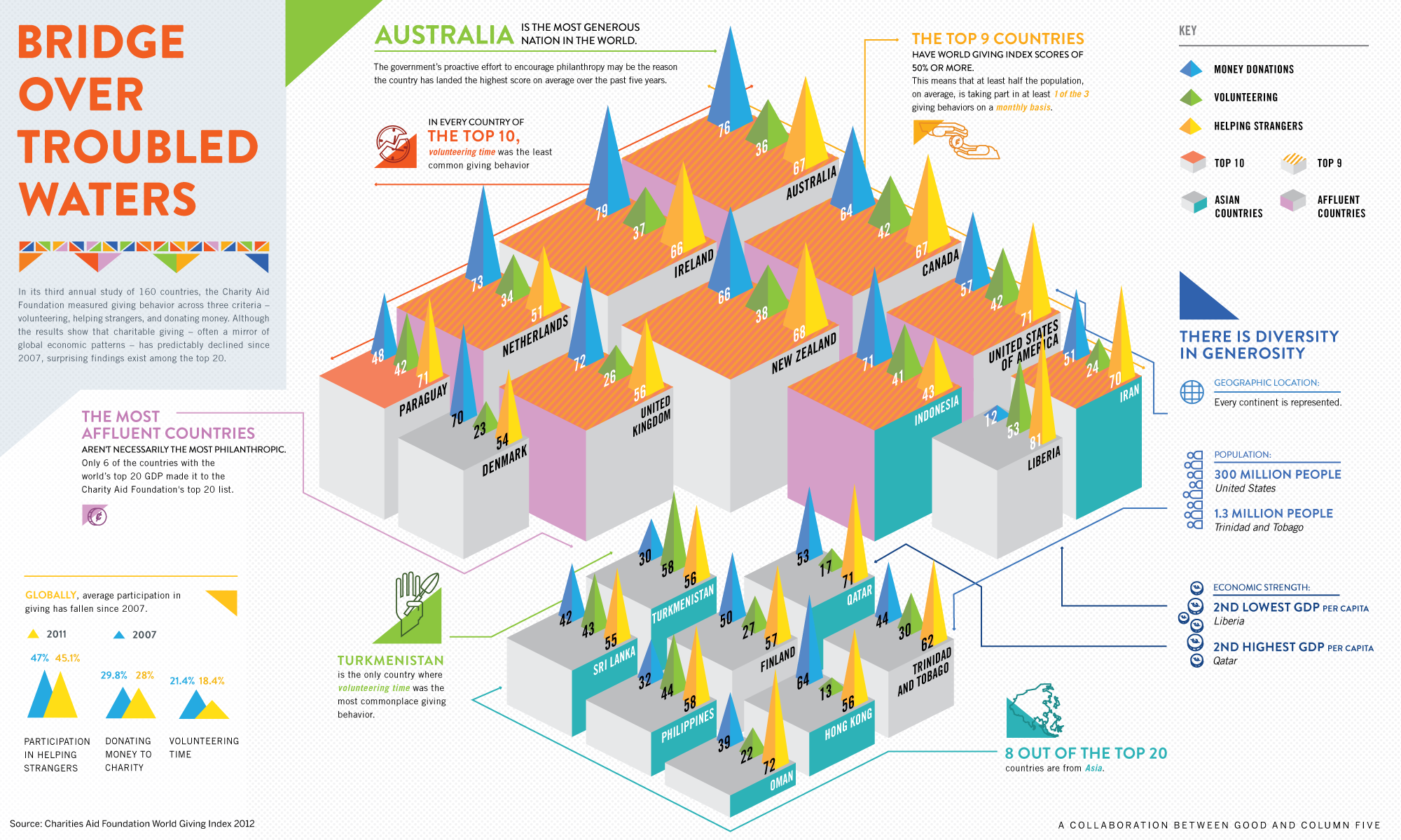
This is another example of how lots of data can be presented in an easy-to-read way. The shapes provide a visual example of volume, so you can easily see at first glance who is the largest donator and who is the smallest. Digging a little deeper, each section calls out several important statistics, keeping the details off the main graphic and making it all easy to read.
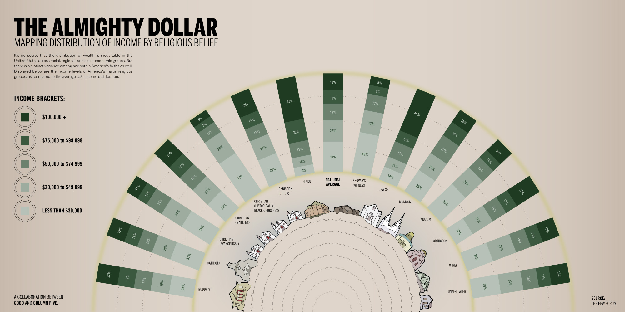
This infographic shows that you can address potentially sensitive topics in a professional and clear way. The national average is clearly shown in the middle, so you don’t have to go looking for that important baseline data to compare the others with. The key on the left helps differentiate between the amounts, and the minimalist aesthetic ensures nothing is misrepresented.
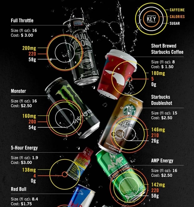
Most of us need a little caffeine in the morning to get those creative juices flowing, but how many of us actually know how much caffeine we are consuming? This infographic gives us all of the information we want (or don’t) and presents it in a quick and clear way. Each can is easily scanned so you can learn the cost, calories, caffeine, and sugar quantities of each. It’s a great example of how to pack a lot of data into a quick infographic.
All of the infographics in this list are great examples of how to turn your data into an amazing piece of content for your readers—even if the topic is a sensitive one. People enjoy learning and reading factual information, so presenting it in a format that is fun and easy to read is a sure-fire way to get people to engage with your content.

Refine your inbound marketing efforts with:
The Ultimate Guide to Inbound Marketing Personas


Other insights you might like