How to Create an Accessibility Switcher™ in Email
Editor’s note: This is a guest post from Paul Airy, Email Design and Development Consultant, and author of the book, A Type of Email. Paul is a leading advocate of accessibility in email, and creator of the Accessibility Switcher™. You can follow Paul on Twitter, and catch him at Litmus Live London, where he’ll be speaking about creating an accessible email design system.
Throughout my email career, people have been my focus. I’ve always been inspired by the relationship between the sender, the subscriber, and the email—and the “magic” that happens when the three connect. I’ve endeavored to challenge myself, and the industry I’m privileged to be part of, to ensure the emails we send to our subscribers, deliver that experience, that “magic,” in every campaign.
Delivering that experience starts with the basics—creating emails that are easy to read and easy to interact with. It’s that simple. These are the basics that inspired my work on typography at a time when most emails were image-heavy, and my work on accessibility, at a time when email accessibility was being talked about, but nothing much was being done about it.
The first thing I did when I began to look at accessibility, was ask myself the question, “What’s preventing us as email marketers, designers and developers ensuring our emails are accessible?” To help me answer that question, I looked to the Web Content Accessibility Guidelines (WCAG), the document that defines the standard for web accessibility, to understand how near or far we are from meeting that standard in the email space.
What I discovered, was that a large number of the guidelines were either irrelevant, or impossible to implement on email, given that email and webmail clients differ from web browsers in their ability to comply to those guidelines. In addition, most of the accessibility guidelines were written in a web-centric manner, and were therefore tricky to interpret for email. I was convinced that it was this impossibility, this inability to implement accessibility in email, to the standards set out in the Web Content Accessibility Guidelines (WCAG), that had prevented us doing so thus far.
This led me to ask myself the question, “What if we could implement a type of accessibility in email?”
I realized that there were a number of principles from the Web Content Accessibility Guidelines (WCAG), and some recommendations, that could be implemented on email. These takeaways found their way into my session on typography and accessibility, “A type of accessibility,” at The Email Design Conference in 2015, which would later form the foundation of the Beyond the Envelope™ Email Design System, which I’ll be talking about at Litmus Live London in August.
Is your email accessible?Accessibility checks in Litmus Checklist make it easy to test your email against key accessibility best practices, identify areas for improvement, and make your emails more accessible to all your subscribers. |
Why accessibility is important
So why is accessibility important? Well, it’s quite simple:
- The more accessible our emails are, the more people we can reach
- The more people we can reach, the better positioned we are to connect as brands and organizations
The question you need to ask yourself is, “Do you want to make it harder, or easier, for people to engage with your brand or organization?”
When we design and develop emails, we tend to assume our subscribers will be able to read and interact with them, based on whether we can read and interact with them. We judge the quality of other people’s experience based on our own. The truth is that every person, and the way they experience the world, is different.
Every single person, and the way they experience the world, is different.
Designing for difference
But how do we go about designing and developing emails to suit each and every difference, in each and every individual? Surely that’s impossible! The truth is, it is impossible, so we have to decide on a first step that’s as inclusive as possible.
As an industry, we’ve already begun to establish that first step. We use semantic elements, such as heading and paragraph tags, to describe the content within our emails, so subscribers using assistive technologies like screen readers can distinguish one type of content from another. We define a minimum font-size of 16px, so more subscribers can read the text. We select foreground and background colors that contrast enough to ensure text is clear and readable.
But the first step is just that. What’s the next step for accessibility in email? How can we create emails that are easy to read and easy to interact with, for more people? I felt that the next step was about giving subscribers the autonomy to configure their own experience, and given that email is primarily a text medium, that this autonomy should center around typography, text size and contrast in particular.
Although there are built-in solutions in most operating systems to adjust the text size and contrast, most don’t work well inside the Inbox. Apple’s iOS allows users to increase the font size system-wide, but results in emails like this one from Spotify (who create some great emails by the way!):
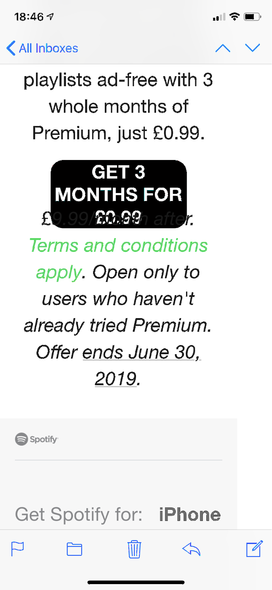
Operating systems and browsers that allow zoom levels, using the + and – keys, exhibit similar inconsistent behavior. So, if these built-in settings aren’t delivering the experience our subscribers need, how about building them into the emails themselves?
Enter the Accessibility Switcher™ Solution
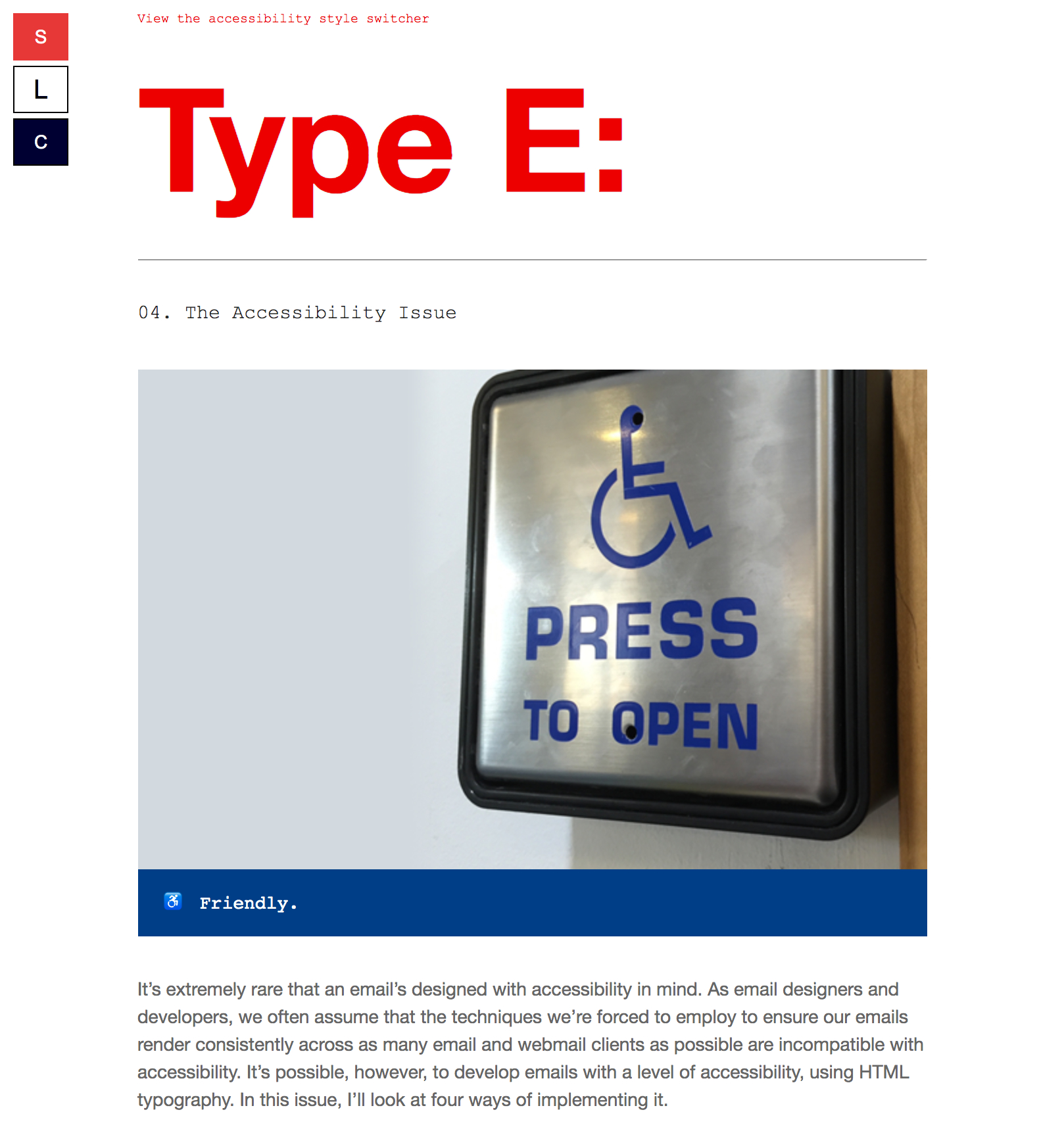
Using interactive email techniques, I created the Accessibility Switcher™, which made its first appearance in the fourth edition of my email, Type E. It included a button for enlarging the text size, a button for reducing the text size, and a button for reversing the color of the email to create more contrast.
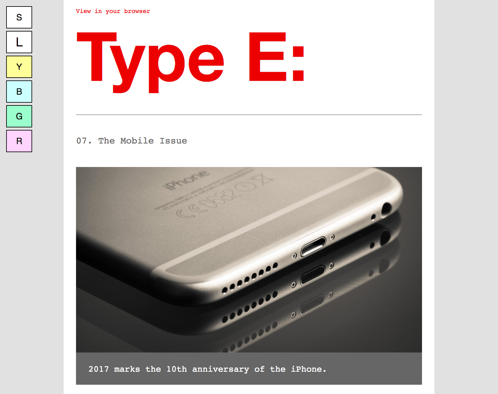
I continued evolving the Accessibility Switcher™, adding a series of buttons to change the foreground and background colors of the email—to create a digital version of the translucent colored sheets used by people suffering from Dyslexia and Alzheimer’s, to aid their reading.
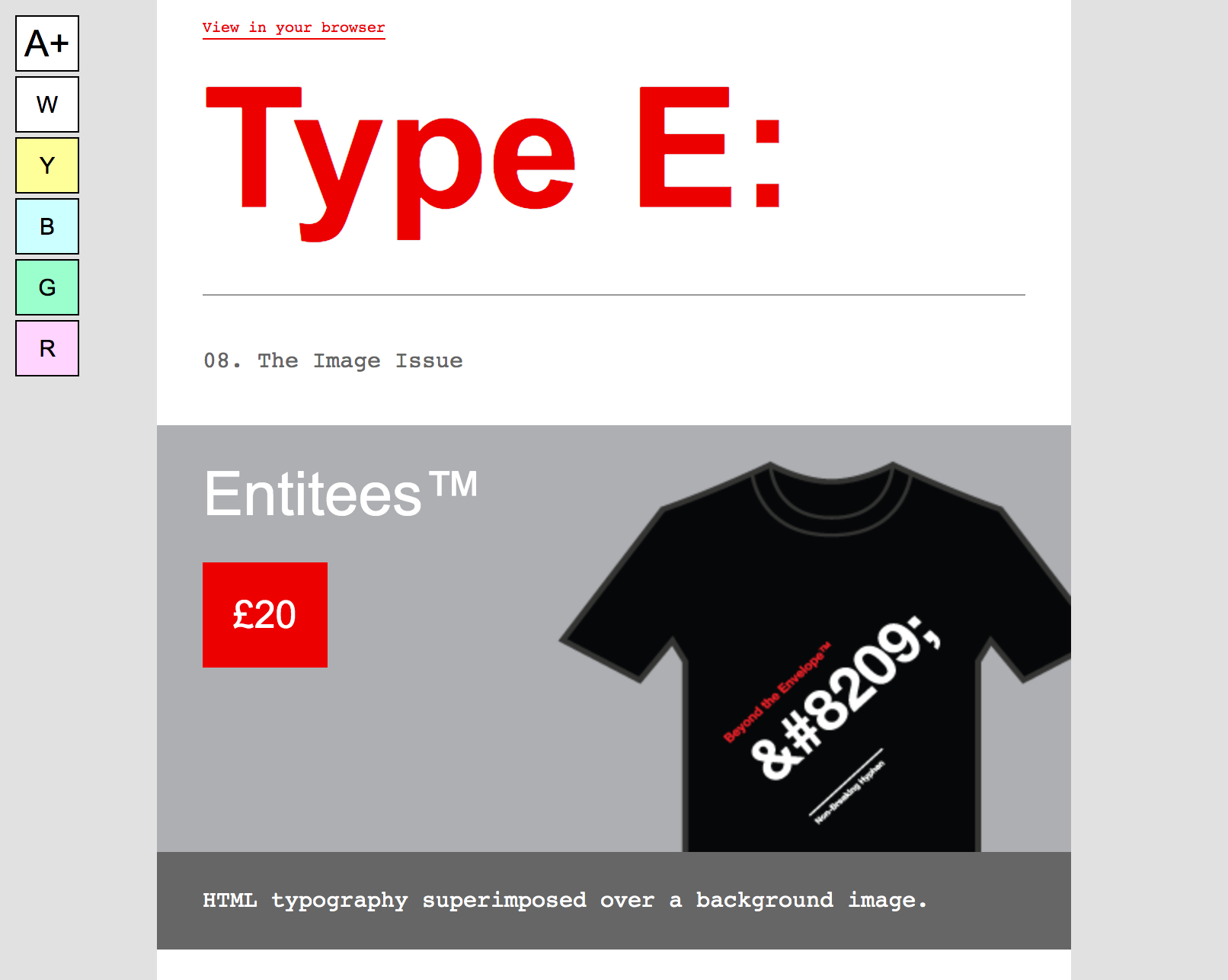
Since then, the concept has evolved further still, replacing the two buttons that enlarged and reduced the text with a single button.
A matter of preference
I’ve always felt the Accessibility Switcher™ should be an option, rather than a standard feature. So, when someone subscribes to Type E: today, they have to opt-in to have the Accessibility Switcher™ appear on their emails. Subscribers can choose to configure it to either allow them to enlarge and reduce the text size, change the foreground and background colors, or both.
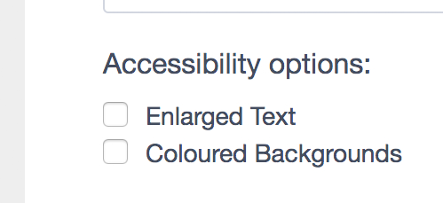
It’s an excellent solution for progressively enhancing that accessible first step, one that subscribers can utilize to configure an email campaign to their own needs and preferences. So, how’s it actually built?
How the Accessibility Switcher™ is coded
The Accessibility Switcher™ employs the use of interactive email techniques, in order for it to function.
Behind the button that enlarges and reduces the text lies a checkbox, which is set to “checked” by default, and behind each button that changes the foreground and background, lies a series of radio buttons.
Here’s an excerpt from the HTML for the Accessibility Switcher™ buttons, placed between the <body> tag and the wrapper of the email:
<body>

<!-- Default Button -->
        <input type="radio" class="default" id="default" name="layout" style="position:absolute; display:none !important; visibility:hidden !important;" checked>
        <label class="default" for="default"></label>
<!-- Default Button End -->

<!-- Large/Small Layout -->
        <input type="checkbox" class="large-small-layout" id="large-small-layout" name="layout" style="position:absolute; display:none !important; visibility:hidden !important;">
        <label class="layout-buttons settings-box-element" for="large-small-layout"></label>
<!-- Large/Small Layout End -->

<!-- Yellow Tint Layout -->
        <input type="radio" class="yellow-tint-layout" id="yellow-tint-layout" name="layout" style="position:absolute; display:none !important; visibility:hidden !important;">
        <label class="layout-buttons settings-box-element" for="yellow-tint-layout"></label>
<!-- Yellow Tint Layout End -->

<div class="mainWrapper">
CSS is placed in the <head> of the email to target, and style each input, allowing you to customize it for your own purposes.
It’s important to note that the Accessibility Switcher™ is hidden by default. Some email clients don’t support interactive elements, so it won’t be displayed, and the email will just display using the default, inline styles.
When displayed and checked, though, styling is applied to the elements with the relevant class name, overriding the default, inline styling of that element. In this case, those styles override things like font-size, line-height, background-color, and color.
Here’s the CSS for the “Large/Small” button, which changes the font-size to 20px when checked:
.large-small-layout:checked ~ .mainWrapper p {font-size:20px !important; line-height:30px !important;}
It’s a relatively easy solution for a surprisingly complex problem. Although it doesn’t, and shouldn’t replace the first step for accessibility I mentioned earlier, it does provide an excellent progressive enhancement that allows subscribers to configure their own experience.
See how Litmus implemented the Accessibility Switcher in our recent newsletter
To seamlessly integrate the Accessibility Switcher™ into Litmus’ newsletter design, we adapted Paul’s original technique a bit here and there. Here’s a detailed walk-through of what we were trying to achieve and how we brought the Accessibility Switcher™ to live in our newsletter.
Check it out on Community →
Accessibility is a journey
When it comes to accessibility, we’re all on a journey. We’re continuing to learn about how subscribers read and interact with their emails, and how we can make it easier for them to do so. With more articles than ever written about accessibility in email and email designers talking about it on stage, there’s little excuse for designing, developing and sending inaccessible email campaigns today.
If you haven’t already, audit your own emails, and see how you can improve the accessibility in your own campaigns. Whether you increase the font size in your master email template, or implement the Accessibility Switcher™, your subscribers will thank you.
 | Ultimate Guide to Email AccessibilityThis guide has the insights and step-by-step advice you need to write, design, and code emails that can be enjoyed by anyone—regardless of their ability. |

Paul Airy
Paul Airy is a Digital Email Designer & Developer at Centrica
