April 16, 2019
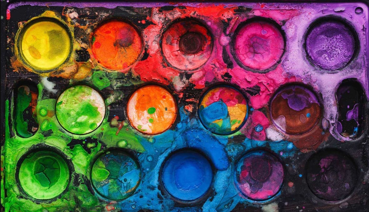
PANTONE 16-1546. If you were to just read that label alone, it sounds like something from a sci-fi movie or a working title for the next installment of Star Wars. In reality, it’s actually the new color of the year from Pantone. Let’s refer to its everyday name, “Living Coral.”
For the last 20 years, Pantone has been celebrating a specific color from their wide array of colors and color profiles (you can see a brief timeline here beginning in 2007). This allows them to highlight a popular color—or perhaps a hidden gem that not many people are aware of—and expand its use by designers.
The colors are chosen carefully, often reflect the current climate of our world, and pull from trends in fashion, technology, and culture. Living Coral, for example, feels like Pantone wanted to focus on marine life and perhaps highlight the fact that some things, such as coral reefs, are only possible in a healthy environment.
My first reaction to Living Coral was mixed. At first, it felt very safe, and quite honestly, I didn’t feel like it could be implemented well across a variety of products, ads, or websites. But then I thought more about the color. I read a little more about its meaning, and my opinion started to change. I started to get behind the meaning, the reason for their choice, and then I began imagining using this color on the web or in a print ad.
Living Coral in a Domestic Setting
Perhaps an underused color on the web and in digital media, coral is mostly reserved for fashion or interior design. And you can see why: It has a warm feeling to it, and it’s a very inviting and calming color. I could easily envision a sterile white room with one accent wall using Living Coral. Now that is a room I could work and create in! Alternatively, take a trip down any high street or inside any mall across America, and walk into a clothing store. Nine times out of 10, you will see shirts, dresses, and even socks in coral.
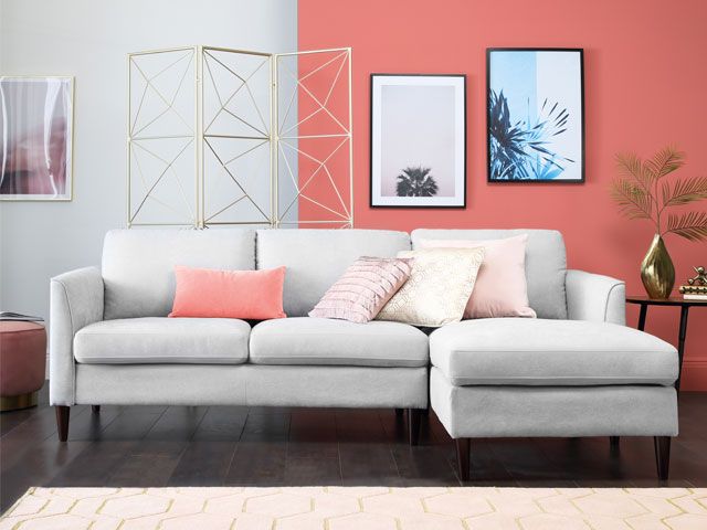
(Here’s that accent wall I was talking about! Photo courtesy of pictureka and Rent.com)
Marketing Designs with Living Coral
Pantone provides color codes and files to help you incorporate the color into your work. From a marketing design perspective, Living Coral feels like the perfect accent color when going for a clean and modern look in your work. Accent colors have a number of uses in marketing design and can either be used to enhance a specific callout or stat to give it more vibrance, or can play a more subtle role for things like sidebars and backgrounds. Living Coral pairs well with neutral colors like light gray and white on a website, but would also work against a dark background as a button color to attract the eye of your reader.

Living Coral also provides a welcome tangent from the bright, almost neon, color palettes we often see on today’s modern websites. Here’s a gorgeous example of a business card using Living Coral:
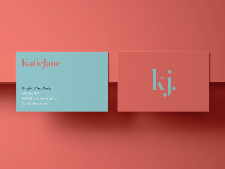
(Photo courtesy of Shutterstock)
Just Go for It!
At first, I was unsure as to how Living Coral could feature prominently in a design. It felt too neutral. But after giving it some thought, and doing some research, I found that it’s actually a very warm and inviting color, which evokes a positive response from users and readers, so my advice would be to be brave and dive straight in! Work it in as an accent color at first, then perhaps a CTA block or a callout. It’s a very versatile color that is underused, so it has the potential to really help you stand out!

Learn about web optimization with:
The Keys to Website UX and Usability


Other insights you might like