
Frustrated by Blue Links in Email? Conquer Them for Good
Blue links in email: They’re a helpful usability feature, but far too often cause headaches for email marketers looking to design thoughtful, on-brand campaigns.
Over the years, we’ve seen multiple ways of handling blue links in HTML emails, from simple to complex.
But which techniques work the best? And how can marketers ensure a beautiful email design without sacrificing useful functionality in an email? In this guide, we’ll look at what blue links are and the best way to prevent them from ruining your own emails. Get ready to learn:
- What are blue links?
- Should you remove them?
- How to change them for each email client
- Edge cases as fallback (and for Outlook)
 | Beware: There are other culprits of a broken email Do email errors make you shudder? Blue links are just one way your email can look broken. Take a deep dive into what can break your email and the tips & tricks to stay true. |
What are blue links?
Blue links are exactly what they sound like: Text in an email that takes on the default blue, underlined styling common to hyperlinks. In email marketing—especially on mobile devices—these blue links are automatically created by email clients to provide people with options for saving or interacting with information.
In recent years, Apple Mail has updated their handling of some of these links and no longer turns them blue. For addresses and times, iOS devices retain the original styling but add a dotted underline to indicate that these are clickable.
While this is a step forward for accessibility for some of the blue link issues, it does not solve all the problems because more than just addresses and times can be affected.
Most iOS versions of Apple Mail turn phone numbers, URLs, and email addresses blue—but leave physical addresses and times in the original styled color (red, in the example below).
In iOS 13, the content is still linked, but the original styled color is maintained:
In our testing, these things are prime candidates for becoming linked content (blue or otherwise):
- Addresses
- Dates
- Email addresses
- Website URLs
- Times
- Phone numbers
The benefits of blue links: Should you remove them or not?
In each case, the information linked could be valuable to subscribers, whether they want to add a phone number to their contacts list or look up an address online. While annoying from a branding perspective, blue links are actually great for usability and accessibility, providing critical functionality.
This brings up the debate: Should we be overriding this behavior in the first place?
On the one hand, we want our email designs to stay consistent and on-brand. Email clients overriding our own styling can cause surprises, anger stakeholders, and cause accessibility issues. On the other hand, people may rely on this functionality and expect to be able to take action on information in an email.
So, what should email designers do?
It’s our opinion that overriding the styles—but not the functionality—of these links is the best approach. The ideal solution for blue links should retain the ability to take action on those automatically generated links but allow us to style those links, not the operating system or email client.
Some would argue that overriding the blue, underlined styling is going too far. However, the default behavior has serious accessibility problems that we can combat. For example, look at this email footer with blue links added to the address:
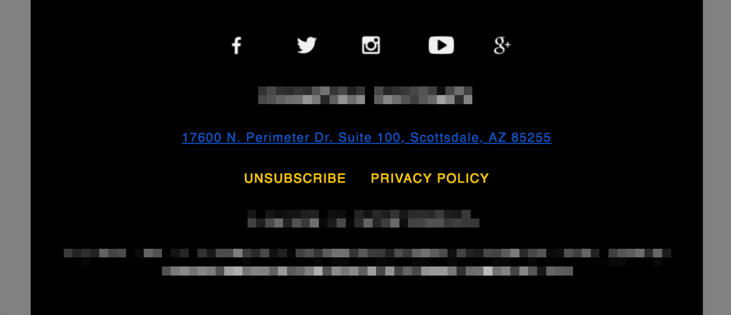
It’s a common design: White text on a black background, with small text to keep the focus on the content above it. When information is linked and the blue styling is applied, the contrast is extremely low. Anyone with visual impairments—or those with excellent sight using a dimmed screen or mobile device in a sunny setting—will have an extremely difficult time consuming that information. A helpful feature turns into a frustrating experience.
Not all email clients treat auto-linking the same, either. While blue links are the most common culprit, some clients maintain the font color but add a subtle underline. Some clients link telephone numbers but not addresses. With all of that inconsistency, it can be frustrating to manage.
So, how can email designers deal with blue links?
The best way to override auto-link styling
Although we’ve looked at different solutions in the past—like targeting commonly-linked text with spans and classes, or inserting non-visible characters into that text to break the behavior—the best solution we’ve found is to rely on embedded CSS to override automatic link styling. Then, add values such as underlines and on-brand colors to let people know the content is still clickable. Ideal for usability and accessibility.
This method has a lot going for it. You can:
- Set your own styles on text.
- Use different styles for different links—it doesn’t force one style across an email.
- Retain the functionality introduced by email clients and operating systems.
- Maintain the styling easily.
That’s a win-win for both you and your subscribers.
The only caveat? Different email clients do different things when auto-linking text, so you need multiple CSS rules to override styling.
Do your emails have blue links? Always know when email clients update their email rendering with Litmus Email Previews. Preview your emails in all popular email clients and devices and spot errors before you send. |
Overriding blue links in Apple Mail
When creating links around text, Apple Mail adds additional attributes to those links beyond the usual href. A simple example is the following:
<a rel="noopener" target="_blank" href="#" x-apple-data-detectors="true">
We covered many ways to handle iOS blue links in the past. Fortunately, all you need to do now is target elements with specific attributes and override styling for those elements.
In the style block of your email, add the following to target Apple-added links and force that text to inherit the styling from its parent element:
a[x-apple-data-detectors] {
color: inherit !important;
            text-decoration: none !important;
            font-size: inherit !important;
            font-family: inherit !important;
            font-weight: inherit !important;
            line-height: inherit !important;
}
The functionality will still be there, but the text will be styled as you originally intended.
To ensure people know the content is clickable, change the value for color from inherit to a hex color code that matches your brand’s design (e.g. #77d6fc for light blue) and change the value for text-decoration to underline.
Overriding blue links in Gmail
Instead of adding attributes to auto-linked text, Gmail does something else entirely. When processing the HTML of an email, Gmail will convert the doctype to an underline element (u). Knowing this, you can then add a hook into your own HTML to target elements only for Gmail. This is commonly done by adding an ID to the body element.
<body id="body"></body>
While there are a few ways to fix Gmail blue links, this is our recommendation: Target all of the links contained within the body in Gmail with the following in your style tag, overriding any added styling in the process:
u + #body a {
            color: inherit !important;
            text-decoration: none !important;
            font-size: inherit !important;
            font-family: inherit !important;
            font-weight: inherit !important;
            line-height: inherit !important;
}
It uses the exact same CSS properties as the Apple Mail trick, just specifically applied to Gmail.
Remember to update the color and text-decoration values to make it obvious to subscribers that they can click the auto-links. Again, some people prefer the option, so don’t hide it from them.
Overriding blue links in Samsung Mail
Samsung Mail uses a similar technique to Gmail. Instead of converting one element to another, though, Samsung Mail will add a specific ID to the email called “MessageViewBody.” Just like with Gmail, target that ID and any links contained within in your style block:
#MessageViewBody a {
            color: inherit !important;
            text-decoration: none !important;
            font-size: inherit !important;
            font-family: inherit !important;
            font-weight: inherit !important;
            line-height: inherit !important;
}
Again, the exact same CSS properties are used as before. And you’ll want to swap for your brand’s color value and underline the link if that’s part of your design guide.
All together now
While it would be convenient to chain all of the above CSS selectors into one rule, Gmail strips CSS using attribute selectors, so the fix would be removed from Gmail, allowing blue links to roam free.
Therefore, you should keep all three rules separate. The good news is after they’re added to email templates, you don’t need to do anything additional in your code to remove blue links from most email clients.
Combined, your HTML could look like this:
<html>
	<head>
	<style>
a[x-apple-data-detectors] {
	color: #77d6fc !important;
	font-size: inherit !important;
	font-family: inherit !important;
	font-weight: inherit !important;
	line-height: inherit !important;
}

u + #body a {
	color: #77d6fc !important;
	font-size: inherit !important;
	font-family: inherit !important;
	font-weight: inherit !important;
	line-height: inherit !important;
}

#MessageViewBody a {
	color: #77d6fc !important;
	font-size: inherit !important;
	font-family: inherit !important;
	font-weight: inherit !important;
	line-height: inherit !important;
}
</style>
</head>
<body id="body">

 <your email code goes here as normal>

</body>
Here’s an example of what this could look like if you did nothing (without fix), removed the default style without adding your own (with fix), and replaced the default styling with your own (with styled fix):
| Without fix | With fix | With styled fix |
|---|---|---|
 |  | 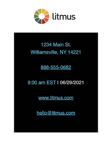 |
Handling edge cases for the just-in-case coder (and Outlook)
As you might know, there are always edge cases when it comes to email design. Blue links are no different. Some email clients will still auto-link text. And because email apps change every 1-2 days, the three clients above could very easily introduce an update that breaks those fixes.
For these edge cases, you can take a different approach.
This technique involves wrapping auto-link candidates with an element that is then targeted via CSS in the head of an email. The container element has a class applied for targeting. Before designers figured out they could use the x-apple-data-detectors hack, this trick was commonly used for Apple Mail blue links, so you’ll commonly see something like “appleLinks” used for the class, but it can be anything.
In our example, we’ll use the class “blueLinks”:
<p class="blueLinks">+1 (800) 123-4567</p>
Since email clients will add a link within that element, target it in the CSS in your email’s style block and override specific CSS properties:
.blueLinks a {
            color:inherit !important;
            text-decoration: none !important;
}
This can be a very robust solution, but it requires more maintenance. Since the content of an email can change frequently, tracking where those classes are applied and ensuring all suspected text is accounted for can be time-consuming and prone to errors.
That’s why we typically recommend using the three embedded CSS solutions above, falling back to the class-based solution only when testing shows a need for it.
Your fix for Outlook desktop clients
Outlook mobile apps can be fixed with the edge case solution above, but that fix won’t work with the Outlook desktop clients.
For Outlook desktop clients, URLs and email addresses will always appear as the default colors if you don’t wrap them in <a> tags. In most cases, you’ll want these to link out to the webpage or email address that is presented, so adding the <a> tag with the href attribute and styling it as a link makes for a good subscriber experience.
If you don’t want it to look like a link, you can still add the <a> tag and style it to look like the rest of the copy.
In edge cases, you may have a client who needs the URL to look like regular copy and not be linked. In this case, the only way to accomplish that is by adding lots of zero-width joiners throughout the link:
www.litmus.com becomes w‍ww‍.‍litm‍us.‍com
This isn’t the prettiest thing, but it works. However, it may cause friction with your subscribers if they try to copy and paste the URL. Sometimes the ‍ show up weird or interfere when pasted into different programs. For example, copying and pasting the URL when coded as it is above in the address bar in Firefox results in a Google search instead of taking you directly to Litmus.com:
So this is what I call a last-resort-bottom-of-the-bucket-client-won’t-listen-to-reason fix.
This fix does not work for email addresses, and in my experience, I haven’t found a solution to create an unstyled, non-clickable email address that works for every email service provider (ESP). For some ESPs, you can use an <a> tag without an href attribute or an <a rel="noopener" target="_blank" href=”#”>. But some ESPs won’t let you send an email with those hacks.
Fix the style, not the functionality
While you might want to remove the blue auto-links for the sake of a pixel-perfect design, remember who your email is for: your subscribers. Email clients have good intentions making things like addresses, dates, and phone numbers clickable—and many people like and look forward to using them that way. Don’t hide them. Instead, transform them to match your email’s design. You’ll make both your stakeholders and your subscribers happy.
 | Create on-brand, error-free emails with Litmus See how your emails look (no more blue links, right?) across 100+ email clients, apps, and devices. Say goodbye to broken emails. Whew! |
Originally published on July 2, 2019, by Jason Rodriguez. Last updated on July 23, 2021.
Carin Slater
Carin Slater is the Email and Content Growth Marketing Manager at Litmus