Inclusive Web Design 101: Basic Principles and Best Practices of Inclusive Web Design
Inclusivity has become an increasingly popular concept in 2019 – spanning everything from business practices, political policies, and digital design. And as the world continues its steady march towards digitalization, inclusive web design is likewise becoming an important business practice.
In the UK, for example, there are an estimated 12.9 million people living with varying impairments. Meanwhile, a recent research found that 70% of websites in the UK are inaccessible to impaired users. This means that nearly three quarters of websites in the UK are missing out on the 12.9 million people and their estimated spending power of £212 billion. This means your web design priorities should prominently feature inclusive web design.
This article discusses the concept of inclusive web design, its principles, and some tips for how UX designers can apply these principles to make their products and services more accessible.
Inclusive Design Defined
In its most basic sense, inclusive design means designing mainstream products and services that are accessible to and usable by as many people as reasonably possible. This includes considering differently abled people, regardless of impairments – situational or otherwise – from conceptualization and planning, to building and completion.
Inclusive Design Personas
When considering accessibility and usability – the two main components of inclusive design – it would be wise to consider these three things:
- Ability – Is the user restricted in his ability to perform routine tasks? This puts into consideration cognitive and physical disabilities. For example, those who are visually impaired or hard of hearing.
- Attitude – How does the user perceive the web? An example of this would be older users in third world countries who tend to be skeptical of sharing sensitive information online due to lack of web exposure.
- Aptitude – How experienced is the user in accessing the web? Are they well-versed in basic web navigation?
Taking these three things into consideration allows you to come up with different user personas and their traits, which will guide you in coming up with a design that’s as accessible and usable to as many people as possible. When defining user personas, also take into account things like their age, gender, pain points, goals, and motivations.
Other things to consider include:
- Access to and quality of hardware, software, and internet connectivity
- Computer literacy and skills
- Economic situation
- Culture
- Language
For example, for a persona that’s hard of hearing, watching videos could pose as a challenge. So one design solution would be to provide subtitles for video content. This not only enables people with permanent auditory disabilities to enjoy your videos, it also allows users in noisy, public spaces to do the same.
Another example would be for a music streaming app with a user persona defined as young, and constantly searching for music. Designing for that user means making finding music as easy as possible, entailing an uncluttered design flow. A design with clear choices would also be inclusive to people with ADHD, lessening the possibility of them being distracted with unnecessary design elements.
10 Principles of Inclusive Web Design
1. Equitable
It’s important to note that this principle is not about making your website look the same and work on every device, but rather providing different user experiences with equally valuable outcomes. You can do this by making real users partake early in the research and testing phase.
If you have limited resources, you can ask your team’s family and friends to chime in. You can also get in touch with disability charities to help you get in touch with real users.
2. Flexible
Because there is no one size fits all solution in inclusive web design, make sure you provide options by building for different outcomes. Thinking of who, how, why, what, where, and when people will be using your website will help in this regard.
3. Simple and Intuitive
You need to make an important distinction here. It’s not just implementing the concept of “less is more,” but “less is more when more isn’t appropriate.” This entails making every feature add value instead of complexity. Your website exists to provide answers, not serve as something users need to figure out.
4. Perceptible
Because what may be perceptible to one user may not be the case for another, it would be best to assume nothing. Some people read to understand, others are more visual learners, others need to contextualize, while others yet need a combination of all three.
Consider the different ways of communicating information. This will help you develop your website or develop your website or app accordingly.
5. Informative
Being informative refers to giving autonomy of site navigation to your users, enabling them to interact and achieve their goals on your site the way they want to. This means ensuring people know where they are on your site at all times, and providing different ways for them to find what they’re looking for.
6. Preventative
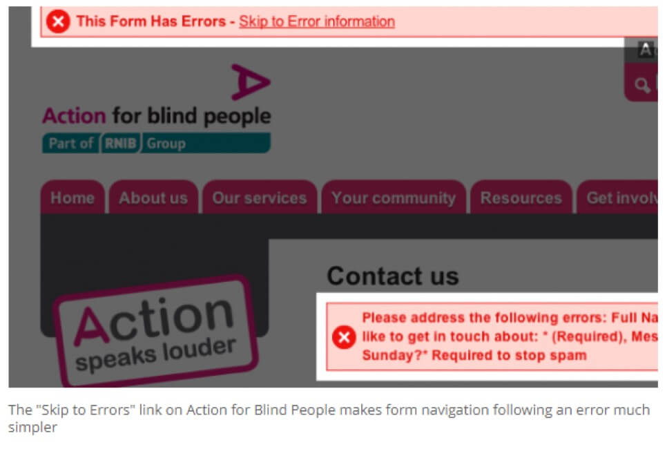
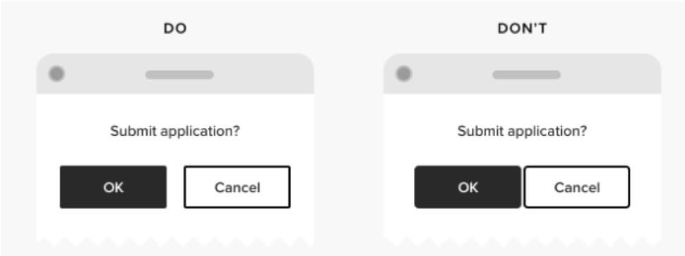
Crucial to being preventative is designing to minimize errors, which will ultimately cultivate trust. And with nearly all websites entailing the need for some form of interaction, designers need to provide easy to digest information that can prevent such errors.
For example, accomplishing forms should be accompanied with clear error messages that guide users (as opposed to red fonts, which may not be perceptible to some users). The same goes for purchasing products, or registering with a website. When users feel supported during these types of interactions, there is goodwill and trust reflected on the brand.
7. Tolerant
Speaking of errors, it’s inevitable that users will be making them, which is where tolerance comes in. If the aim of being preventative is to build trust, the goal of being tolerant is to build user confidence. The combination of user confidence and brand trust goes a long way in influencing the likelihood of people visiting your website again.
8. Effortless
Being effortless is a key tenet of usability. Unnecessary demands and restrictions on your users make websites cumbersome to use, putting a strain on users and making them want to go elsewhere for what they need.
Having happy users who can interact with your site as easily, efficiently, and effectively as possible is the aim of an effortless web design.
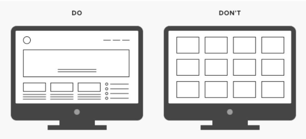
9. Accommodating
Having an accommodating site means intelligently using spaces on web pages in a way that makes people want to interact with your website. For example, packing a page with content and features makes a site look crowded, and ultimately, inconvenient to use. Too much space and not enough content can lead to users questioning whether the site has loaded properly.
Being accommodating means putting users at ease when it comes to navigating and interacting with your website. This includes accessibility from devices of all shapes and sizes.
10. Consistent
Consistency entails providing a familiar environment that’s aligned with industry standards, guidelines, and best practices. This doesn’t mean, though, that there’s no room for creativity and innovation. It just means understanding when to adhere to conventional rules, and when to break them.
Inclusive Web Design Tips
Plan a clear visual hierarchy
Planning how your content will be presented and organized is important to making design accessible to all. This entails aligning information with visual hierarchy, which takes a user’s eyes on a natural journey through the content. As a guide, you can Gestalt principles (principles of grouping) to organize related items.
According to Google, touch targets should be a minimum of 48*48px. This ensures that people with impaired vision or motor function are able to interact with a website.
As well, use padding and spacing to further ease interactions. Touch elements should be separated by at least 8px of space. Doing so reduces the tendency for users tapping on the wrong option.
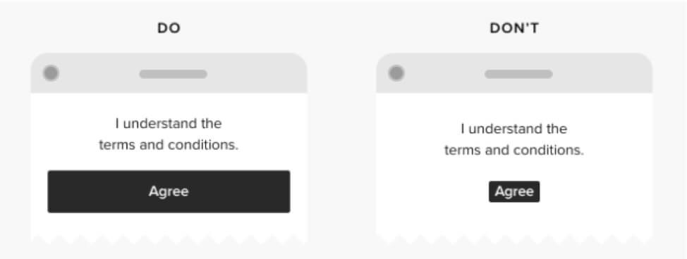
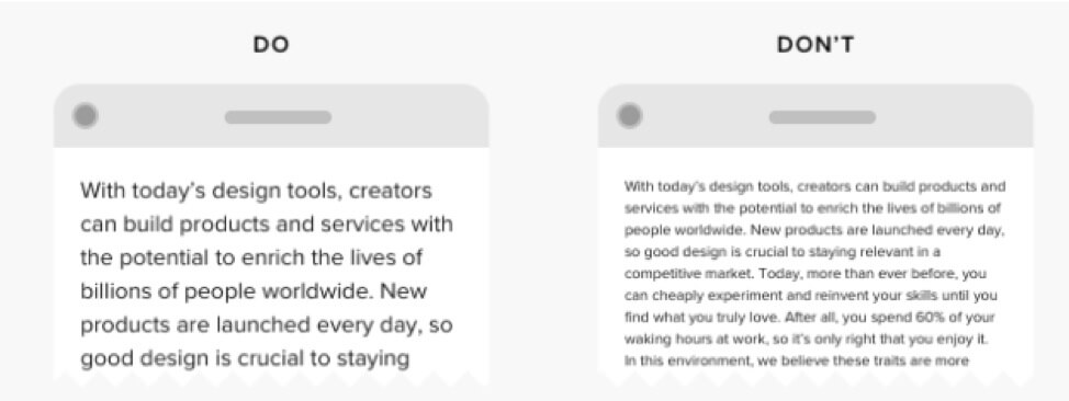
Use a larger font size in all areas of design
Just like adhering to social image size standards, set a font size of at least 16px, and ideally, 20px for body text. Doing so will not only enhance user experience for the visually impaired, it also won’t affect other user groups.
Where small text has to be used, user upper case. But if aesthetic considerations come into play (as you can see with Spotify and Netflix’s navigation footers) implement letter spacing, and heavier font weight.
Use high-contrast color combinations
This refers to contrasting values – the relative light and dark of two colors, as opposed to contrasting hues. To adhere to the general standards, you can refer to the W3 accessibility guidelines, which requires a contrast ratio of at least 4:5:1 in larger elements, and 7:1 in regular ones. Alternatively, there are online tools that help check the contrast ratio.

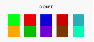
And when it comes to hues, avoid problematic color combinations for functional element designs like color coded maps or buttons whose functions are indicated by colors. This caters to users that suffer from some form of colorblindness.
These are just basic tips for inclusive web design. You can find a more comprehensive list here.
Takeaway
Inclusive web design is about considering different abilities and different situations different users could find themselves in. Implementing the above principles and best practices falls in line with making the full access to the web a basic right. Additionally, allowing as many people as possible to access your site only makes perfect business sense.