Want More Leads? The Top 6 Conversion Optimization Tips For Your Homepage
These Simple Homepage Upgrades Can Drive Big Growth In Lead Numbers
 I’ve probably looked at (for the sake of evaluation) over 25,000 homepages.
We end up working with many of those companies to help improve their sites, so I’ve had the benefit of watching as our recommendations and upgrades produce the desired results.
Today, we evaluate and provide website homepage recommendations to almost anyone who contacts us. A lot of those recommendations are similar, and all are designed to produce improved results.
Here are the top six homepage upgrades you can make tomorrow to drive more leads immediately.
1. Tell A Better Story
It sounds silly, and I’ve probably written about this a hundred times, but it’s almost always the worst part of most company websites: The headline on your homepage.
Here’s how to know if you’re doing it right. It’s a checklist, so see how you do. Go to your homepage, look at the headline text at the top of your page and determine how many of these five boxes you can honestly check off:
□ Does it clearly explain what you do? Would a third-grader be able to tell you exactly what you do?
□ Is it disruptive? If I read it, am I inclined to think, “I better look around, or I might be missing something that could help us”?
□ Is it emotional? Does it make me feel anything? People are emotional beings and make purchase decisions emotionally.
□ Is it compelling? Does it make me want to click around the site?
□ Is it dramatically different compared to my three top competitors?
How many of these boxes can you check with your homepage headline? The more you can check, the better your site is going to be at producing leads.
Google and Microsoft both report that you have about 10 seconds to grab a visitor’s attention and move them into your site. Without a strong headline and compelling story that grabs them and sucks them in, you are limiting your ability to drive leads.
2. Make Sure Your Page Isn’t Too Long
This is a new issue for most newer sites. The advent of mobile devices, mobile search and the way people search for information, visit sites and move through sites has shown us that longer, more story-oriented sites perform better.
But some people have lost their way and created sites that are so long you barely get to the bottom before wanting to move on.
Remember, our brains are organs, just like the heart and lungs. Your brain gets tired. You know what that feels like. When you get that extremely long email and you just want to read it later, that is your brain telling you it’s too tired to deal with that amount of dense information.
The same risk is in play with long websites. You’re scrolling and it never ends. So, you just leave. Not the action you want your visitors to take.
Your website cannot be one long page — at least not for long. I have no problem launching a single-page website with a well-designed homepage and a plan to add new pages strategically over the next few months.
What I’m talking about here is a super long page that almost no one ever gets to the bottom of. How do I know and how will you know? You should be using heat-mapping software like Crazy Egg, Lucky Orange or Hotjar.
Check out Hotjar's special page on using heatmaps.
These tools will show you exactly how many visitors are making it down your page and where they’re leaving. The tools will give you unmatched insight into how to adjust and optimize your page to deliver a better visitor experience.
Remember, page views are not the end game; clicks and conversions are the goal. Clicks because that signals Google to the page’s value, and conversions because that means leads.
3. Use Social Proof Liberally
A homepage without social proof is like a home without windows; it’s just not right. The people coming to your site don’t believe you, but they do believe your customers or clients. The social proof is your chance to highlight others who have had positive experiences with you.
There are a lot of different ways to do this, but one of the biggest questions related to your homepage is this: Where do you use the social proof? Some people believe it should be used early, after the first panel and above the fold (this means visitors don’t have to scroll down), while others believe it should be presented in order of how people process information.
There are a variety of ways to show social proof. Some people show logos, others use quotes from people and still more like to have video of people talking. As a point of reference, nothing works better than video of your customers telling their story of how you helped them.
Video marketing in all shapes and sizes is quickly becoming one of the hottest and most effective ways to tell you story in an emotional, compelling and disruptive way. Using your customers to tell their story is hands down going to produce much better results.
There is a definite pecking order on social proof, too. Not all social proof is created equally. Here’s how we see it, in order of most effective to least effective:
- Video testimonials with names, titles and company names
- Static testimonials with names, titles and company names
- Static testimonials without any names, titles or company names
- Logos (better than nothing, but not nearly as good as the other three options)
Typically, a combination of all four works well and allows you to leverage the video assets you have with the logos and approved testimonials. You wouldn’t want to put all of this on the homepage, but social proof is not a homepage-only application. You’re going to want to use these in emails, in sales execution, on your blog and on other pages of your website, so deploy wisely.
4. Deploy Action Pointers On CTA Buttons
Not to state the obvious, but your CTA (call-to-action) buttons are key to driving leads and, in some cases, they are an under-optimized tool in your toolkit.
First, there are ways to help people notice them more, like using arrows and pointers to direct people’s attention. You can also use pictures and imagery to direct visitors to notice those CTA buttons more often.
Next, make sure you haven’t drifted too far into design mode with your buttons. If your designers are more interested in what looks good, they might need a results reset.
Those buttons should be what stand out the most on any of your pages but especially on your homepage. Remember, the more clicks, the higher you’ll rank on Google.
5. Optimize Copy On Your CTA Buttons
Words matter, and they especially matter when it comes to CTA buttons and driving leads from your homepage.
We’ve done extensive testing on this, and here is an excellent example of why words matter.
This is typical copy (words) for a CTA button; Download Your Whitepaper Today. You’ve seen this everywhere. It makes sense, too. But did you know that Download My Whitepaper Today will likely outperform Download Your Whitepaper Today by almost 90%? If you’re getting 100 leads, changing your to my could produce 190 leads.
Here’s more on that from our friends at Unbounce.
Make sure your copy is action-oriented and direct. Learn More almost never outperforms Download or Click Here.
Adding a sense of urgency to your button copy can also have a big impact on results. Simply changing the copy to Download My Whitepaper Now from Download My Whitepaper can also have a major impact on how many people click that button on your homepage.
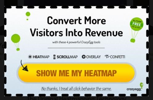
Here is an example from heat-mapping software company Crazy Egg. They’re applying a number of best practices in this CTA button.
 Note the color of the button — bright yellow, when that’s NOT even in the color palette. Note the arrow pointing to the button, and note the use of the word my in the button. Three excellent applications of CTA design that work together to drive better results.
They’re also using a graphically designed button instead of the simple “out-of-the-box” buttons that most CMS and marketing automation software tools provide. We’ve seen a serious lift when we moved from basic buttons to more graphic buttons. Plus, those graphic buttons give you a ton of extra opportunities to consider some of the suggestions above.
6. Match The Right Offers Based On Your Prospect’s Buyer Journey
Finally, another adjustment has been proven to produce some of the most significant results across all of these recommendations.
The other day I was talking to a prospect in the software space, and their homepage had not one but five Request A Demo (the actual copy) buttons on their homepage. They had a Watch Video button, too. Of the six things I could do on their site, five of them were to request their demo.
They did have a couple of other links on the page, but they were text links and not nearly as prominent as the demo buttons.
This is a common challenge, especially with software companies that are in a big hurry to get demos scheduled.
But it’s the wrong approach. It’s like asking you to meet with a sales rep, dedicate your precious time and be sold to before you even know if you’re interested. It’s too early in your prospect’s buyer journey.
Before people start jumping up and down, I’m not against making it easy for people to request and schedule their demos, I’m just suggesting you might have skipped a few other steps that can produce an increase in additional leads.
What you should be thinking about is the purpose of every page on your site and the buyer journey stage that page is designed to support. The homepage is almost always an early buyer journey page, but it’s also a gateway for people who are at other stages of their buyer journey.
Then you’re going to want specific pages for people at various stages, and you’ll want to match the offers and their CTA buttons to those stages. If you want to learn more about the stages in your prospect’s buyer journey, check out this page on the Cyclonic Buyer Journey™.
Let’s stick with the software industry for this example. You can see that each stage of the buyer journey has a different type of offer:
- Pre-awareness – Tip Guide: 10 Ways To Know If Software Can Help Your Company Save Money
- Awareness – Video: How Software Helped Our Company Save Over $1 Million
- Education – Infographic: How Software Helped 6 Different Teams Deliver Cost Savings
- Consideration – Buying Guide: How To Decide Which Software Vendor Is Right For You
- Evaluation – Assessment: 6 Ways You Can Save Money At Your Company In Just 30 Minutes (or here is where you can offer a demo)
- Rationalization – Reference reel with three testimonials from customers who realized cost savings from the software
- Decision – Contract/agreement: Simple text, limited legal, easy and frictionless signing process
Create pages on your site for each stage and apply the offers liberally. On your homepage, start with the Awareness offers or the Education offers, and as your visitors work down the page, consider the Evaluation offer toward the bottom of the page. Don’t fill your homepage with offers; keep it to two or three at the most.
You can have the Evaluation offer at the top and the bottom. This works well in helping visitors who are ready to talk find what they’re looking for quickly.
Finally, none of this is possible without ongoing testing and optimization. It is highly unlikely that you’ll roll out your new homepage and it will perform optimally out of the box. What is required is a dedication to A/B testing, ongoing optimization, the development of key performance metrics for your homepage and a commitment to pushing up those numbers month over month.
This won’t happen magically. It takes expertise, work and a weekly emphasis on making even small changes, tracking those changes and leaning into those changes that produce the best results.

CEO and Chief Revenue Scientist
Mike Lieberman, CEO and Chief Revenue Scientist
Eliminate Hit-or-Miss Marketing Moves
Get advice, tips, tools and guidance to generate more leads for your company in this weekly email newsletter.


Eliminate Hit-or-Miss Marketing Moves
Get advice, tips, tools and guidance to generate more leads for your company in this weekly email newsletter.


