Adaptive Design: How It Can Deliver Better eCommerce UX?
In the world of eCommerce, trends come and go faster than most people can keep up with. But no matter the trend, one thing remains important in eCommerce – user experience.
Ecommerce user experience or UX refers to how a user or customer feel and what they think of your business after visiting and interacting with your ecommerce website. It can either be positive or negative.

Why is UX important for an ecommerce business? Consider this: no matter how amazing your products or services are, without a positive user experience, customers won’t stay long on your site and it’s likely that they’ll abandon their carts. Combining UX designing and psychology on the other hand to achieve positive user experience will definitely improve the conversion rates of an ecommerce site.
The importance of UX should not be compared to the value of adaptive design and user interface in general. While they are correlated, they are completely different.
- Adaptive Design Defined
- Latest Mobile Ecommerce Stats and Trends That Deserve Your Attention
- Ecommerce Sites With Standout Adaptive Design
- Best Adaptive Design Practices for Improved UX on Your ECommerce Site
-
6 Ways You Can Improve eCommerce UX With Adaptive Design
- #1 Improve Static Content Performance With a Content Delivery Network
- #2 Consider Both User Context and Device Capability
- #3 Appearance is Important, But Always Prioritize Function
- #4 Master the Art of Image Optimization
- #5 Eliminate Unnecessary Elements
- #6 Boost Mobile Shopping UX with Microinteractions
- Final Thoughts
Adaptive Design Defined
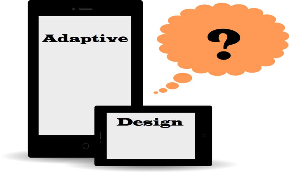
As the term implies, adaptive design is a design created and applied in graphical user interfaces so that they can adapt to any screen size and device. According to statistics, 85% of customers will complete the purchase from one device to another. With adaptive design, the system is able to select the most size-appropriate layout for the browser and screen size.
Some people use the terms adaptive and responsive interchangeably when discussing UI design but there are actually some differences between the two.
The main difference is that with adaptive design there are usually six fixed layout sizes created (for the six most common screen widths) while the content moves dynamically when responsive design is used as there is just one layout that resizes to fit different screen sizes.
Simply put, responsive websites only scale what’s on-screen instead of fully optimizing all the elements so they all work.
Latest Mobile Ecommerce Stats and Trends That Deserve Your Attention
From $96 billion in 2015, eCommerce on mobile’s revenue is expected to reach up to $693 billion this year – an astounding increase of 621 percent.
By the end of last year (2018), mobile phones and tablets accounted for 27 percent of all retail ecommerce sales in the US alone. This year, Wolfgang Digital’s KPI report says that while 53 percent of traffic to ecommerce sites come from mobile devices, they deliver only 32 percent of the total revenue.

This past few years, aside from the online marketing tools commonly used, chatbots and augmented reality have been utilized by a lot of brands that have recognized their potential in boosting their business. IKEA, for example, pleased their customers by allowing them to visualize how their products will actually look in their homes or offices with the use of augmented reality.

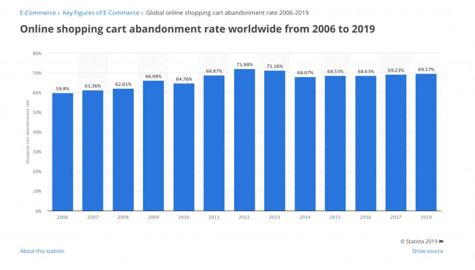
Cart abandonment rate is a global problem. For a few years now, it has remained within the 69 percent to 70 percent range.
Multiple instant checkout options for ecommerce sites are considered normal as the number of customers using PayPal, as well as Apple Pay and Google Pay, has grown considerably in the past few years.


Ecommerce Sites With Standout Adaptive Design
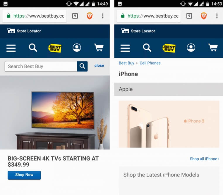
Best Buy
If you are an ecommerce business owner, you want to make sure that you have an online store that works across all devices. Best Buy is an excellent example of a business with positive UX thanks to its adaptive design. Best Buy’s menu on its desktop displays more items compared to its mobile version with a hamburger menu that customers can click on to access the hidden items.
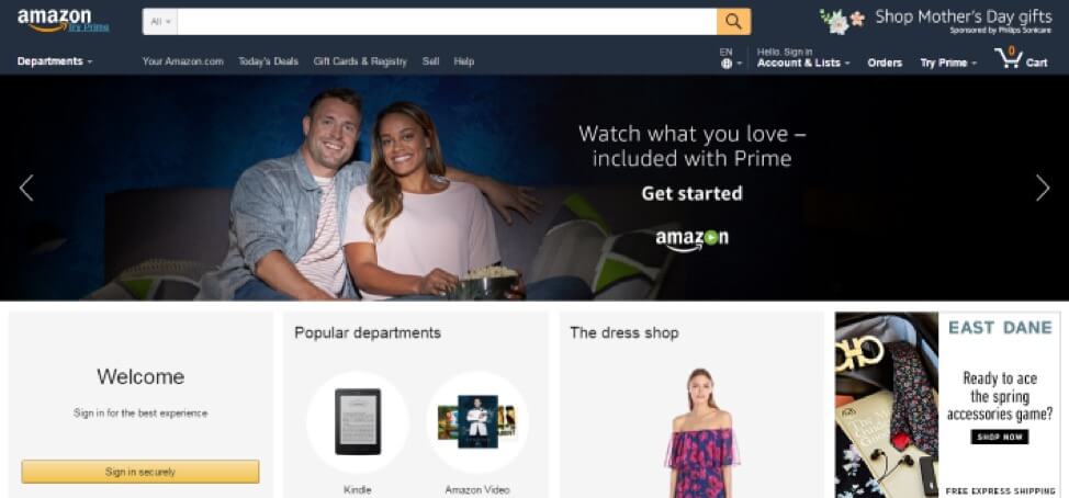
Amazon
Amazon achieved an access speed increase of 40 percent with its adaptive website design. Mobile users are also able to open ‘Amazon.com full site’ now instead of the responsive design that was previously available.
Nike
Mobile users can visit this shoe giant’s mobile website at m.nike.com. The mobile version of their website has limited items on display on the menu. You can only see the search and shopping cart icons along with the hamburger menu where all the options can be accessed.

Avenue 32
Avenue 32 is a luxury ecommerce site that also uses adaptive design. What they provide visitors to their site is a seamless, streamlined, and aesthetically pleasing design. All the elements of their website result in a positive UX.
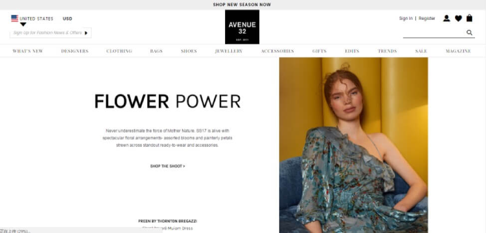
A clean design, with elements and functions that are easy to find – this combination results in a website that’s both easy to navigate and use.
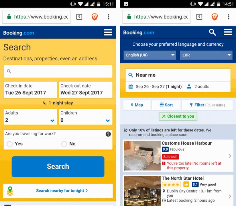
Booking.com
Booking.com is among the most popular hotel booking sites worldwide, and its adaptive design may be one of the reasons for this. When you use its mobile version you can simply ‘search nearby’ as it uses GPS to recognize your location and narrow search results. The mobile Booking.com also has fewer items promoted and smaller images.
You’ll notice that the theme of presenting all the most important details mobile users will be looking for are in most of the examples presented in this article.
Best Adaptive Design Practices for Improved UX on Your ECommerce Site
There are a few psychological reasons that trigger conversion. But there is also a number of ways you can boost conversion through UX design. Here are some of the best ones.
- The Right Color Scheme
With the right color scheme, your ecommerce site can draw positive emotions from your existing and prospective customers. It can help increase their engagement and also help with conversion. Choose the right color not only for your logo but also for the product names and clickables.
- Content Delivery
Content should be delivered accurately on any device. This is one of the most important factors that affect user experience. Users should not have to take extra effort like zoom out to view the texts clearly or zoom in to see the entire page. The same goes for images and videos.
- Prospect Engagement
With the use of cookies, you can make a more personalized contact with prospective customers. You can create tailored messages and greetings and use purchase or viewing history to recommend related products in the future.
- Accessibility
Accessibility is important to customers. They need access to all the elements on the website without having to use a keyboard when they are on their mobile devices. The elements themselves should be interactive to be able to connect with customers better. Consider the expectations of your users and design from their point of view.
- Hierarchy
When displaying information on your web pages, you should follow the right visual hierarchy so users won’t have a hard time navigating through the pages when they’re looking for something. Be strategic when displaying visual content and know that when you achieve the right aesthetic tone, users will find your website more intuitive.
- Empty Space Optimization
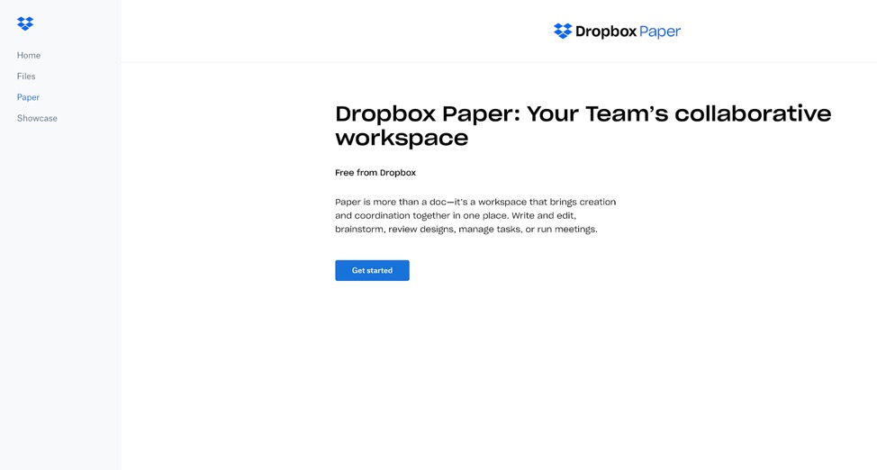
Improve UX and boost business opportunities by taking advantage of “in-between” moments when users get zero state screens. Instead, make use of that empty state to add more value to your business and keep users informed of what’s happening. Check out Dropbox Paper’s zero state UX design. Placing a call-to-action button helps users proceed without confusion.
- Customer-Centric Design(CCD)
A customized platform that focuses on the needs of the user is ideal. Features like voice search and image-recognition are truly helpful. Voice search can improve SERPs ranking immensely. Giving users the option to find products via image searching will also give your website points. According to Salesforce, more than 40 percent of users agree that intelligent assistance is a helpful factor that improves their experience.
6 Ways You Can Improve eCommerce UX With Adaptive Design
#1 Improve Static Content Performance With a Content Delivery Network
CDN or Content Delivery Network is a network that is made up of different servers used to duplicate specific content. It can greatly improve content performance as it delivers content based on the users’ proximity to the server.
For instance, a user from South Korea would likely get content that is on a server in China as opposed to one located in London. This means that when choosing a provider, you need to make sure that they have servers in place where most of your market is. As well, you’ll need to be wise when it comes to choosing packages.
When you look at your hosting control panel and find that you only need 10GB of bandwidth a month, choose a package that caters to that need.
#2 Consider Both User Context and Device Capability
Needless to say, screen space on mobile devices, be it smartphones or tablets, is limited compared to a desktop screen. For this reason, it is crucial that you consider what really matters – the goals that mobile users have (which often differs from that of desktop users) as well as the capabilities of different devices.
Some elements of your website may not work properly on mid-range and lower-end gadgets. When you design for mobile, make sure that you have different mobile versions too.
Amazon gets this so they have at least five versions of their website to fit varying capabilities of phones and tablets. Google also delivers varying layouts for their search results depending on the device used.
#3 Appearance is Important, But Always Prioritize Function
Fancy design does look good but what shoppers look for and stay for is not aesthetics but function. Some design trends can even be distracting or confusing to some users. If you want to improve user experience, prioritize function. Beautiful design can draw a good first impression but if that would get in the way of great functionality, you should go for options that make things easier for your users. It’s one of the best ways to improve conversion rate, too.
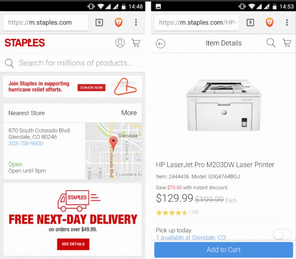
As you can see above, Staples’ mobile design might be simple, but it includes all the elements they’ve found their users to need, particularly those using smaller screens. Instead of focusing on making it look good, they instead made sure that things like store locations closest to users, contact details, store hours, basic shipping details, products and ratings immediately greet users.
The add to cart button is also placed strategically within reach of a mobile user’s thumb. A great touch, quite literally.
#4 Master the Art of Image Optimization
There is no exact formula for image optimization. You need to learn how to balance aesthetics, performance, and user experience. Note that a ‘one size fits all’ approach won’t work mainly because of the varying sizes of screens. Another reason is the popularity of retina devices that result in people looking for images with higher resolution.
Thankfully, you can solve the problem of slow page loads and bloated pages by using services like adaptive Images. What it does is figure out the screen size and automatically resize and serve the appropriate version of the image so that it works perfectly on any device.
#5 Eliminate Unnecessary Elements
Take time to determine the elements on your pages that you really need and those that you can scrap. One way to know which ones to keep would be to study and fully understand how users use or interact with those page elements.
For instance, there may be pages in your website that do not need social sharing buttons to get more followers on Instagram, Facebook and other social media platforms. It would be sensible to remove those buttons on those pages.
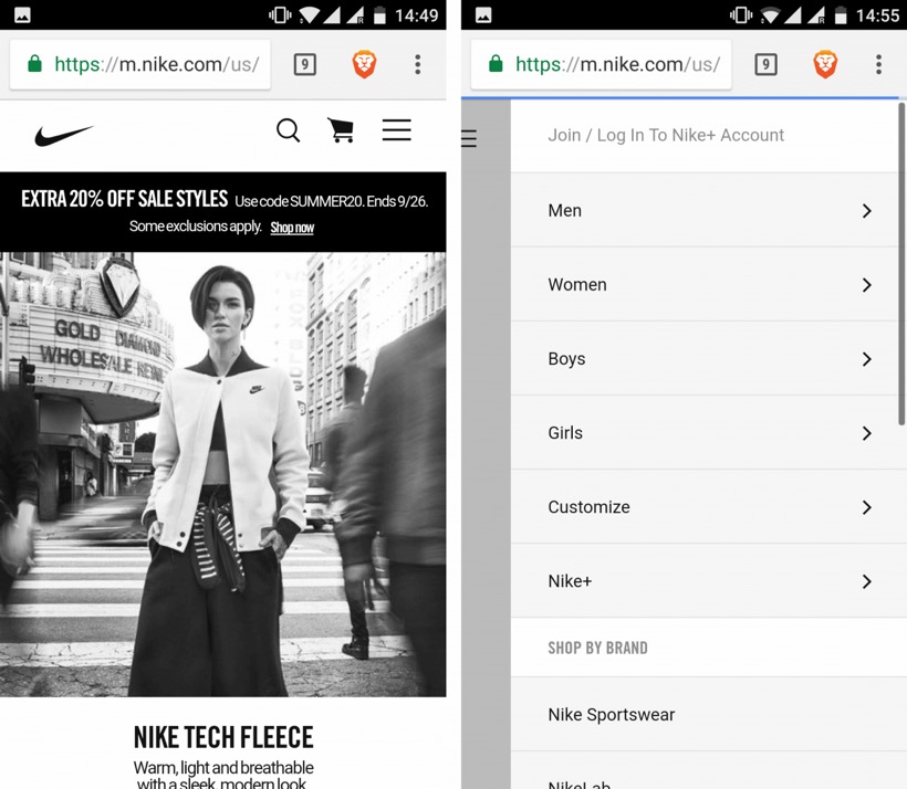
Going back to the Nike example, they do a great job of presenting mobile users only with what they need, while keeping all the necessary options just a few taps away. While the desktop version has a looped video on the homepage, the mobile version features a static frame. This saves bandwidth and hardware resources, while also making sure the page loads at an optimal speed.
#6 Boost Mobile Shopping UX with Microinteractions
Microinteractions may be the thing that will get you that positive UX you have been wanting. Your users want some control when they’re on your website. Give them that. Something as simple as an animated logo that tells your users what the volume level is as they adjust it, could work wonders.

You could also include small notifications to let users know when pages are loading. This microinteraction will come across as an act of courtesy, and may be the reason they stay on your website.
Other things microinteractions bring include:
- Guiding user navigation, making it more intuitive.
- Reducing user anxiety by boosting comfort and providing more natural interactions.
- Reducing errors are providing immediate feedback.
Final Thoughts
User experience should always take the front seat in any ecommerce site. A lot is riding on UX for it to be neglected. By following the tips mentioned above and taking note of the best practices discussed, you can ensure that you have an adaptive website that offers superior user experience.
Does your eCommerce site have an adaptive design? What do you think of using adaptive design to boost UX? Share your thoughts with us!