
November 5, 2019
When thinking about infographics and how they are designed, I often recall a not-so-famous quote from a very famous author, Sir Arthur Conan Doyle: “Data! Data! Data! I can’t make bricks without clay!”
Data plays an important part in any business, but to truly understand the data your company has compiled and collected, they must be represented and displayed in the right way. This is where infographics can serve an important role in making sure your audience receives and understands the data you are presenting.
Infographics, essentially, are a visual representation of compiled data that is put forward in a graphically appealing and easy-to-understand way.
The best and most effective infographics use the data they have as a foundation and let the design flow around that. They are clear, concise, and to the point—while staying within brand guidelines if such constraints are required.
Below are eight examples of some excellent infographics.
1. Highlighting Local Community
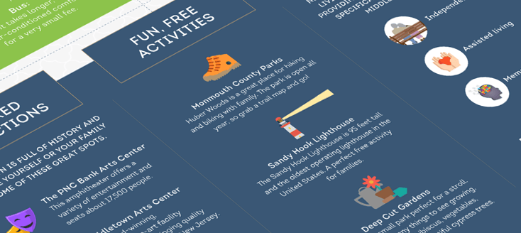
(View the full infographic here.)
This infographic is easy to follow, and the visuals lead your eye from point to point, taking in all of the information about what activities to do in New Jersey. It's a clean design with a good use of colors.
2. Helping Customers Find Their Product Fit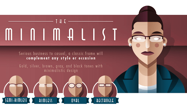
(View the full infographic here.)
This infographic has a great use of fonts to capture an overall style, which is also distinct in their use of illustrations over product photos. The data here is clearly represented, with each section having additional style examples and an overarching fact.
Special mention to the fantastic use of color to break up the sections, which helps the user process the data from each section more efficiently.
3. Decision Tree Measures Disaster Preparedness
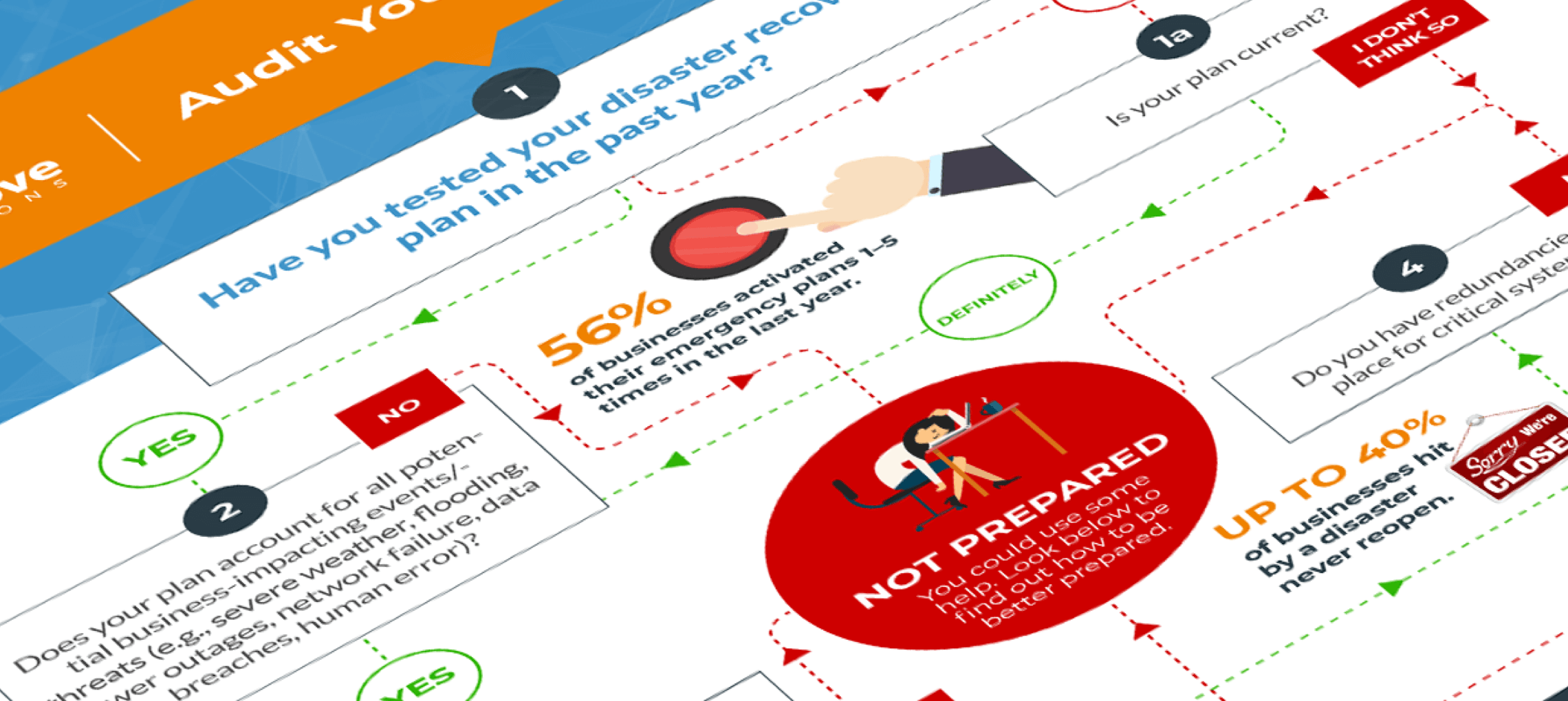
(View the full infographic here.)
4. Educating On Design Elements & Principles
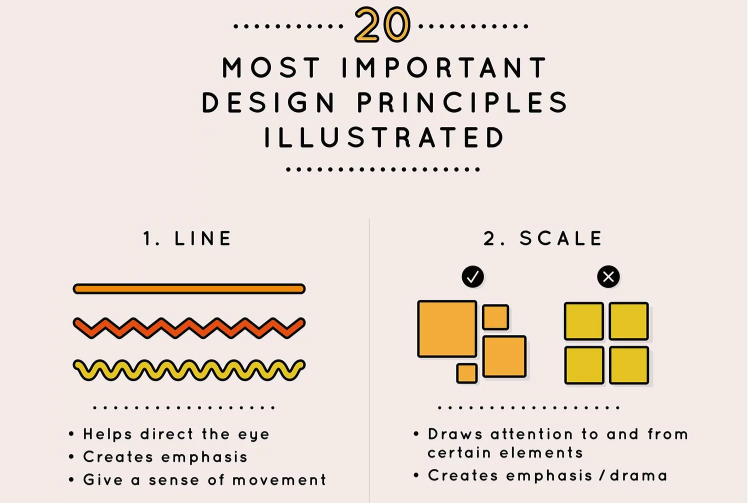
This piece is by Canva, a great resource for design guidance and templates, so it's no surprise they do a good job of showing off their own principles.
The separation of elements with good use of space is clear throughout this infographic, with the data broken up into small segments for easy digestion. The illustrations fit perfectly with the data to give a clear visual representation of what is being talked about. In this case, the infographic is great for people who are not familiar with design.
5. Call To Support Endangered Species

(View the full infographic here.)
This altruistic infographic uses colors and shapes relating to the topic and tying the message together. The important statistics are clearly highlighted and well-separated within the design, and the overlapping elements bring a sense of depth to the visuals.
Although there is no CTA at the end, there is a takeaway question for users to contemplate, which keeps them thinking about the infographic and its contents after it has been read. 
6. Traveling Tips For Frequent Flyers
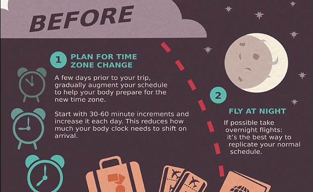
(View the full infographic here.)
The designer has cleverly broken the infographic into three sections using different times of the day and weather patterns, bringing a relatable element to the design while creating smaller chunks of data.
The user is guided by the “flight path” of the plane, which ties into the topic of travel well. Although the design is flat, the use of texture adds depth and brings certain elements of the design forward for the user. This designer has taken a different approach to the key facts, but using a numbering system over large/bold type still offers the appearance of data.
7. Improving Brand Distinction
(View the full infographic here.)
While technically not a traditional infographic, this web graphic is important to include here as an example in making interactive content stand out with design and UX. You can have all the elements of a traditional infographic — clever icons, short snippets of information, and data — while choosing to present it in a different way.
For this experience, instead of scrolling down the page to read the image, user can click an arrow or pieces of the graphic itself to navigate the content.
8. Changing Behavior Through Learning

(View the full infographic here.)
This infographic has plenty of data, and though the layout is long and there is no clear visual path, the information is still easy to read and take in, because each data point has its own boxed-off section with an accompanying visual cue.
Color is used to transition from one section to another to create the separation needed amid a lot of information.
Conclusion
When designing an infographic, it is vital to keep the key data points clearly represented while guiding the user from point to point, using colors and fonts to break the design up as you go along.
Build on those data by tying the overall design to your company brand, or if there are no brand requirements, choose colors and fonts that fit with the overall theme.
This post was originally published on August 5, 2016, and was updated in November 2019.

Plan, design, build, and launch your website successfully with:
Mastering The Art of Website Redesigns


Other insights you might like