
2010s to now: Email design trends that survived the test of time
Email has come a long way. Founded by Ray Tomlinson in 1971, what started as a way to communicate with colleagues who wouldn’t answer their phones evolved into a powerhouse. The email marketing channel continues to bring staggeringly high returns, with an ROI of 36:1.
This October, email officially turns 50. We can’t help but feel a bit nostalgic. That’s why we’ve decided to take a look back at email’s history, from the 2010s to now.
We asked email experts Lily Worth, our email design and production specialist, and Brian Thies, email developer and owner of Thies Publishing, to dig into the archives and share some insight about their experience through the years, specifically with coding and design.
Take a walk with us down memory lane as we revisit email design trends that survived the 2010s. In this post, we’ll look at some of the most iconic design trends and how they evolved for the better.
Email grows up in the 2010s
The 1990s to 2000s was a renaissance period for email design. Around 1991, the internet—as we know it now—was born. Then in the late 1990s, email experienced a rebirth with the introduction of HTML to email.
What about the 2010s? Despite being “the most sort-of” decade of all time, major advancements did take place with email marketing.
During this decade, a lot of things took off: segmentation, personalization, email automation, compliance (like GDPR), accessibility, and much more. This set the stage for email marketing as we know it today.
Here’s a brief history of email marketing milestones over the past decade:
- 2009 – Responsive emails are introduced.
- 2010 – Triggered emails become the norm, with 48% of marketers now sending triggered emails.
- 2012 – 90 million Americans now use email on a mobile device.
- 2013 – Google introduces tabs within Gmail.
- 2014 – The integration of CSS with HTML brought in the era of interactive emails.
- 2014 – Dynamic content is used to create personalized experiences with subscribers.
- 2014 – Canada’s anti-spam legislation (CASL) comes into effect.
- 2015 – CSS animation within email gains popularity.
- 2016 – Personalization takes over.
- 2016 – GDPR is adopted.
- 2018 – Apple introduces Dark Mode as part of their 15th OS release.
What about coding and design?
Email design trends that defined the 2010s
To jog our memories, we asked Lily to dig into the archives and share the earliest email she could find. Let’s take a look at the first email she designed and developed for Experian in 2009:
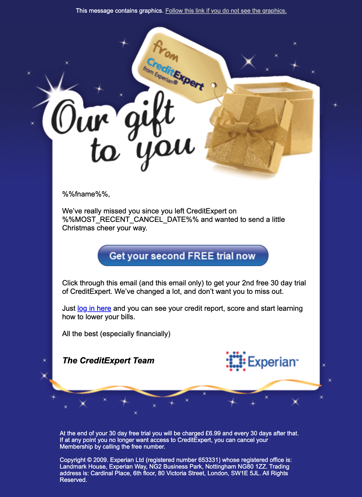
Her thoughts after revisiting this email? “Lots of image slicing, tiny fonts, and no responsive code.”
Here’s another one of Lily’s first emails, from a different project at Experian:
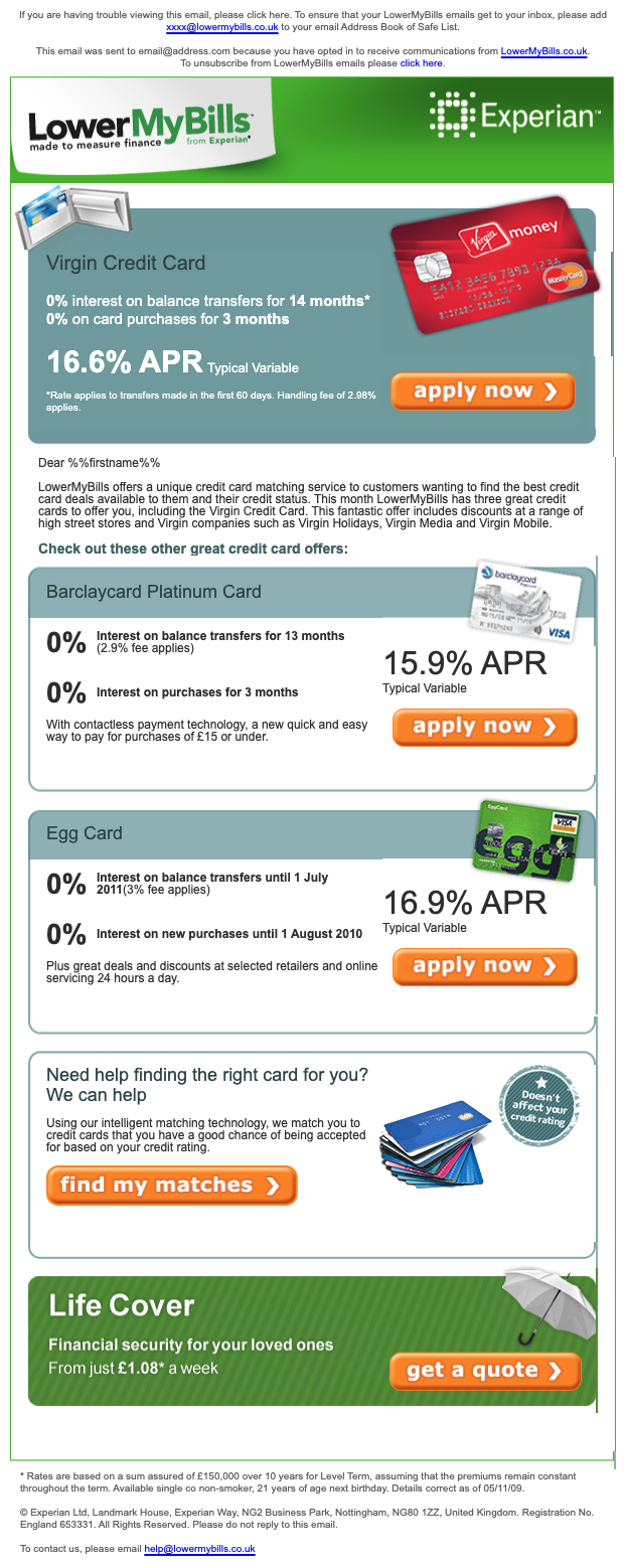
What does Lily recall from this one? “The buttons and lengthy preheader text. It’s good to see that back then, we were using live text the majority of the time.”
To take things a bit further, we asked our community on Twitter to share the first email campaign they ever sent (thanks #EmailGeeks!). Let’s look at some of the key characteristics that defined emails of this decade.
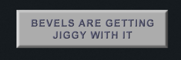
Garish buttons
Before bulletproof buttons, there were buttons of all kinds. Common treatments were glossy, and the good ol’ bevel and emboss.
First, let’s take a look at some examples of glossy buttons.
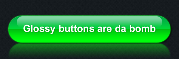
Here is an example in email, dating back to 2014:
And look at this bevel and emboss effect. Irresistible, don’t you think?
Although more heavily a characteristic of the ’90s, we saw a combination of glossy mixed with the bevel and emboss technique in our early emails, shown by one of Megan Boshuyzen’s first emails she designed in 2008.
https://twitter.com/megbosh/status/1369690759461486603
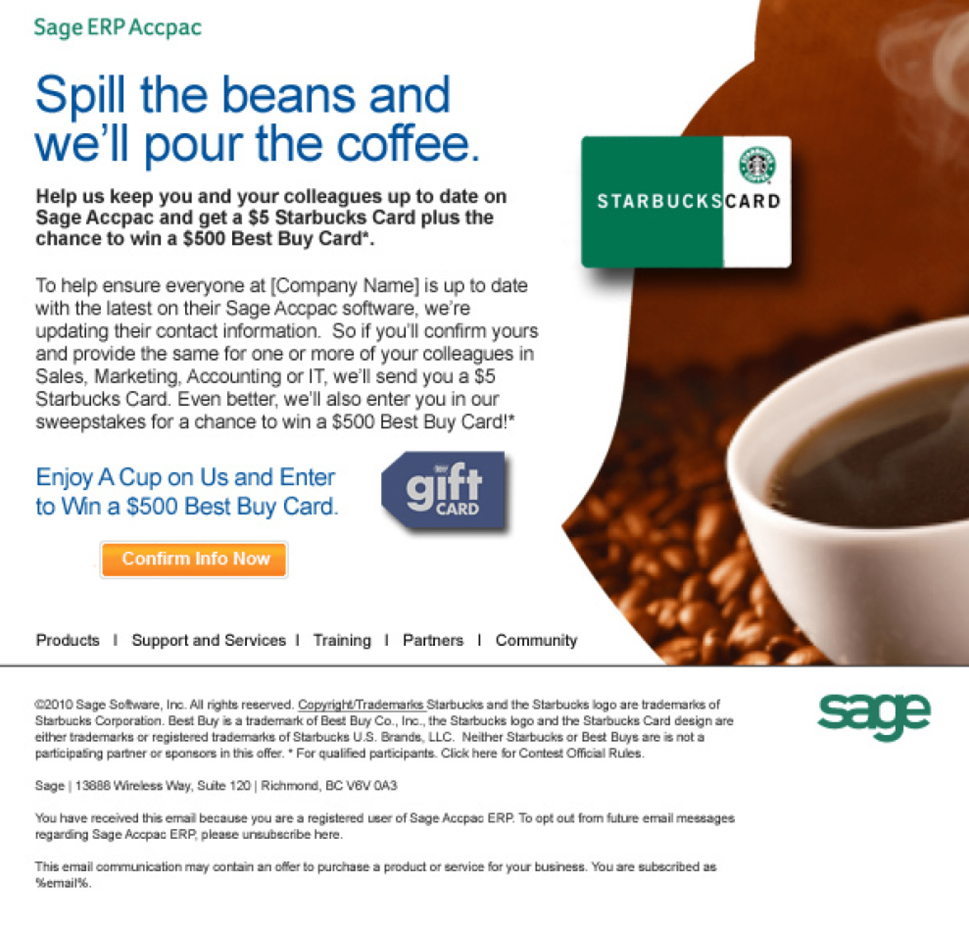
Drop shadows
It seems we were big fans of adding depth to our emails in any way possible back then. In addition to the button styles listed above? Drop shadows.
Check out this email from 2010. The “floating” Starbucks card and gift card were made possible by drop shadows.
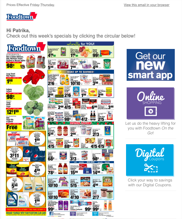
Navigation bars
Email design tends to closely follow the footsteps of web design. A lot of what was popular on the web would shortly find its way to email.
Here’s an example of a navigation bar in one Paul Airy’s first email campaigns:
One of the first email campaigns I designed and developed. pic.twitter.com/euS5FcafnV
— Beyond the Envelope™ (@Paul_Airy) March 10, 2021
Another example of the navigation bar shown below, from Justine Jordan:
As Emily Benson said, emails had the tendency to look like “websites trapped on email”. We couldn’t have said it better!
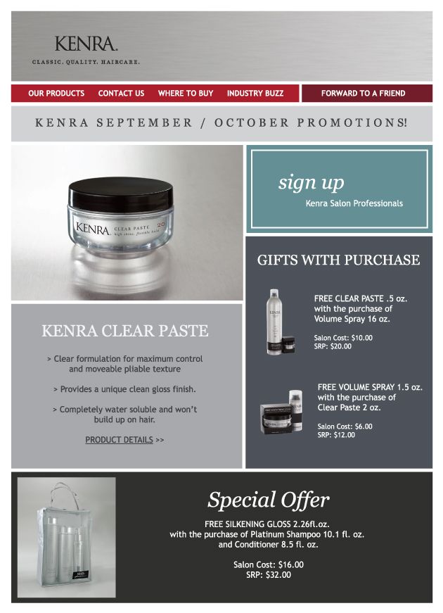
Callout boxes
Before mobile became the norm, the focus was heavily on desktop. The approach seemed to be “get as much as possible into this email.”
Although sidebars are commonly used in email today, back then, callout boxes would often be featured in the sidebar of emails as a way to structure content.
Some of the cons of sidebars are that they add visual clutter and can be difficult to make responsive. Even cleaner, well-designed sidebars could distract subscribers from the main goal of an email campaign.

Ushering in a new era of email marketing
Many design trends as we know them today were introduced in the past decade. The introduction of responsive design in 2009—coupled with the surge in email usage in the early 2010s—was a catalyst, opening up the doors that would later influence much of how emails are built now.
As we progressed through the decade, accessibility and inclusive design became a bigger part of the conversation.
Designing for mobile devices
With the increasing popularity of mobile during the early 2010s, optimizing for mobile devices became a necessity. Scalable, fluid, and responsive design became important approaches to consider in email development. According to our post in 2015:
Mobile email was barely a blip on our radars in 2011, and made up just 8% of email opens. Fast forward to 2014, and nearly half of emails are opened on smartphones and tablets—a 500% increase in four years.
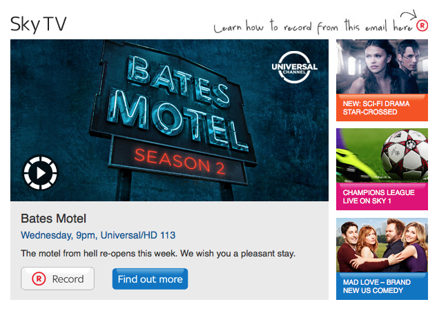
Here is an example of an unresponsive email from 2016 (and another example of a website trapped in an email):
Collaboration
When we asked Brian about the biggest changes he’s seen with email in the past decade, he spoke about how the increased demand of automation and transactional tools created a hiring surge:
“One of the biggest changes was the growth in the number of legitimate (and relevant) marketing emails from companies looking to establish a foothold within their industries.
This includes the increased use of automation and transactional tools to create a closer connection with their users and consumers. That surge helped generate a hiring frenzy, and paved the way for the enormous email marketing community we enjoy today.”
 Brian Thies
With more people, comes more collaboration. Eventually, the need to work smarter cross-collaboratively became evident. It required thinking through the long-term process of usage of what was being coded—not only for the email developer but also for the ever growing team of marketers, designers, and engineers in the “hiring frenzy.”
Strategies like reusable content blocks, snippets, globals, and templates became a regular part of coding emails more efficiently.
What email design trends survived and evolved?
Let’s take a look at what design trends survived and evolved in the past decade.
Buttons, but better
As discussed earlier, one of the most iconic aspects of email design in the past decade were those garish buttons. And while we still see bevel, emboss, and glossy, they’re toned down and simple.
Here’s a present-day example of a button with a bevel and emboss effect:
Once accessibility became a bigger part of the picture, we figured out how to make buttons bulletproof, so that our calls-to-action weren’t contained within images that could be blocked or turned off.
Use of imagery, but smarter
Before we knew image-only emails weren’t the best way to produce email campaigns, we were doing it.
Back then, a popular method for building emails would start with slicing on Photoshop (#SlicinAndDicin, anyone?), exporting the HTML, and making it work from there. However, as we learned and evolved with time, we found it wasn’t the best method.
By 2012, 90 million Americans were using email on a mobile device. With the rise of mobile, we figured out how to work smarter.
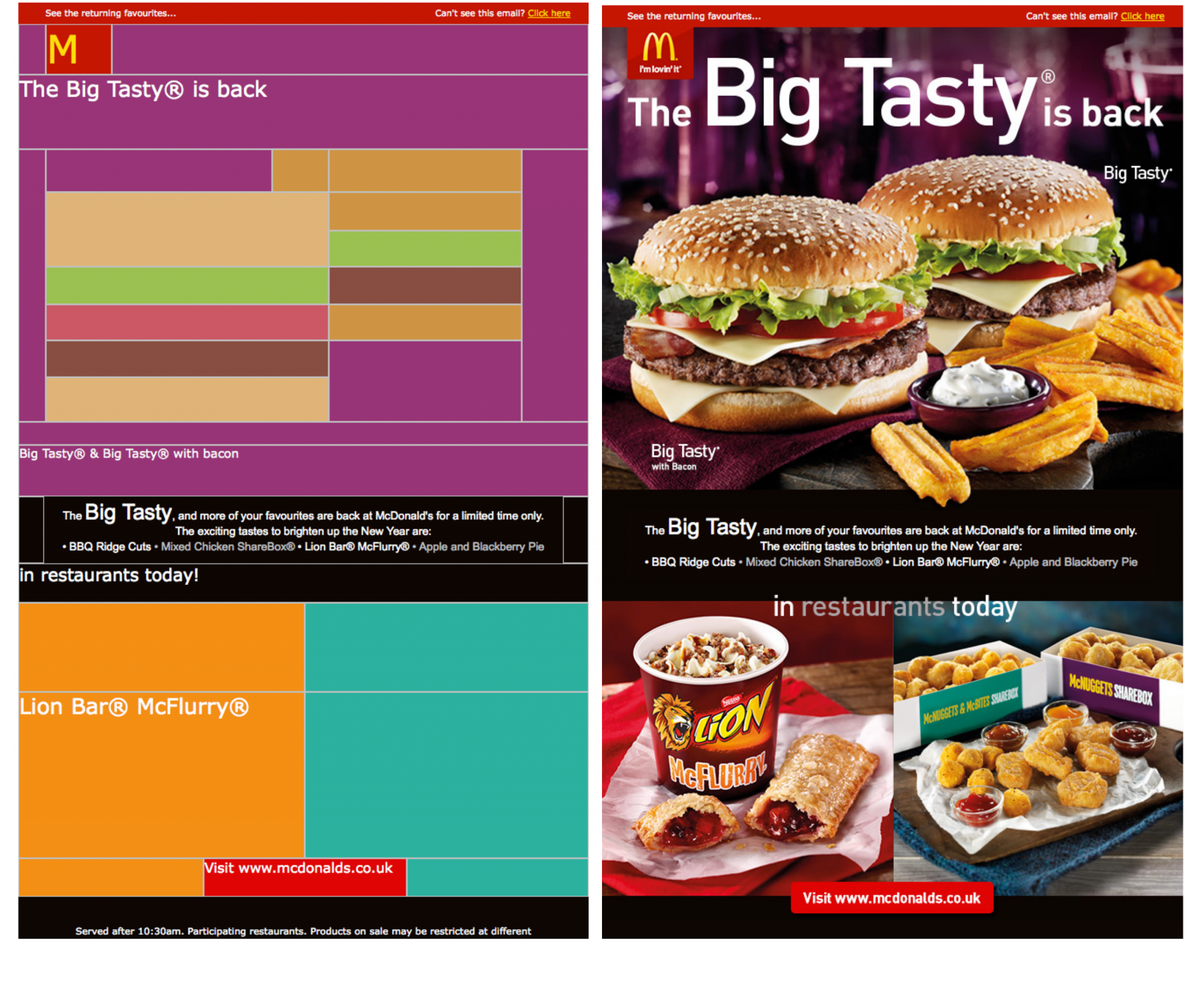
In this example from McDonald’s in 2014, we see how they’ve implemented some best practice techniques with alt text and background color, keeping subscriber experience top of mind. Here’s a side-by-side comparison to show images on versus images off.
The overarching theme: simplicity
While we do see all these things in email today, they’re more subtle and simple than they were back then. In a nutshell, Lily explains email now has “much cleaner design—simplified layouts with much less clutter and bigger fonts. Readability is now better considered.”
Overall, emails of the past had the tendency to have a lot going on compared to emails we see today. The use of cluttered layouts (callout boxes and navigation bars) has evolved into much simpler ones.
It’s nice to reminisce
Reminiscing on our past can bring awareness to how much we’ve changed. And change is good—it’s a sign we’re growing and evolving! So thank goodness email is always changing, right?
What comes to mind when Lily and Brian think of the 2010s?
“I am a fan of the evolution of email, definitely living in the present/future and not looking back. 😆”
 Lily Worth
“While I miss the simplicity of a smaller number of email clients to manage, I don’t miss the amount of testing that was involved before Litmus. Being able to make small tweaks in code and see the results across all email clients at once has been an enormous time saver.”
Brian Thies
Ensure your emails look perfect in the face of change Email is ever-evolving, with over 15,000 different potential renderings—and counting. Ensure your emails look perfect in the face of change. Protect your brand reputation in every email send by ensuring each send is on-brand and error-free, in any inbox. |
One way to jog memories of the past is to think about specific details, from a holistic perspective. So, to help transport Lily and Brian to the past, we had to ask them about things they also missed, aside from email.
What do Lily and Brian miss from the past decade?
“Being less dependant on screens, British comedy was better back then, and I miss going to see bands play live almost every night.”
Lily Worth
“Easy. Not having to wear a mask.”
Brian Thies
And finally, we couldn’t resist and dared Lily and Brian to share their first email address (hint: only one told the truth).
- freakslovefridays@hotmail.com
- OhHellNo@ICantAnswerThat.Nope
Ah, the good ol’ days
Every now and then, it’s nice to reminisce. Looking at our email past can remind us of how far we’ve come. And as a result, it can help us develop a newfound appreciation for the present.
While we may miss the zen of #SlicinAndDicin on Photoshop, evolution is a good thing. The 2010s were a defining decade for email. The ’90s walked, so the 2010s could run.
Still feeling a bit nostalgic? We are too. That’s why we made this special edition of Litmus Weekly as an homage to the ’90s.
Meet your new email bestie It’s our anything-but-ordinary newsletter made by email marketers, designers, and developers. Subscribe for handpicked content and news you should know about—all with a personal take. |
Kimberly Huang
Kimberly Huang is a Content Marketing Manager at Litmus