
Trending in Email Design: Dark Styles
Each year, we see new design trends shaping digital marketing—from the use of color and imagery to typography trends, interactivity, and more. In our “Trending in Email Design” series, we look at the hottest digital design trends—and dive into how they translate into email marketing.
Dark email designs have been gaining momentum over the last year as various email clients and apps have rolled out Dark Mode support. Bright designs can create a very jarring experience when viewed in Dark Mode, so designers have started to consider a “Dark Mode first” approach, crafting inspirational creative that looks great for all subscribers, no matter which color scheme they set their inboxes to.
Plus, even when your subscribers view your emails in the default bright mode, dark designs can help make your email stand out. With the flood of campaigns that take the traditional approach to email design—dark copy on a bright background—an email design that uses a reverse color scheme will catch your reader’s attention.
Which brands do dark email designs well, you ask? Get inspired by these beautiful examples.
How are brands embracing dark designs?
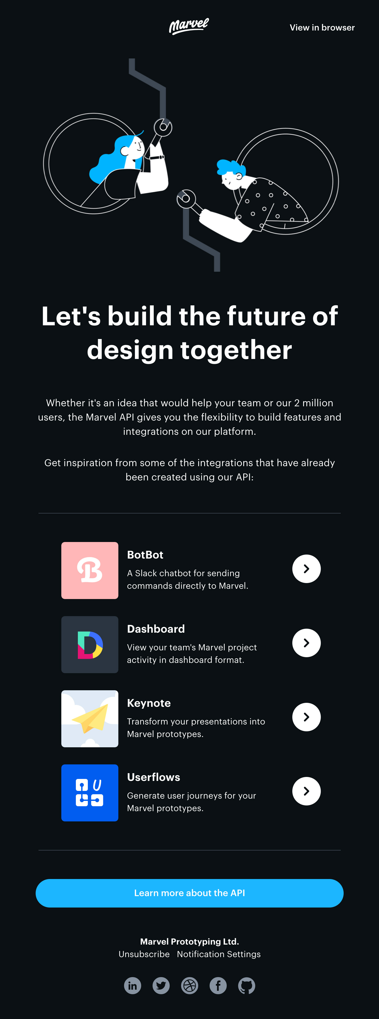
Marvel
Design platform Marvel reaches out to developers in this neatly crafted email to discuss working with their API. Developers often set their machines or their code editors to Dark Mode due to the vast amounts of time spent at their screens reading and writing code. Marvel may have made the decision to make this a dark design when considering their intended audience.
Marvel combines the dark background with custom illustrations in white, featuring highlights in a bright, friendly blue—a stunning combination that stands out in the inbox.
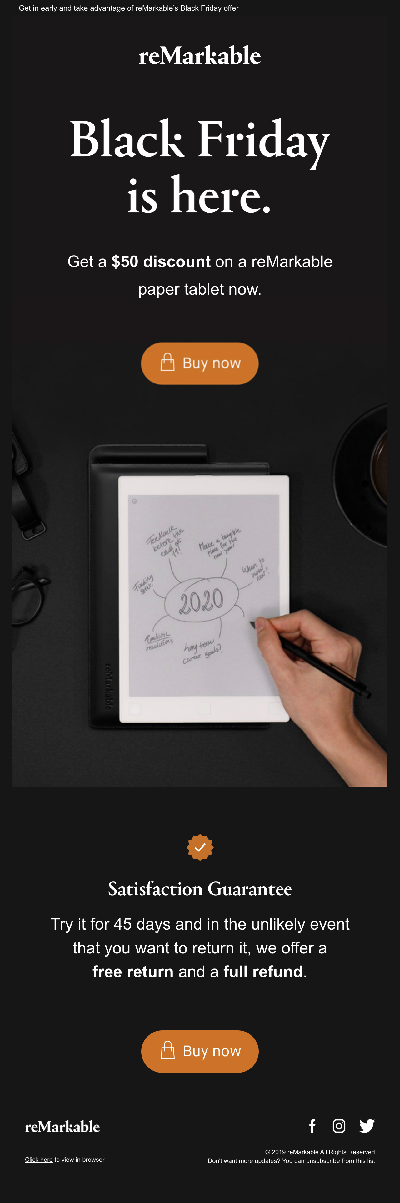
ReMarkable
Black Friday gives designers the opportunity to get creative with dark styles whilst promoting themed offers. ReMarkable, who produces a writing and drawing device, uses bold typography and negative space to promote their offer in an easy-to-digest way. The orange CTAs add a touch of color to this otherwise simple design. The result is a stunning email design.
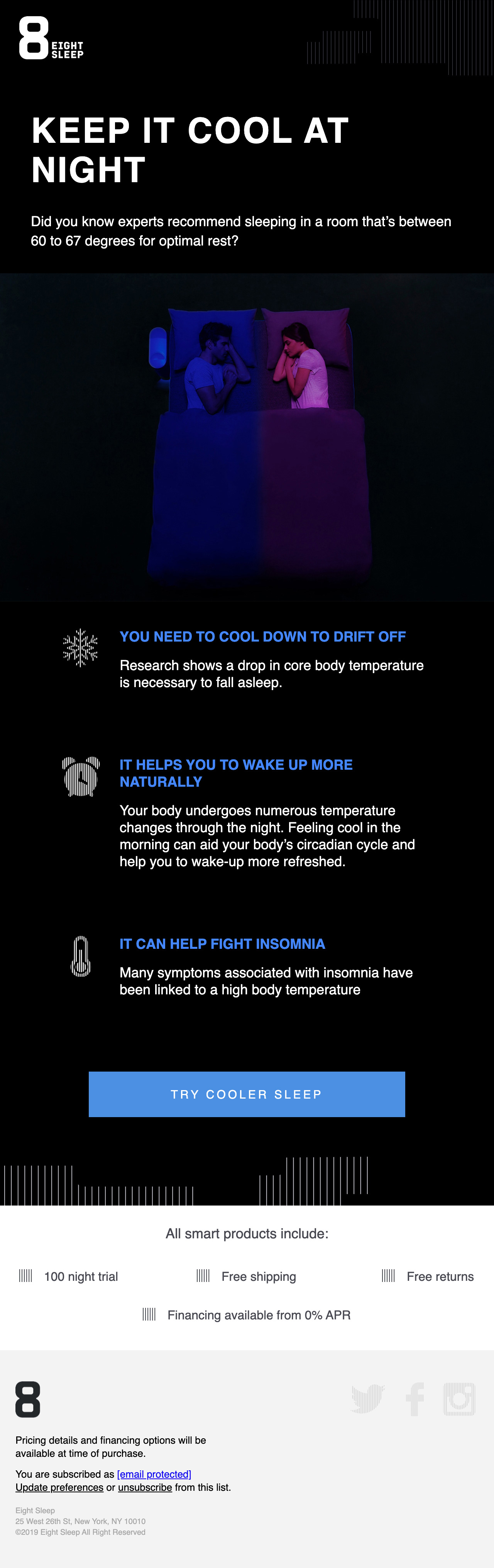
Eight Sleep
Eight Sleep promotes temperature control products that aid better sleep. The dark background with highlights in a cool blue creates a peaceful night time scene—perfect for promoting products that keep you cool at night.
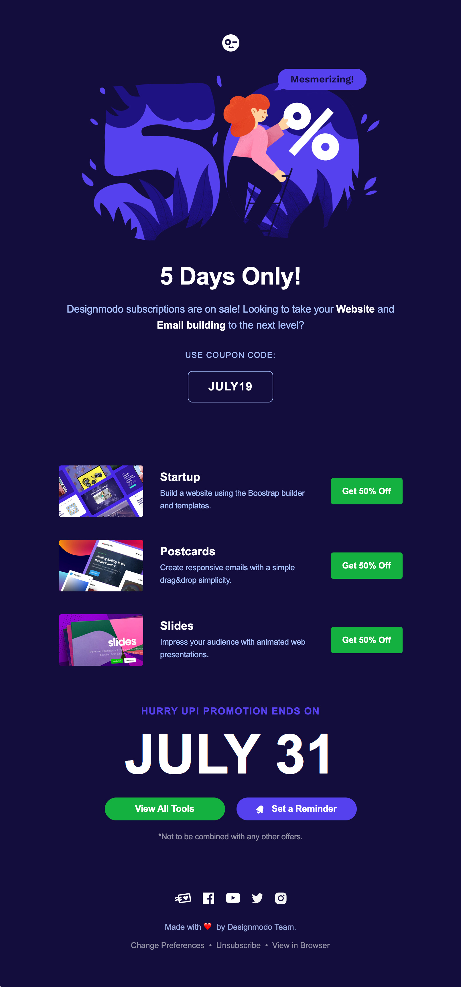
Designmodo
You don’t have to work with black and white to utilize dark styles. In fact, using pure white (#FFFFFF) against pure black (#000000) is also known to strain the eye if you are presenting more than a single paragraph of text. Instead, we recommend working with very light and dark gray combinations for a better reading experience. You don’t have to limit yourself to shades of grey, either. Designmodo takes advantage of different dark and light tones of blue to craft this beautiful campaign.
Equal Parts
Cookware retailer Equal Parts have a number of bold colors in their brand palette, which they make pop against the dark backgrounds of their email designs. In this loyalty campaign they use the power of their bold color palette to take the reader on a journey, offering a fun, digestible, and beautiful way to absorb the details of their referral program.
The New York Times
When combined with bright, vivid colors, dark designs can be friendly and fun. But when paired with more muted colors, dark styles can set a completely different mood and evoke very different emotions.
This campaign from the New York Times is using a dark style to create a gloomy, serious look that’s a perfect fit for their new TV series documenting troubling topics.
Hulu
It’s quite common to see dark styles utilized to promote TV and film, such as this example from Hulu for The Handmaid’s Tale. This dark and gripping drama just wouldn’t get the same promotional impact if framed within an email sporting a bright background. Instead, the dark design builds interest and atmosphere, beckoning the reader to “come back and watch.”
Bellroy Premium
Dark colors are often associated with elegance and formality, so brands looking to give their campaigns a premium look and feel may want to consider a dark color palette. Check out this campaign by Bellroy, an Australian accessories brand. Bellroy’s design team combines the power of a dark background, beige-golden shades, and a serif font to give this campaign a high-end look that’s perfect for promoting their premium range of accessories.
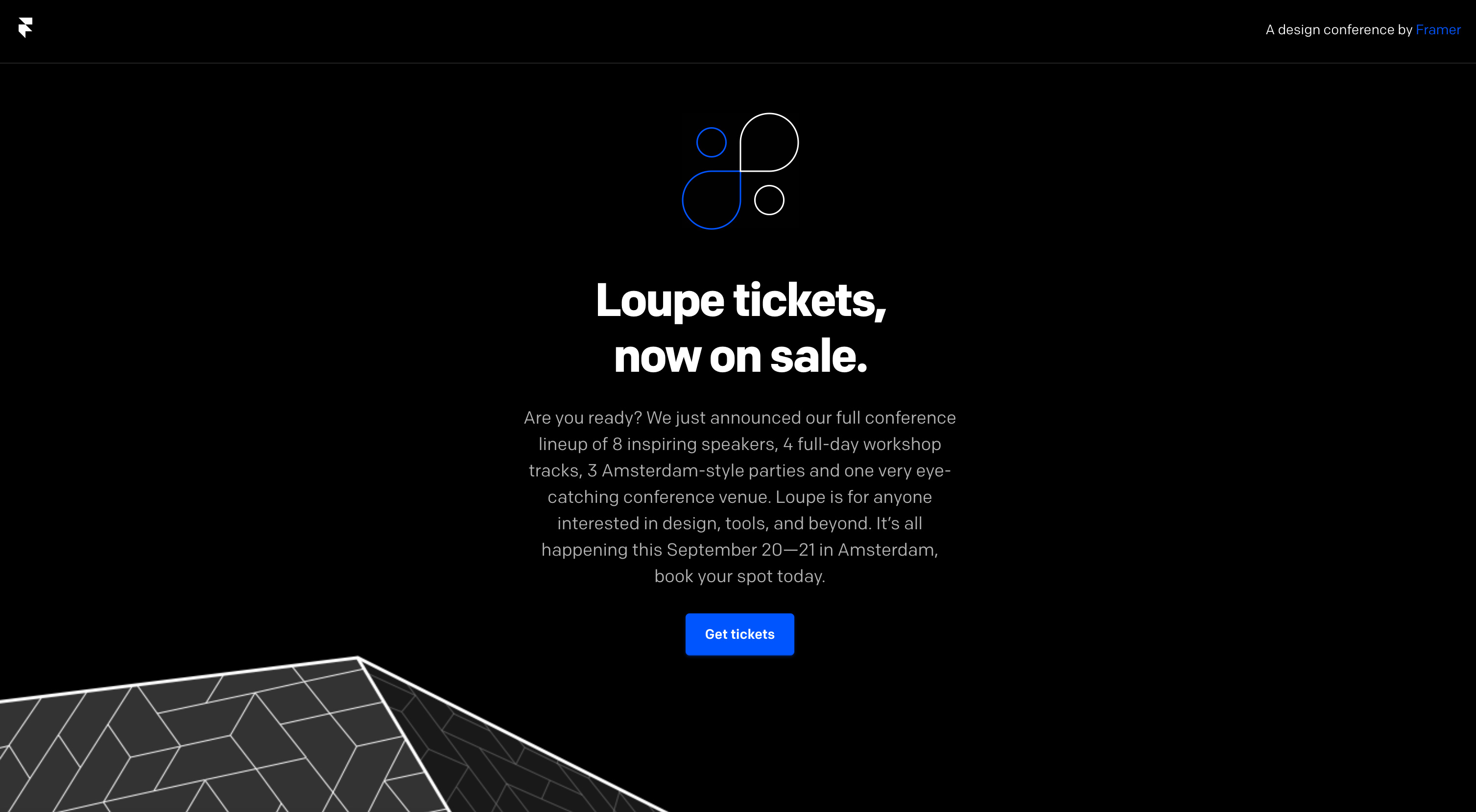
Loupe
Design conference Loupe created a simple but impactful campaign to announce that tickets have gone on sale. The use of a single bold color, negative space, and full width development make this one of my favorite dark email designs.
What’s your favorite dark style email?
We’d love to see your favorite examples of brands utilizing dark styles in your emails. Share them in the comments below.
Lily Worth
Lily Worth was a Senior Email Designer at Litmus