

With consumers making purchasing decisions online, one of the most critical factors that affect where they buy from is their PPC landing page experience.
This is due to the psychology behind the offer, messaging, and overall design of the page. This either drives users to bounce off your site or entices them to take the action you are eliciting. Statistics show that if you don’t prompt visitors to enter your sales funnel on the first try, the chances of them returning and performing the desired action plummet quite drastically, with only 26% of users returning.
The human brain was found to process information within about 13 milliseconds. It then takes 400-500 milliseconds, on average, to respond to visual stimuli.
Looking at previous statistics of user interaction, the majority of new users spend only 15 seconds on a webpage. Therefore, if you do not catch someone’s attention between the time they see your page and the time they process that information, you have lost the sale.
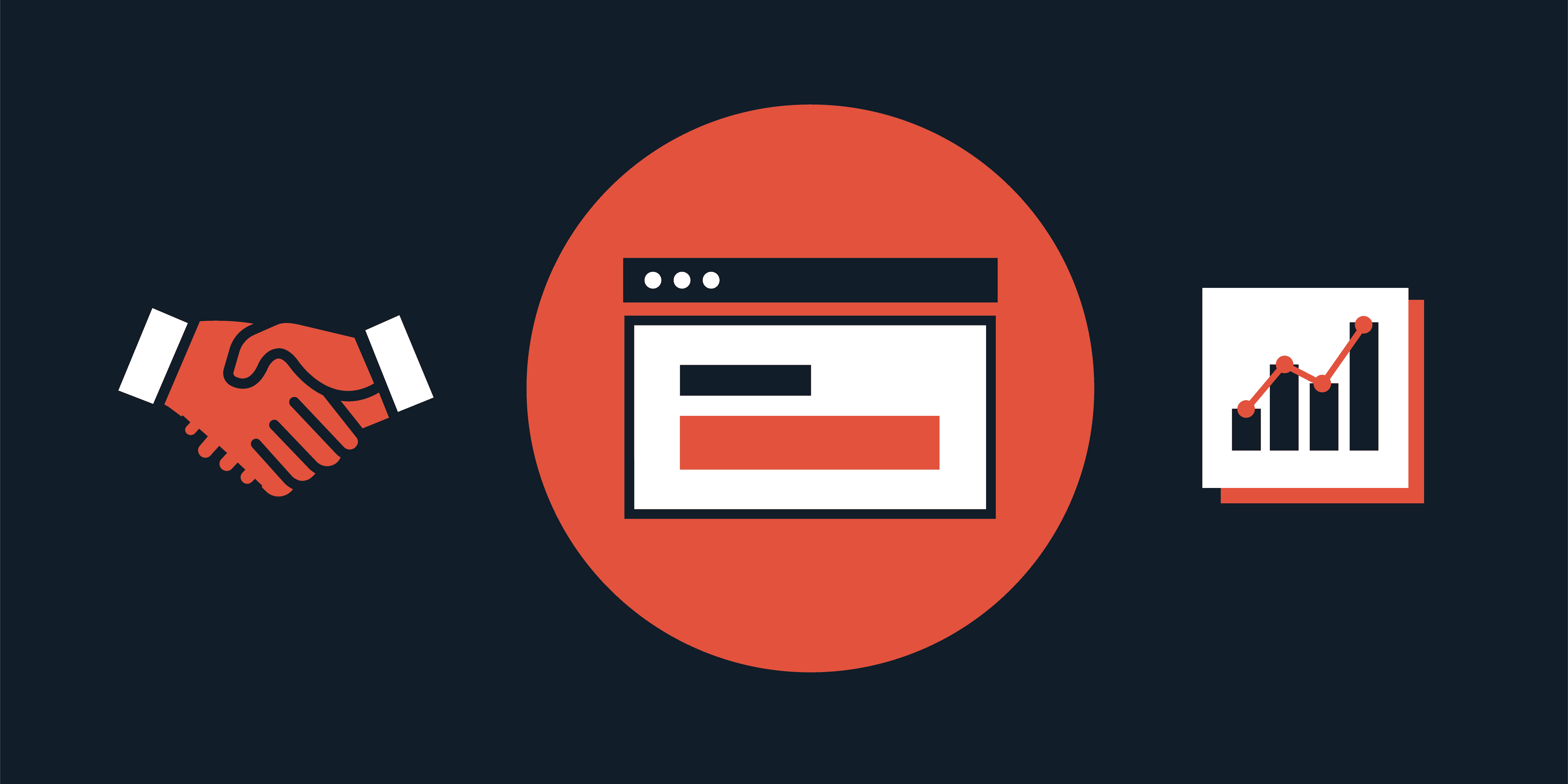
What differentiates a high-performing landing page from an average or poor-performing one can be the slightest variance. These aspects are studied as a science amongst conversion rate optimization (CRO) designers. Below are 15 different examples of highly-effective PPC landing pages. We will outline elements that make them exemplary models to inspire your own brand’s pages.
Editor’s note: You will notice that the focus is mainly on the “above the fold” section of each PPC landing page, since this is the most impactful area. The research found that 80% of users’ viewing time was spent above the fold, making this area the most important part of your page.
1. Volusion
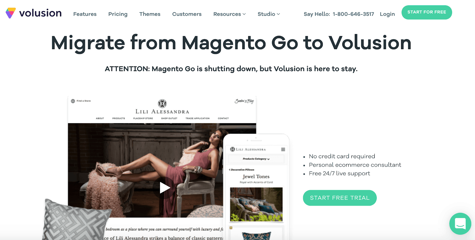
Why It Works for a PPC Landing Page:
- Competitor poaching: The messaging uses a competitor’s loss to take advantage of their prior clientele in a way to show how stable their brand is.
- Action-based call-to-action (CTA): The call to action, “START FREE TRIAL”, is well-written, action-based, and contains the buzz word “free” to get users clicking. It also utilizes a great color scheme to draw the eye.
Areas of Improvement:
- Page segmentation: The page itself lacks organizational structure with no use of colors or lines to separate each section. This can cause sensory overload to the user. By segmenting each section, including the navigational menu and image on the left and strategically using color and shape, you can create a visual and informational hierarchy on the page.
2. Convertize
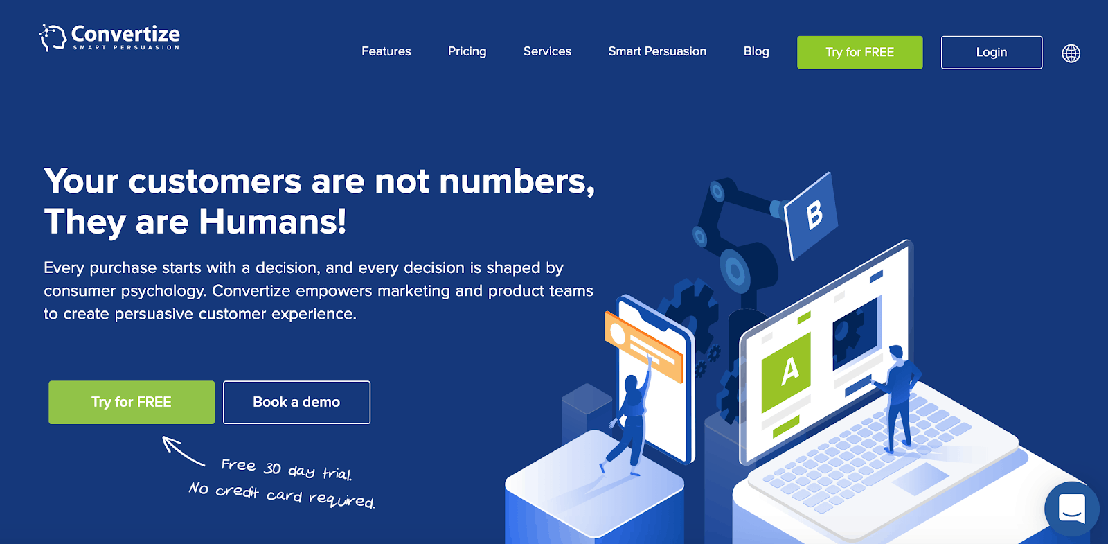
Why It Works for a PPC Landing Page:
- Directional design: The addition of an arrow on the page instantly draws your eye to the primary, bottom-of-the-funnel CTA button.
- Attention-grabbing colors: The pop of color on the button works to enforce the directional design cues.
- Dual call-to-action: Including a double CTA with different offers meets users at higher and lower stages of the sales and marketing funnel. If they’re not quite ready to book a demo, they can experience a 30-day trial to understand the service better before they make a purchase.
- Elimination of user friction: By including the snippet “No credit card required,” users can feel at ease knowing they receive a free trial with no commitment afterward.
Areas of Improvement:
- Selective Language: While the main focus is getting users to sign up for a free trial, the secondary CTA focused on demo signups should be optimized. The phrase “Book a demo” implies that the user has to put in the effort, they will have to put in work to schedule, and most likely speak to a salesperson for the demo. Changing the language to focus on what the user receives rather than what they have to give will result in higher clicks. The revised version could be: “Get my demo” or “See my demo now”.
3. Bluehost
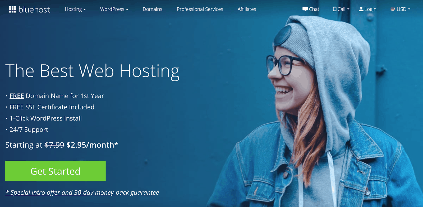
Why It Works for a PPC Landing Page:
- Benefits section: The benefits, listed in bullet points below the headline, clearly depict their value to the reader in an easy-to-consume format.
- Human line of sight: In this example, the person on the page is looking directly to the left. This causes an instinctive directional cue that focuses user attention on the benefits and CTA on the page.
Areas of Improvement:
- Specifying a Unique Value Proposition: The current headline is very vague without any supporting context. Every brand claims they are the best. However, this text doesn’t say why or how. What makes Bluehost the best? Where is the data? Including “why” the audience should use this tool in their headline could increase signups.
- Encapsulation: To intensify the directional cues of the human line of sight, the copy and CTA can be encapsulated within a box on the left-hand side. This form of directional design further guides users to your main goal on the page.
4. Hippo
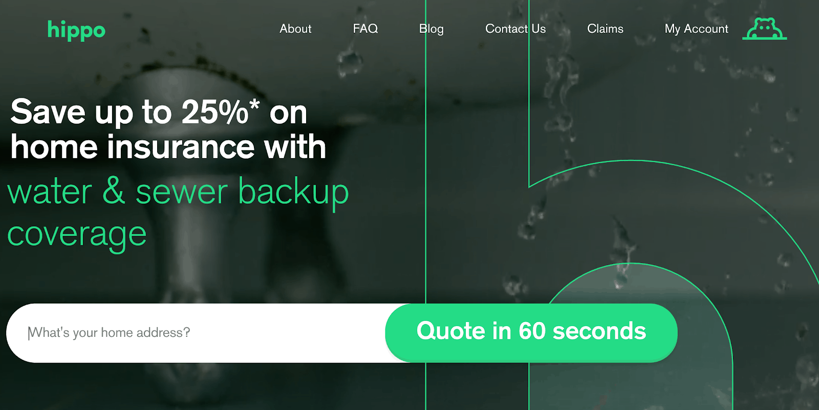
Why It Works for a PPC Landing Page:
- Utilizing statistics: Communicating exactly how much a user can save on their insurance (25%) incentivizes them to get a quote.
- Alleviating friction: The addition of “60 seconds” within the button eases any apprehensions a user might have by showing just how fast they can receive a quote – reducing friction.
- Quick capturing multi-step form: The form is narrowed down to one question to fill out, which makes winning the first lead simple. Behind this first step is the rest of the form. Although more information is required, it has been proven that users who start filling out a form are more inclined to move through it than users who never fill out their information.
Areas of Improvement:
- Augmenting the button color: Currently, it blends with the branding color scheme. Utilizing a different color would be more attention-grabbing.
- Implementing better imagery: The current image is difficult to see and does not support the messaging as much as it could.
5. Nationwide
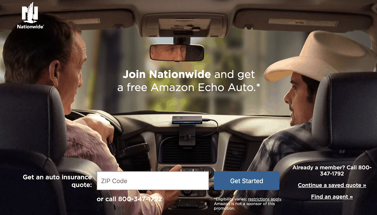
Why It Works:
- Dual-directional design: The image utilizes multiple directional cues with the two men and their different lines of sight, pointing to the headline.
- Authoritative figures: Using country star, Brad Paisley, and former NFL quarterback, Peyton Manning, as reliable figures, instills overall trust and brand endorsement. Keep in mind; this marketing tactic only works if you have the budget for it. However, it can lead to an increase in conversions on your PPC landing page.
- Offer incentives: Promoting the offer to receive a free Amazon Echo upon signup gives even greater enticement to users deciding between multiple insurance companies.
Areas of Improvement:
- Using arrows over the line of sight: The human line of sight is currently focused on the main headline rather than the overall page goal itself (CTA button). The best practice is that directional cues should be drawing attention to the essential element of the page, rather than the headline. Adding a directional design element pointing to the “Get Started” button, such as an arrow, would help the user take the desired action.
- Honing in on one offer: If you look closely at the page, you find a total of five different CTAs, which can cause confusion. Limit the number of choices a user can make to one or two. By providing too many options, you risk the potential of an indecisive consumer and the paradox of choice.
6. Magisto
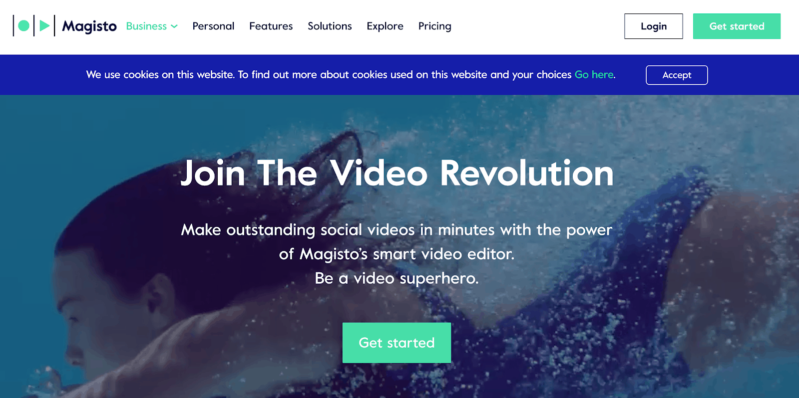
Why It Works for a PPC Landing Page:
- Subtle, implicit direction cues: This page subtly uses directional design by positioning the subheading in an arrow shape pointing down to the “Get started” button.
- Clear value proposition: Users learn that the program is easy and straightforward to use by reading the copy. It informs them of how fast they can create videos by utilizing this software.
Areas of Improvement:
- Eliminate distraction: Remove the navigation bar to eliminate distractions and keep users focused on the CTA page.
- Establish brand trust: Adding social proof, such as customer quotes or logos of flagship clients, can increase overall brand trust (see example below).
7. Angie’s List
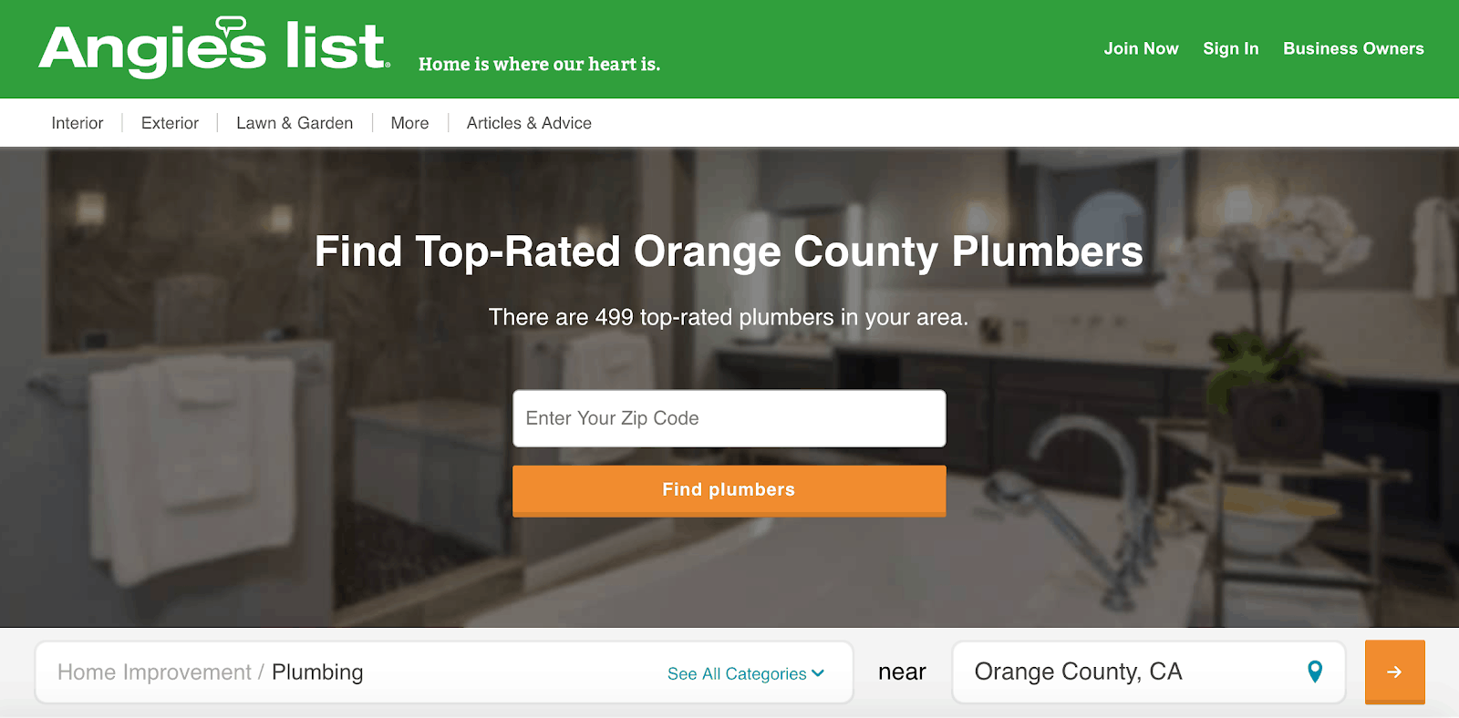
Why It Works for a PPC Landing Page:
- Robust color scheme: As mentioned previously, this page uses opposing colors with an orange CTA button versus the green color scheme on the page. The color pops and draws the visitor’s eye in.
- Customer-specific info: This page uses copy that is specific to the customer by providing location-specific data.
Areas of Improvement:
- Drive attention to statistics: If the number of plumbers in the region stood out, it would build further confidence in the potential buyer to make a purchasing decision. Currently, the number fades into the background.
8. Dialpad
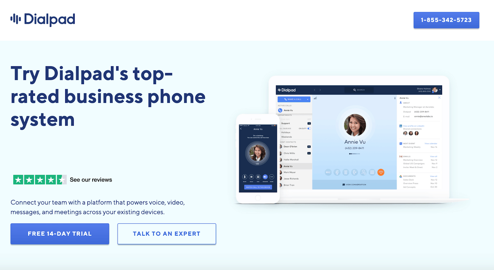
Why It Works for a PPC Landing Page:
- Establishes user confidence: Highlighting the high star-rating above the fold creates a feeling of trust, validity, and confidence in the product. It also shows a sense of reality because it’s not full five stars.
- Descriptive subheading: The subhead text clearly describes the platform features and relevant use cases.
- Supportive product imagery: The image shows the platform in detail, which can offer a preview into what users will receive when they sign up.
Areas of Improvement:
- Avoid focusing on yourself: The headline is centered around the company and can come off as “promotional”. Companies can miss the mark here and not resonate with prospects. Instead, utilize language centered on your target audience and THEIR priorities or pain points. For example, “Increase Your Team Communications by X% Compared to Traditional Phone Systems.” Avoid over-using your brand in your messaging because users care more about what THEY get.
- Distinguish the review source: The high star reviews are excellent to highlight but begs the question, where are these reviews coming from? Do not assume that the user will recognize the branding of your chosen review platform. Showing the review stars, without an authoritative source, (Capterra, TrustPilot, Software Advice, G2, etc.) limits the authenticity.
9. DoorDash
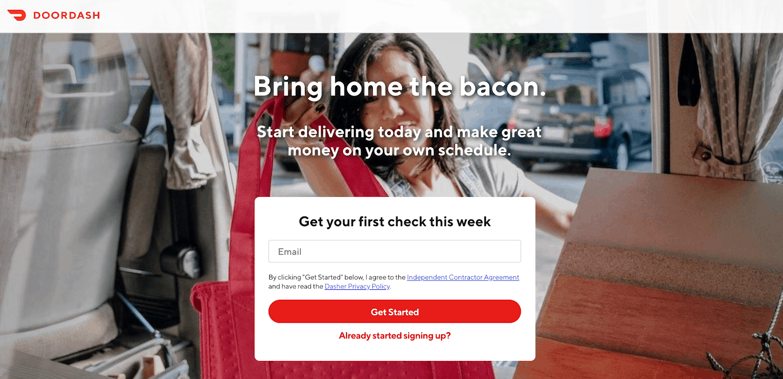
Why It Works for a PPC Landing Page:
- Straightforward motivation: The form headline is very motivating for users and convinces them to enter their email to sign up and start earning cash. The focus of the copy is centered around what users find most valuable, $$. It also ties back into food, which DoorDash is delivering, with the mention of “bacon”.
- No distractions: There are no options to leave the page in the navigation bar, and the page is short with one primary CTA.
Areas of Improvement:
- Better organization: The copy and the form blocks the current image. If you were to move these elements to one side or the other, it would make the background picture more visible. This would allow users to better visualize the service, as well as increase organization across the whole page.
- Streamline the language: A stronger CTA such as “Start earning” would yield better results, as it ties back to why a person would get started in the first place. This would allow the messaging around the headline and subheadline to flow right into the call to action.
10. T-mobile
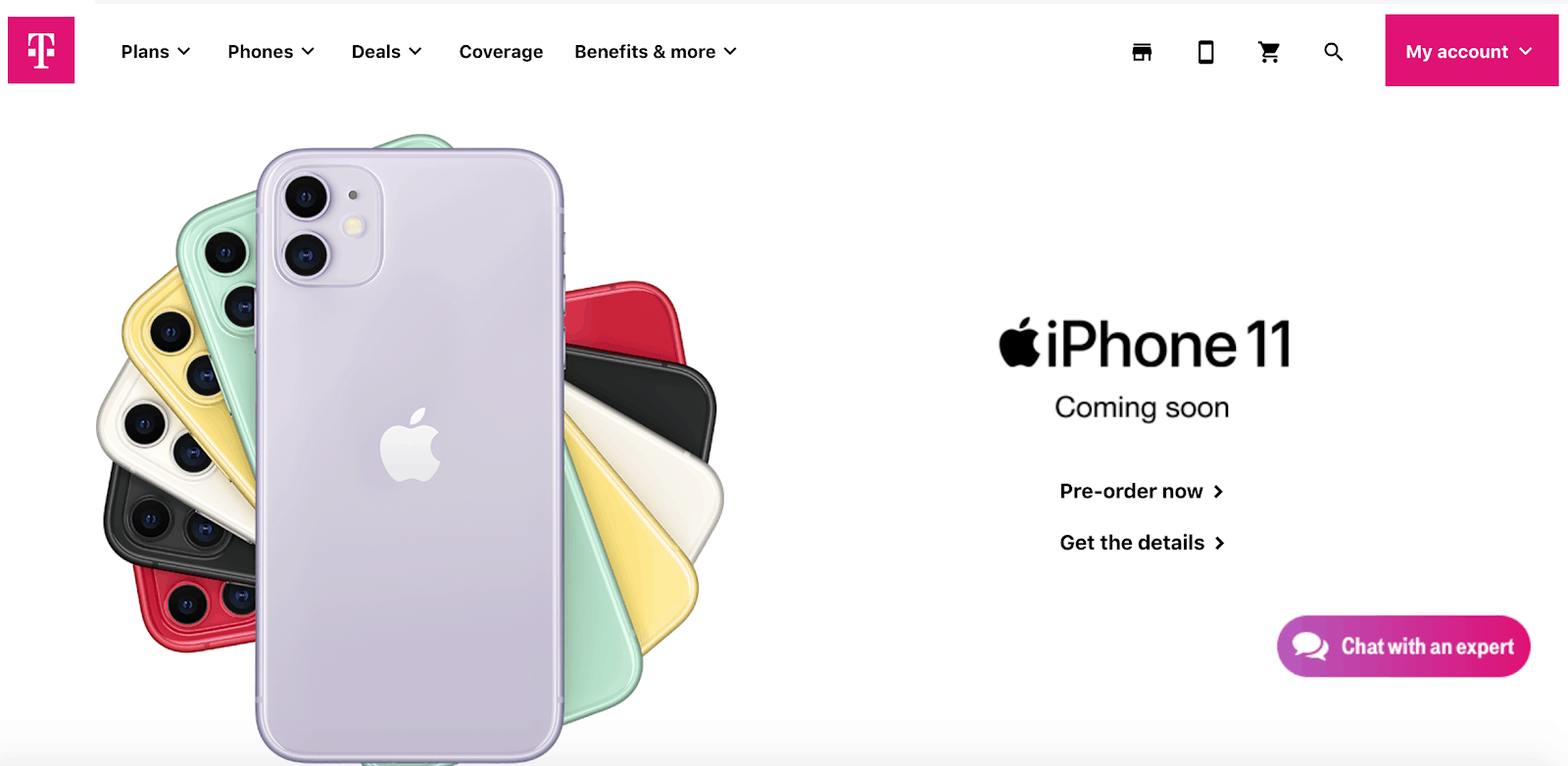
Why It Works for a PPC Landing Page:
- Clean, minimalist design: The page conveys a simple design with a clear purpose to get users to pre-order the new phone. It lets the images of the phone speak for themselves without the extra noise.
- On brand: There is no need for the utilization of a subheadline and motivational extra words for household names, such as Apple. Why? Since the products are already so well-known and their products are in demand, they can utilize their name in their favor.
Areas of Improvement:
- Reducing multiple CTAs: The purpose of this page is for users to pre-order the new iPhone. However, the “Chat with an expert” CTA is competing for users’ attention.
11. Hello Fresh
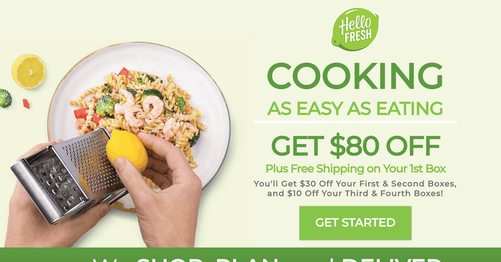
Why It Works for a PPC Landing Page:
- Speaks to the right audience: The phrasing within the main headline, “Cooking as easy as eating,” accurately depicts their unique value proposition, which resonates with their ideal customer profile (ICP).
- Valuable offers: The multiple offers on the page provide excellent incentives for users to convert and distinguish themselves from their competitors in a highly saturated industry. Putting an exact dollar amount also helps your audience see their savings from the beginning.
- Relevant visuals: The image on the page is connected to the service and provides support to the copy by giving users a tangible visual of the quality and ease of the product.
Areas of Improvement:
- Better use of the offer: Utilizing the offer as the primary touchpoint can create a sense of urgency; however, it can be used to their advantage a little better. For example, implementing a directional design element, such as a timer countdown of when the offer expires, would work here. Also, adding an exit-intent offer that pops up as a user moves their cursor away from the page would provide value. These elements increase urgency and keep a user on the page who may be ready to bounce off.
- Better CTA labels: A change in CTA text from “Get started” to “Send my meals”, “Get my savings,” or another similar CTA that is more specific to the product would have a better chance at converting. Speaking directly to your customers and their specific offer leads to higher conversion rates.
12. Monday.com
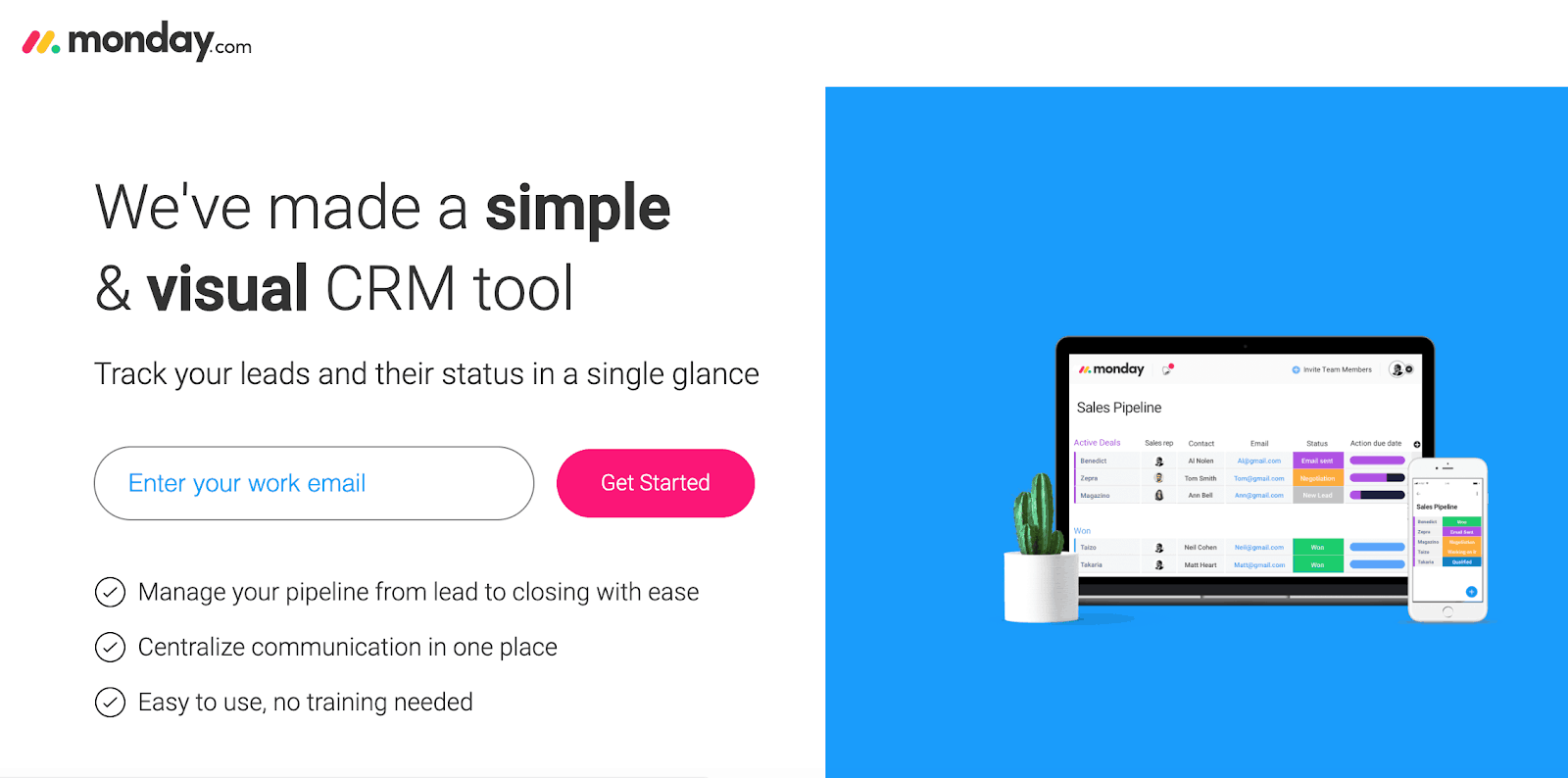
Why It Works for a PPC Landing Page:
- Stand-out call to action: The CTA button color pops out and draws your eye directly to the most crucial part of the page.
- Bullet structure: The bulleted value propositions provide action-based copy that is easy to digest. This can further ease users down the funnel who may need more convincing before they make a decision.
- Organized page flow: The overall page design harmoniously works together to enhance different elements and create a stellar UX.
- Direct messaging: The short, simple headline and subheadline increase the chances that users read the entire page rather than just skimming past essential details. Including too much “fluff” when building out your landing page or ads, is one of the most prominent mistakes marketers make.
Areas of Improvement:
- Moving the field label: Having the label “work email” within the form itself could lead to some friction since it disappears when a user clicks to type. By adding the label above the form box itself, it will make it easier for users to know what is needed at all times.
- More compelling verbiage: Changing the “Get Started” CTA to “Start tracking” could lead to more conversions. Always come back to the visitors’ pain points; they’re visiting this site because they’re interested in lead tracking. Help them get to where they need to be.
13. Slack
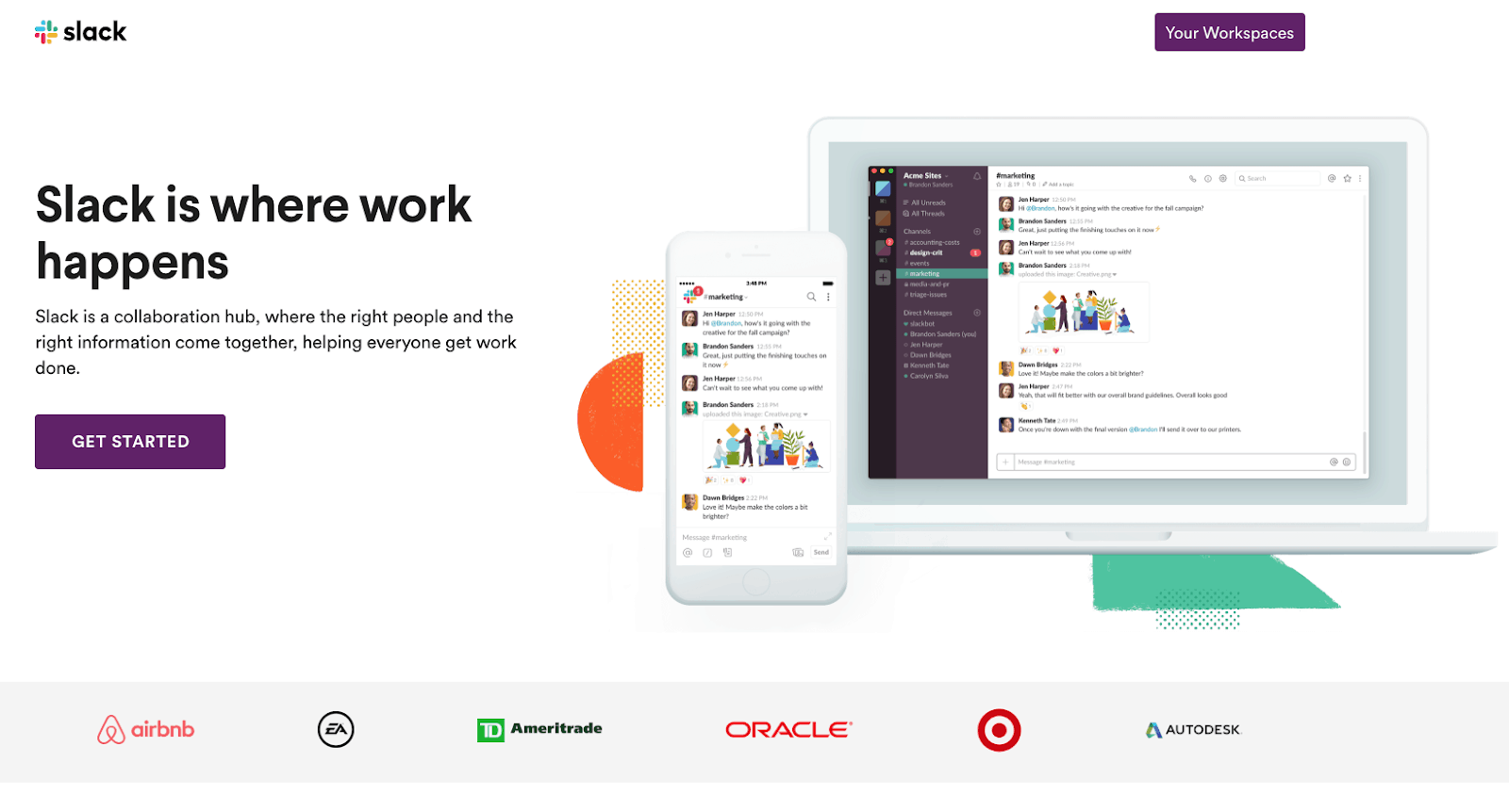
Why It Works for a PPC Landing Page:
- Brand utilization: Since Slack owns a massive brand name, utilizing the company name in this circumstance is beneficial in establishing authority.
- Social proof of enterprise customers: The inclusion of customer logos from high profile brands instills a sense of trust and popularity for the users. It puts the idea of “If Target and EA trust this brand, it must be worth my time” within the minds of users.
- Limited distractions: There are no additional links within the navigation, sending visitors to various pages. The point of this page is clear, with a direct CTA and secondary CTA for existing customers.
Areas of Improvement:
- Furthering trust: The page does an admirable job to instill confidence already; however, utilizing different phrasing in the headline can further establish an already powerful idea. Copy that includes “Increase work productivity by X% with Slack” would add even more value and that trust factor.
14. Progressive
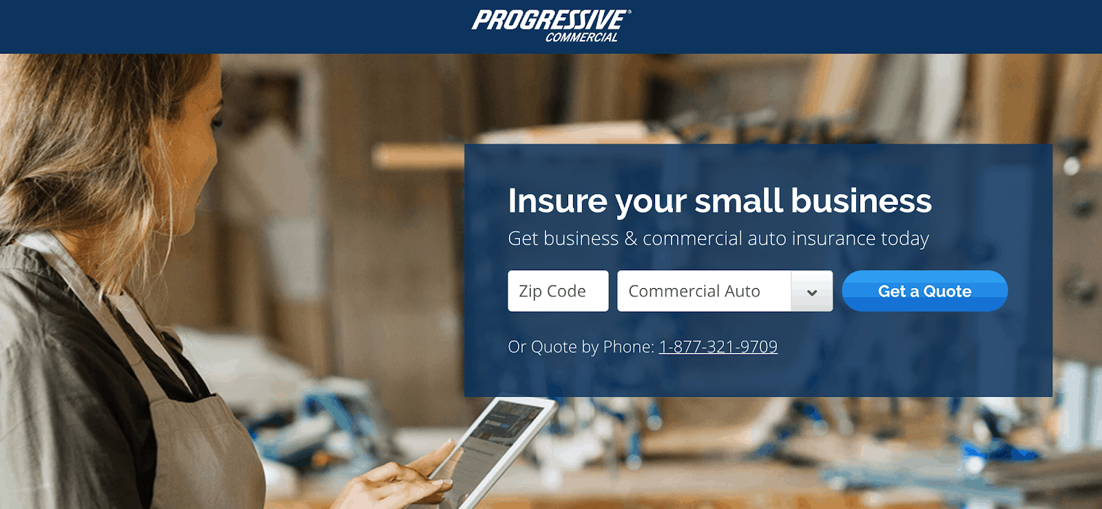
Why It Works for a PPC Landing Page:
- Directional cues: The background image provides directional cues with the woman looking directly at the form.
- Resonates with their ICP: The headline is specific to their target audience. By including “small business,” they can deter any customer who is not in that bucket.
- Hyper-specific CTA: The CTA label is specific to their offer rather than a more general wording such as “Start now”. Users are prepared to receive a quote, once they’ve filled out their information, and take the next step closer to a purchasing decision.
- Balanced CTAs: The secondary CTA is readily available but not as prominent as the main “Get a quote” CTA.
Areas of Improvement:
- Color change: Utilizing a pop of color on the CTA button to stand out should be implemented here. The current blue stands out, but not as much as it could with an entirely different color. Make people notice what you want them to do.
- Speak to the user: Speak more toward the audience by saying, “Get My Quote” rather than “Get A Quote.” This adds a sense of personalization, and while it’s a small effort, it can add a touch of connection between your product and the audience.
- Stand out from the competition: In a highly competitive industry such as business insurance, companies must emerge from the crowd. Including statistics within the subheadline describing how much your team can save users, such as “Save up to X% on insurance,” would build trust and take this PPC landing page to the next level.
15. Pipedrive
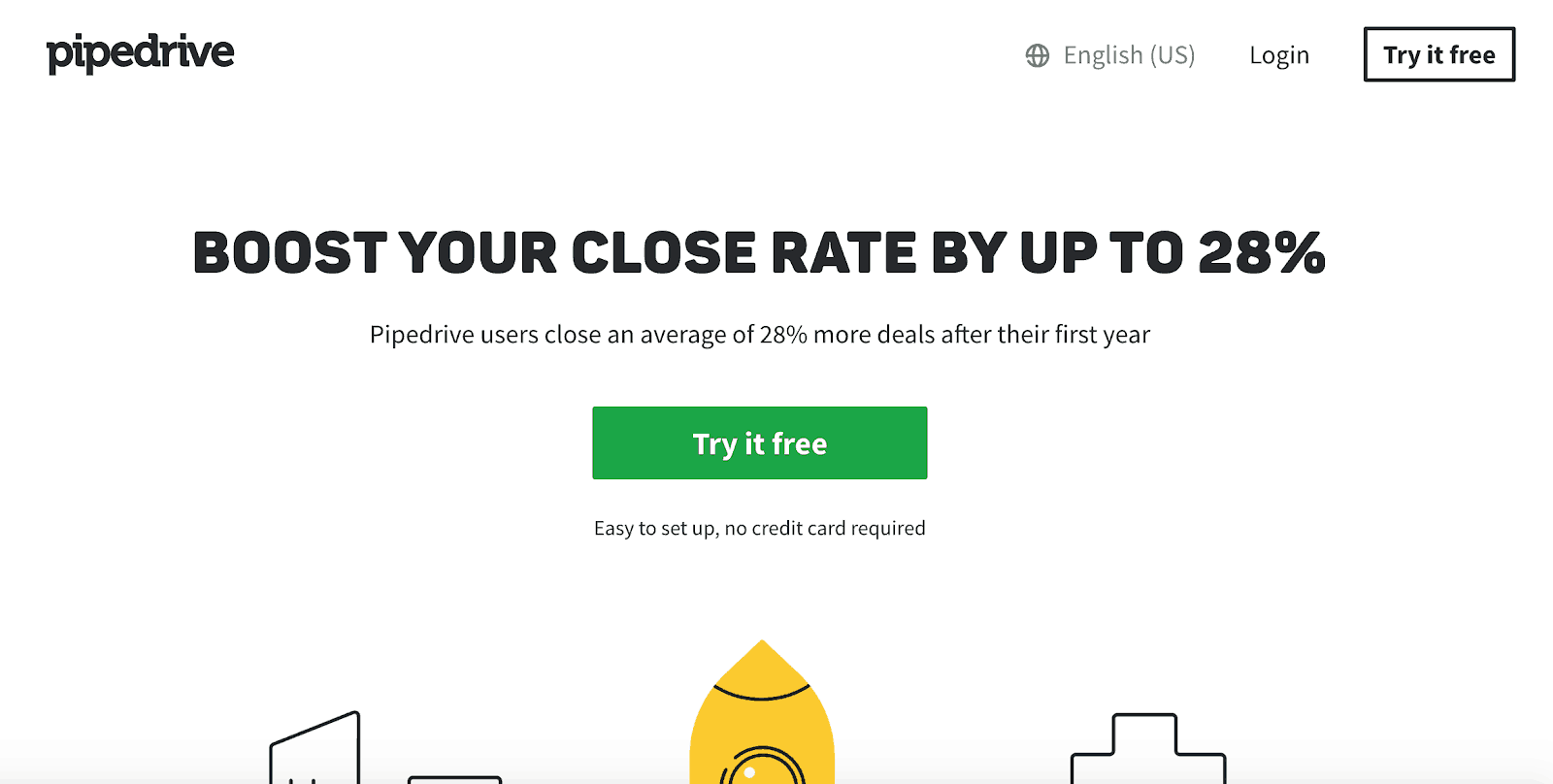
Why It Works for a PPC Landing Page:
- Explicit design cues: Whether intentional or not, the imagery toward the bottom of the page acts as a directional design cue pointing to the primary CTA.
- Specifying an increase in performance: Using real stats (28%) is an impactful way to increase conversions and give users a tangible numerical value to motivate them to try out a product. By providing actual numbers within your copy, users can resonate with how much your product will improve their own lives as well.
- Minimizing Barriers: The copy below the CTA button limits any hesitation that the user could have when trying a free product. Typically a credit card is required even with a free trial. However, stating that it is not needed leads to a better UX.
Areas of Improvement:
- Brand trust: Adding social proof to the page above the fold in the form of customer logos or reviews. You know the drill.
- Adding a round button: Changing the button from sharp edges to a rounded button shape has proven to increase conversion rates and overall user experience in some studies and could help improve this page.
The Importance of CRO
Overall, these landing pages are just a few examples of how a small optimization can lead to robust results. As you have gathered above, most pages follow the same overall best practices of which elements they include above the fold.
These best practices all factor in customer psychology and how the brain reacts to different shapes, language, and interactions. By understanding how the brain works, you will start to learn the foundations of CRO and increasing conversions on your pages.
Think about the last time you went grocery shopping. What were the factors responsible for choosing one brand of frozen pizza over another? Was it brand familiarity, price, packaging? Or was it the strategic placement of the product higher on the shelf, which made you subconsciously think it was a better brand?
All of these minor elements play an impressive part in consumer psychology and buying decisions.
With such little time, users take to make a snap decision online; you must implement best practice CRO strategies and continuously perform A/B testing. Building out your pages with this notion in mind will lead to growth overall and a better UX.