How to make your landing page irresistible and drive action
Imagine a pet brand is promoting its new, grain-free dog food. You, a potential customer, see the ad and the inviting CTA that reads, “Save 20% now.”
You excitedly click the ad to learn more, but instead of landing on a page with a coupon code, you land on the toy section of their website. Yikes.
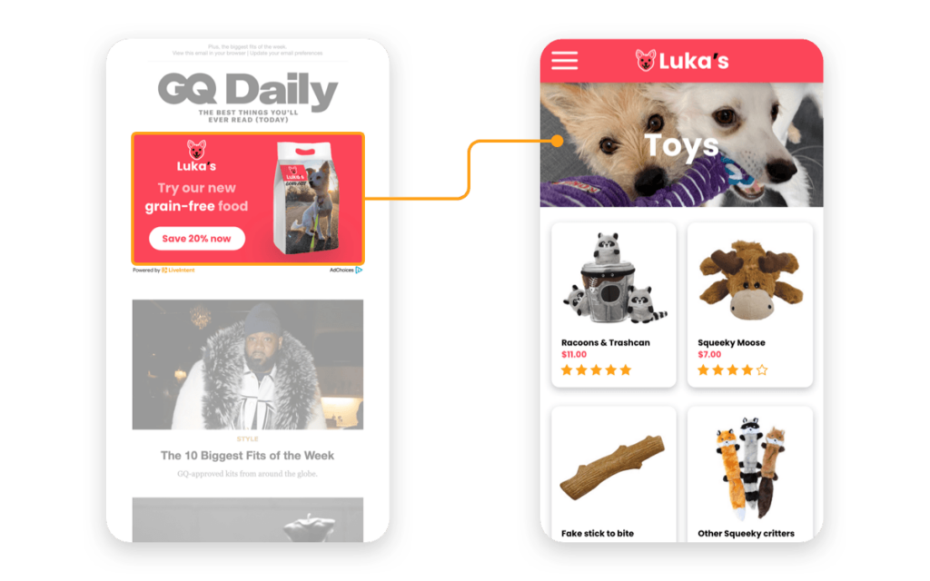
You’d probably be confused and a bit annoyed. You might even find the brand untrustworthy for not delivering on what they’re promoting. Or you might pick up where the brand left off, do a quick search for “grain-free dog food,” and find a competitor with a more intuitive website.
The point is that a clear CTA with a relevant and strong landing page (aligned to your campaign objective) is more likely to drive action than one that isn’t. This small but critical detail can dramatically impact campaign performance, brand perception, and customer experience.
But this isn’t the only detail that can make or break your landing pages. There are other variables that can mean the difference between a frustrated customer and a satisfied buyer.
So what’s the secret? Read on for the keys to making your landing page irresistible.
1. Have a unique and memorable call to action
Calls to action (or “CTAs”) are the text and button on your landing pages that readers can click to further engage with your brand. A CTA should be clear, well-written, value-focused, interesting, testable, and quick to prompt visitor engagement.
Deliver on the headline’s promise: The CTA should encourage readers to click, sign up, download, or register.
Highlight value: Consider sprucing up generic CTA copy like “Buy Now” with words that convey the value of clicking that button.
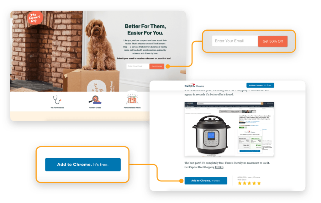
Match your goal: What is the goal of your page? Match your CTA with the conversion stage you want to target people. For example, an informational page seeks to educate, so use a soft educational CTA. A product-specific landing page, on the other hand, might call for a more salesy CTA. Be sure to also follow through on what you’re asking – in other words, if your ad says “buy now,” don’t send the user to a page to fill out a survey.
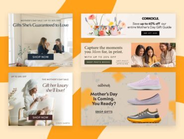
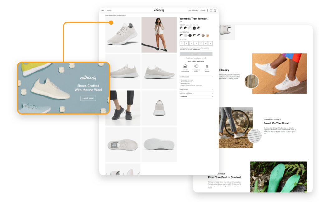
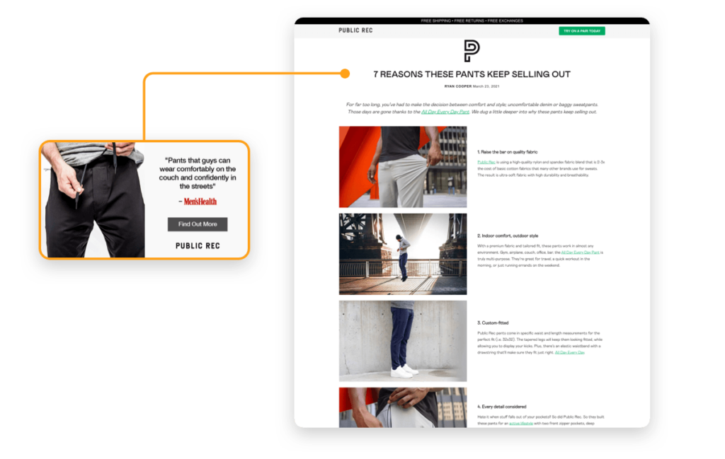
Align copy and design with ad expectations: If your ad shows a pair of shoes with the CTA “Shop Now,” your landing page should contain that same pair of shoes and clear information about how to buy them. Don’t just send people to your homepage or to a general product page where they now have to search for the specific product you advertised. Oh, and make sure the product is in stock and not close to selling out, otherwise you might lose a potential customer.
Test away: If you want a landing page visitor to buy something, “Learn More” won’t be as strong as “Shop Now.” Test different copy to see what resonates with your audience. Remember, people are inundated with marketing messages, so make your CTA copy worthy of a click.
Make it easy for people to click: Be sure your CTA is visible in high-contrast font.
Ensure forms load quickly for the user: Make it a seamless process to get customer information. The forms located on your page should always be simple for the user. People expect web pages to quickly load, so use tools like Google PageSpeed to identify how the performance of your landing page can be improved.
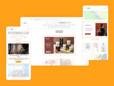
2. Make your landing page visually pleasing
Consumers are more willing to do business with anyone or anything that appears professional – and good aesthetics are an important part of that.
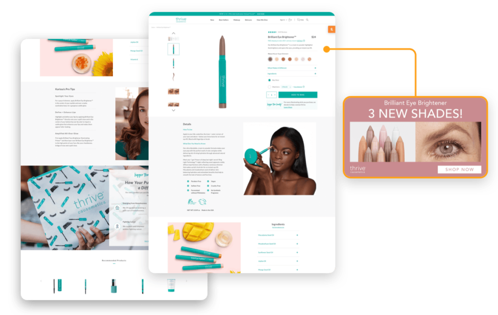
Select your images wisely: Use imagery that’s evocative and unique to both your brand and the goal of the campaign. Don’t just use any stock image. Select a sleek product photo or someone using your product or service.
Simplicity is key: Many brands see higher conversions when they remove unnecessary design elements, so keep white space prominent so that the important design elements – like a headline, hero image, and CTA – stand out.
Use contrast to highlight your goal: Keep important visual elements highlighted. For example, you could put a thick dark border around your sign-up form that has a white background.
Think about how every visual asset works together: From headings and font to white space, each visual element should work in harmony to create a sleek, user-friendly feel.
3. Incorporate your brand story, voice, and iconography
Your landing page content should match all brand assets to create a seamless and intuitive user experience. Maintaining consistent design across all channels shows professionalism. Consistency builds brand trust and having a cohesive brand story and iconography will help build this.
Consider the flow and format of visual elements on your landing page. Your font, colors, visuals, navigation, logo, and videos should mimic your website, ads, social media profiles, and all other marketing channels.
Cohesion also goes beyond brand visuals. With a limited word count on a landing page, it’s still important to convey your brand’s personality. Is it upbeat and friendly, or studious and serious? Carry through your usual tone within your landing page from all other marketing channels.
4. Go beyond the “what” and teach the “why” to visitors
What’s in it for your landing page visitors? Stating this will help encourage people to click. You can restate a million product proof points, but it all comes down to connecting your brand’s value to a visitor.
To do this, your landing page copy should succinctly answer “why” visitors should consider using your product. Here’s an example from Professional Wingman that shows how you can implement the “why” in your landing page copy.
5. Drive towards one goal
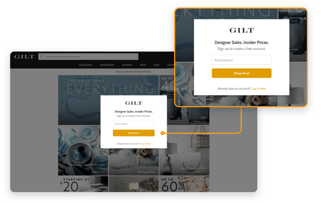
If you’re looking to collect email addresses, make that the only thing a user can do on the page. Use pop-up windows for privacy policy and terms and conditions pages.
The longer the funnel, the harder it will be for the user to complete the desired action, and therefore harder for you to achieve your goal and make good on your campaign budget. A good rule of thumb is to keep your funnel under two minutes and avoid asking people to provide too much personal information – like their street address or birthday – unless it’s vital to the buyer journey.