4 Essential Graphic Design Trends You Need To Know
Keeping up with what is popular in the graphic design world can almost feel like a full-time job. I mean every day there are thousands of amazing graphics published across the world. However, once you look at enough of those examples you start to see some patterns and tendencies.
But you don’t have time for that.
Thankfully I have done all that hard work and distilled those examples into a few popular trends! Now with these 4 graphic design trends for next year, you can be ahead of the pack even before year begins.
So let’s jump into it!
Muted Color Palettes
After years of bold, neon, and bright colors being used on millions of graphics, things are going to look a lot more reserved this year. In fact, this year vivid colors are going to be replaced by more muted color palettes across the board.
Brands like Apple, LinkedIn, and more have actually already added these more nuanced colors to their graphics. Here’s how Apple does it:
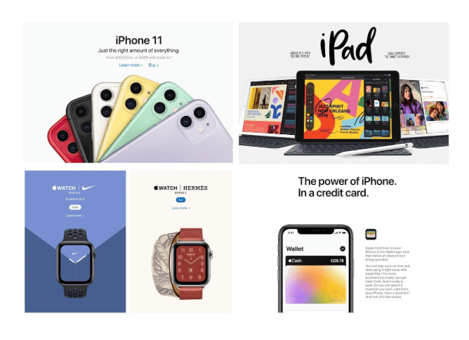
Once Apple does something new, the world is bound to follow.
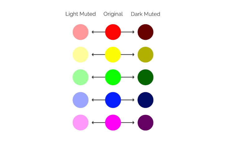
If you’re not aware, muted colors are basically the opposite of vivid colors. These colors are created by adding black, white or complementary colors to a base color.
This shift actually will influence, as you can see in the other sections, the rest of the design trends for next year. That said, just because the dominant colors are going to be more reserved this year, that doesn’t mean graphics are going to be less colorful. For example, check out the variety of simple colors used in the examples from eBay‘s Instagram:
As you can clearly see there are still a plethora of different colors used across their graphics. If they would have used popular bold colors from the past few years, the graphics would have felt very abrasive. But with these muted colors, each graphic feels very modern and genuine.
Muted colors are often viewed as very authentic and large brands can use that to their advantage, especially on social media. Check out how LinkedIn uses them below in their Twitter shares:
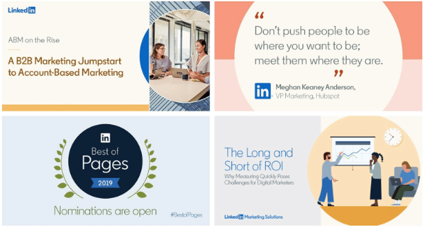
Each of those graphics looks very approachable and like it was shared by one of your colleagues. Not one of the largest tech companies in the world. Now because muted colors are usually created by adding white or black to vivid colors, they pair exceptionally well with neutral colors. As you can see in the example below from Ellevest, the muted colors blend well with the white background instead of overpowering the graphic. Again these graphics feel a lot more genuine as well.
You can also use flat muted backgrounds to make text or content easier to consume (which is why they are used extensively in infographics for content marketing). Especially when you use a bold or heavy font, like Fast Company:
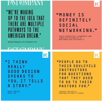
Again, instead of overpowering the graphic, the muted colors blend exceptionally well with the dark text. You can even use your brand colors as a starting point and create almost a secondary color palette full of muted colors to use. That’s exactly what LinkedIn does.
Abstract & Dreamy Illustrations
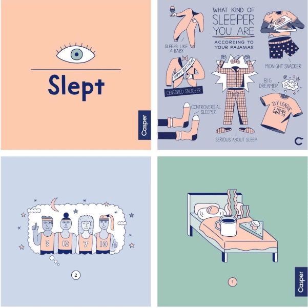
I always recommend using custom illustrations and icons in your marketing or social media campaigns. No other brand is going to be able to copy those graphics exactly, and they look about a thousand times better than a boring stock photo. Over the past few years, the prevalence of these custom illustrations has exploded. Casper was actually one of the first large brands to embrace this trend:
Many brands quickly followed their lead and the effectiveness of these somewhat simple illustrations decreased just as quickly. So to really be seen in this year you are going to have to take your illustrations up a notch.
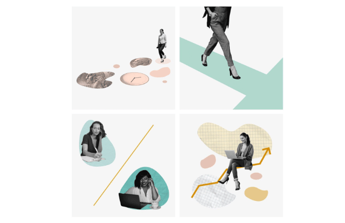
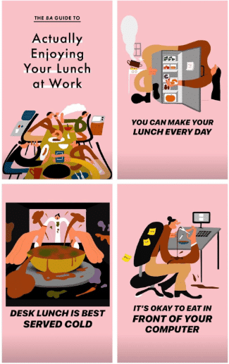
Go ahead, embrace the exaggerated, the abstract and the dreamy in your illustrations. This year the weirder, the better when it comes to illustrations! Not sure what I’m talking about? Check out the examples below:
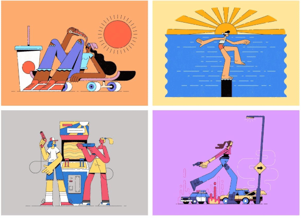
As you can see in the examples above, using muted colors in your illustrations is always a good idea!
Especially if you want your graphic to feel more genuine or down to earth, like in these Instagram stories from Bon Appetit:
Plus in a crowded space, like the food industry, your custom illustrations are going to stand out like a beacon of good content.
Taking the time to create something this unique for a simple Instagram story is why they are killing the content game lately. Imagine how boring it would have been if they would have just shared stock photos of a desk or a shot of food. Yet so many marketers think that they can just share one of those low-effort visuals and call it a day.
Doist is another brand that uses custom illustrations across their blog and marketing efforts. However, their illustrations aren’t as crazy as some of the other examples in this section:
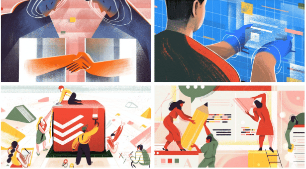
I like to bring them up because their graphics always fit the topic of their blog post or share.
They strike a nice balance without turning off their readers with random illustrations. Each is very eye-catching and it also gives someone a preview about what each blog post is about.
Crafting something that fits your topic nicely is one of the best parts of using these custom illustrations, in my opinion.
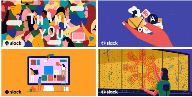
The only problem with using illustrations like this is that you can’t really keep your branding consistent across every graphic. If that’s very important to you, just add your logo or brandmark to each image, like Slack does:
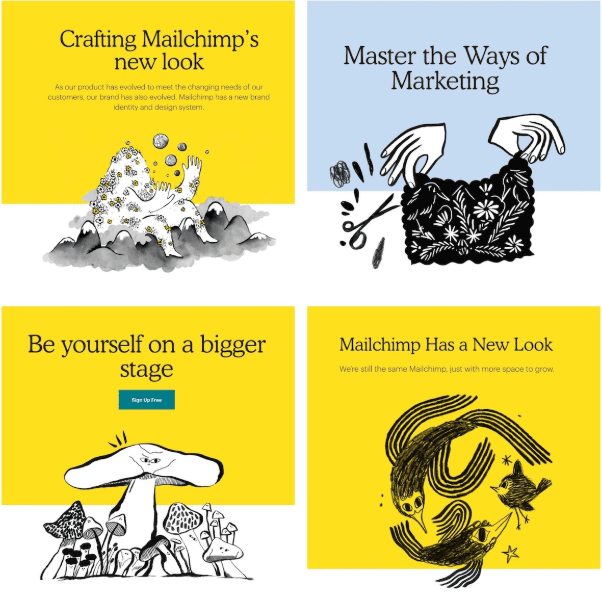
Eventually, your brand might even be known for the wacky illustrations they create. Like MailChimp!
Minimalist Landing Pages
Most popular design trends are driven by changes in consumer behavior and attitudes.
The shift to more minimalist landing pages is the only one that I can confidently say was driven by Google’s algorithm. Yes, you’re reading that correctly, this design trend has become very popular partly because of a search algorithm.
Google rewards pages that load quickly and efficiently on mobile devices with better rankings in search.
That means there’s a huge incentive for brands in competitive industries, like Buffer, to have a landing page or home page that loads rather quickly.
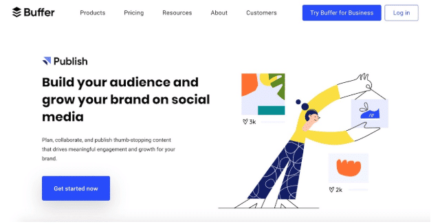
The higher your brand appears on popular terms usually leads to more traffic and customers. They also used a few of our other graphic design trends on their homepage!
The perennial design innovators over at Slack have used a minimalist home page as well:
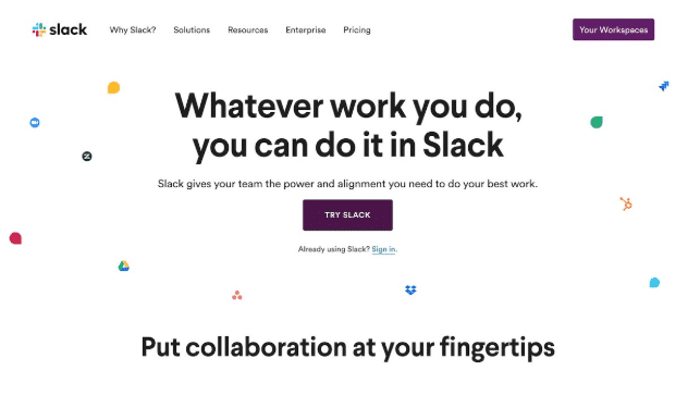
As you can see in both of these examples, they keep the layout and design rather minimalistic. A layout like this will not only decrease the load time but it can be used as both a mobile and desktop landing page.
The flat background, simple illustration and more will easily shift from desktop to mobile. Sometimes, when a brand uses a high-quality photo or video, that shift isn’t as seamless as it should be. Then mobile users are left with a poor user experience, which Google takes note of. And it could hurt your search rankings if not addressed.
Another fantastic thing about landing pages like this is you can keep your messaging very focused and push customers to a single call to action. As you can see in the landing page below, Calendly uses a very simple message and sign up form to hopefully convert their viewers into customers.
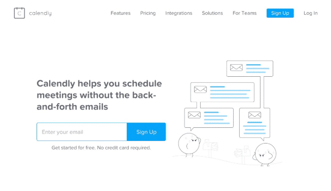
This is a true minimalist homepage because it uses
An uncomplicated landing page also makes it very easy for new and old users to immediately get value. Instead of hiding their sign-up and login pages on another page, Dropbox placed it right on their homepage:
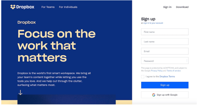
Now you can quickly access your files or documents when it’s crunch time. Think of all the other sites that take you through a bunch of pages just to view a document or file that you own!
Small user improvements like this can really help convert passive viewers to customers and even evangelists next year.
Heavy Bold Fonts
There are literally thousands of unique fonts, which makes it a little difficult to pick a single popular font next year. So for the final graphic design trend, let’s take a look at the popular type of fonts for this year: heavy fonts.
Things are going to get a lot bolder this year with these heavy fonts being used extensively across design projects. You probably have seen a few examples of heavy fonts in previous sections as well.
Heavy fonts are basically the larger, beefier cousins of the bold brand fonts that were popular last year.
As you probably know there are a ton of different font weights between thin and extra bold. These popular heavy fonts would be at the bottom of this list, near the extra bold.
Combining these strong fonts with the rather muted colors can really make your graphics look modern and trendy. Check out how the stong fonts contrast extremely well with the muted backgrounds examples from ClassPass.com:
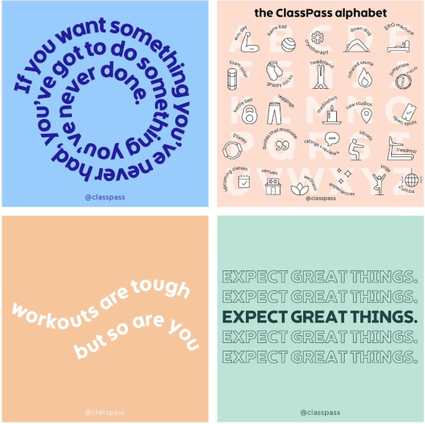
If they would have used a bold background color and heavy font, the graphic would have felt overwhelming and dated.
The same thing can be said about the fonts in this example from Adobe:
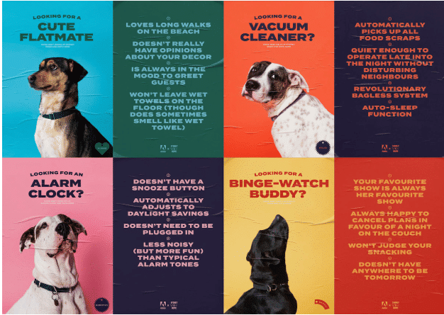
Not only do the heavy fonts create some great contrast with the muted colors, but they also contrast well with the cute dog pictures.
I like to use these heavy fonts across social media to really grab the attention of our followers. For example in these social media graphics from Hootsuite, you can see the titles really jump off the screen:
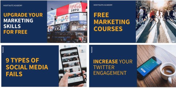
If the creators of this graphic would have used a thin or minimalist font, the text would have quickly faded into the background. But with the heavy fonts, the title of their articles instantly becomes the focal point of the graphic.
Immediately communicating your idea or point like this is very important on social media, especially in this day and age.
The only thing about these heavy fonts is that they start losing their effectiveness if you use them too much. So try to stick to only using them in short phrases or titles:
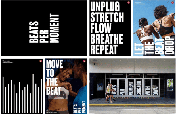
Can you imagine trying to read a whole document full of heavy fonts? I think your eyes would give up after the first few sentences.
Congrats you made it to the end! I truly believe you should be ready to take on the graphic design world with these 4 trends. But if you want to see all 8 trends with a ton of examples, check out our full write-up and infographic about the top graphic design trends for next year.
Author: Ryan McCready, Content Editor at Venngage. Ryan went to the University of Arkansas and graduated with a degree in economics and international business. Now instead of studying the economy, he writes about marketing, graphic design and social media.


Get a Free Consultation
for Content Marketing