
Trending in Email Design: Bold Typography
Each year, we see new design trends shaping digital marketing—from the use of color and imagery to typography trends, interactivity, and more. In our “Trending in Email Design” series, we look at the hottest digital design trends—and dive into how they translate into email marketing.
Typography in email has been a hot topic of discussion for a number of years. Web fonts have enabled email designers to be more creative and helped brand identities stand apart. In 2019, the print and digital design world has seen a trend towards bigger and bolder typography—and this trend is now hitting our inboxes, too.
The reason for this trend? It’s another way to grab a subscriber’s attention, make a bold statement, and quickly push key messages. Big, bold headlines are fast becoming the norm in email design, often stealing the show from—or even replacing!—photography or other imagery. Copywriters are creating succinct, fun content that entices and intrigues while remaining digestible and engaging. This harmony between large and concise copy increases the chances of messages being heard, so as designers and copywriters become more creative with text, emails with fewer or no images are on the rise.
Bold Typography in Email Marketing
Here are some examples of brands getting their message across with typography that’s big, bold, and beautiful.
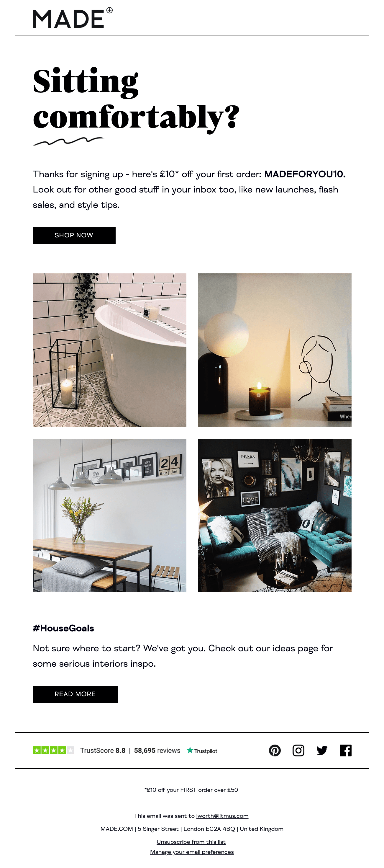
Made
Many retailers rely on the power of product imagery to catch subscribers’ attention. But does every email have to lead with that? For furniture marketplace Made.com, it doesn’t. Instead, they welcome new subscribers with a beautiful, bold headline. Their use of story-telling typeface FS Neruda and the perfectly placed hand-drawn squiggle direct the reader’s attention.
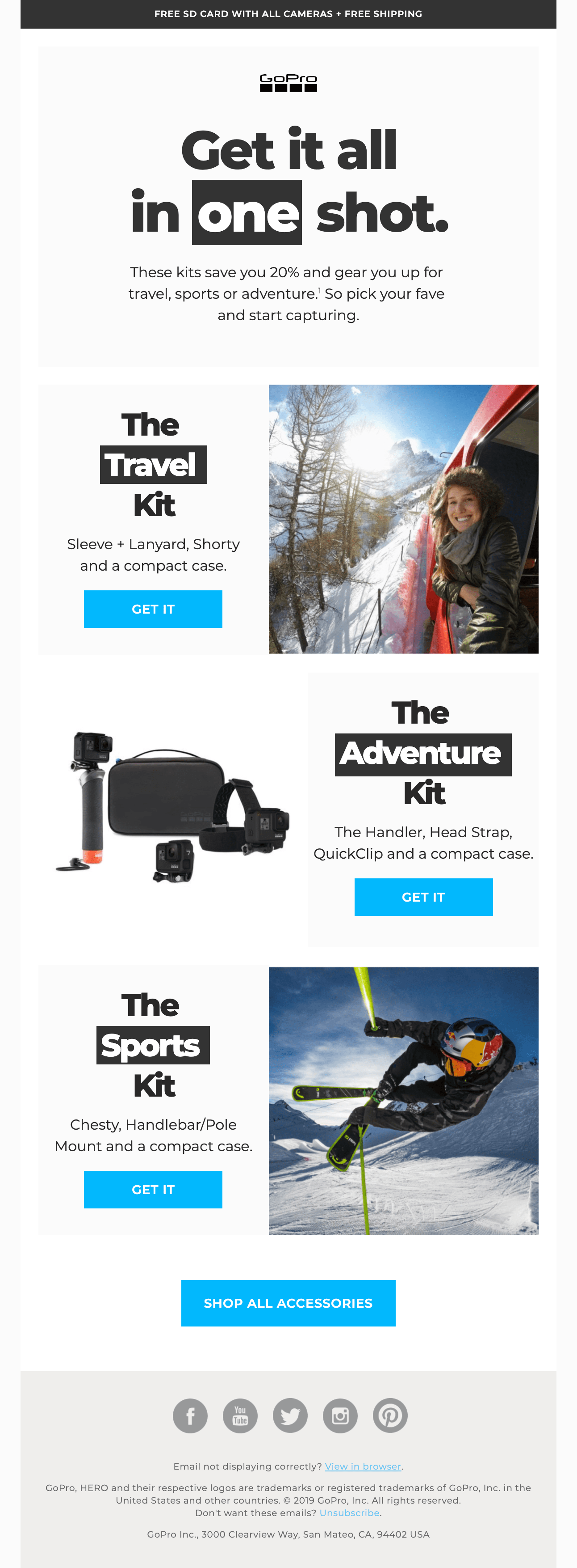
GoPro
Yes, the imagery in this email is stunning. But it’s the bold typography that makes this email from GoPro truly special. Subscribers can quickly grasp the message just by scanning this email—and, by inverting single words in each headline, GoPro helps enforce the message that whatever your buzz, you can capture the perfect shot. To make this bold statement, GoPro uses Montserrat, an open license font that compliments clean, uncluttered compositions.
See the code and how it renders across clients in Litmus Builder
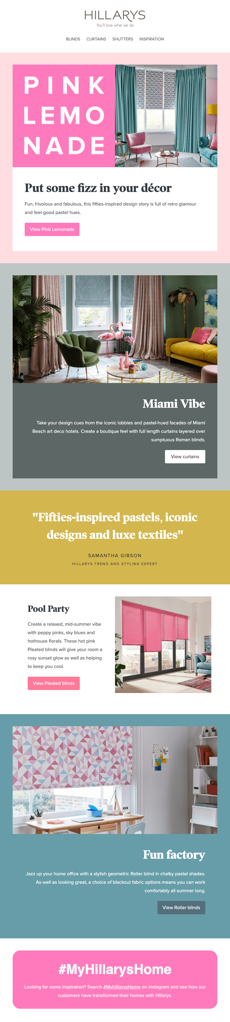
Hillarys
Bespoke window furnishing service Hillarys make a big statement with the headline of this trend email. Combining bold color with big typography is a combination that’s hard to ignore. The use of sans serif font Proxima Nova in the hero is beautifully complemented by serif typeface Poynter Oldstyle Display, used in further headlines throughout the email.
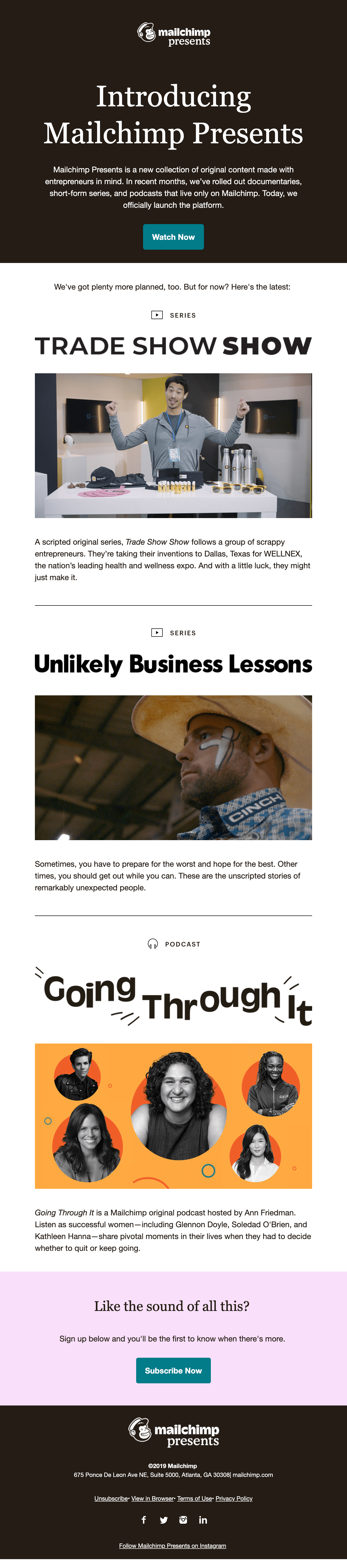
MailChimp Presents
This launch email from MailChimp introduces MailChimp Presents, a collection of entrepreneur focussed content. Mailchimp uses multiple typefaces to make each piece of content stand apart and retain engagement throughout the email.
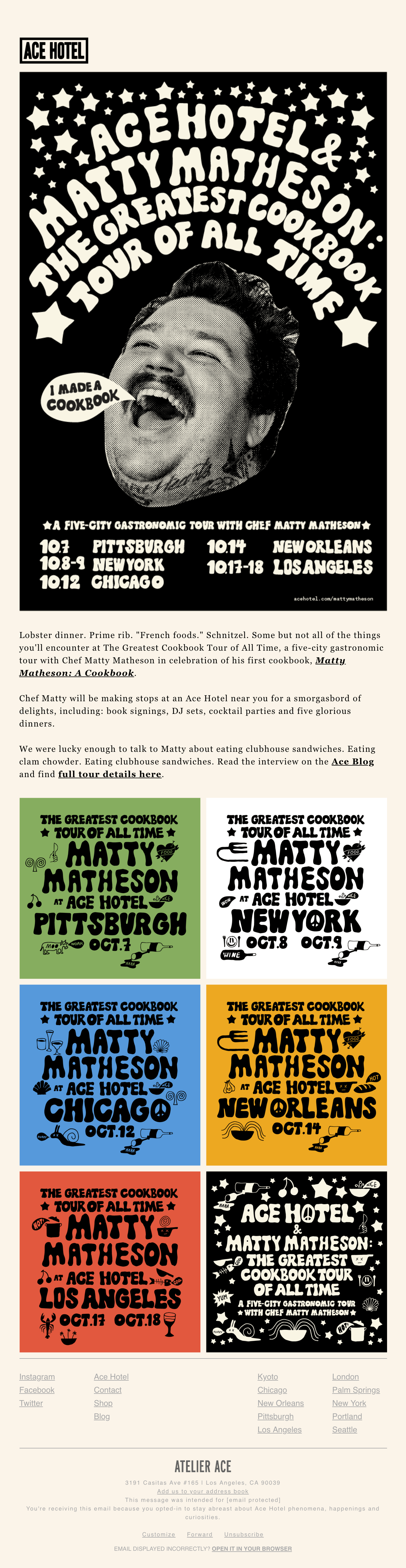
Ace Hotel
Ace Hotel shows just how creative typography can be with this design, announcing celebrity chef Matty Matheson touring five of their US hotels. The live text within the body of the email uses serif system font Georgia, a great accompaniment to the hand-drawn typeface used to highlight dates and locations within the images.
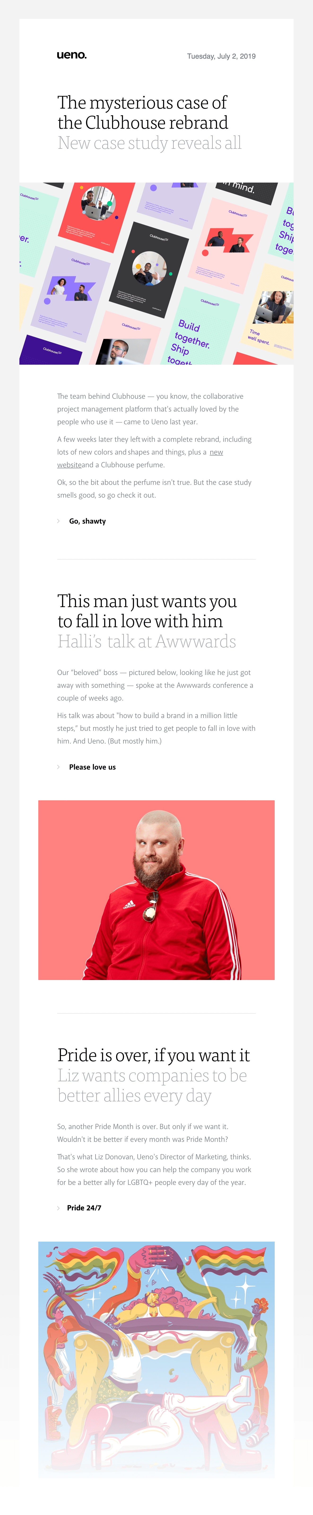
Ueno
Newsletters by creative agency Ueno offer a clean and fresh design with beautiful typography. Large, bold, and black serif headlines along with large gray sub-headers beautifully lead subscribers into articles. The body copy is set in sans serif Akagi, which allows for unassuming bold text CTAs to stand out.
To ensure that the headline font renders across email clients, Ueno uses images rather than live text. This is a common practice—however, it’s always best to consider how an email will read with images off and remember to mirror text within the images in alt tags when using this approach.
WeTransfer
Typography can have a huge impact on brand identity. Licensed typefaces and custom-made fonts help brands gain trust and stand out from competitors. WeTransfer provides that unique brand impact on open with their use of Canela for bold headlines and Fakt for body content. Both are commercially licensed fonts.
Let type talk: When brands go without images
When typography is used the right way, an email can be visually appealing without the support of photography or illustrations. You don’t believe typography can replace the power of imagery? Let these beautiful examples of no-image emails convince you otherwise.
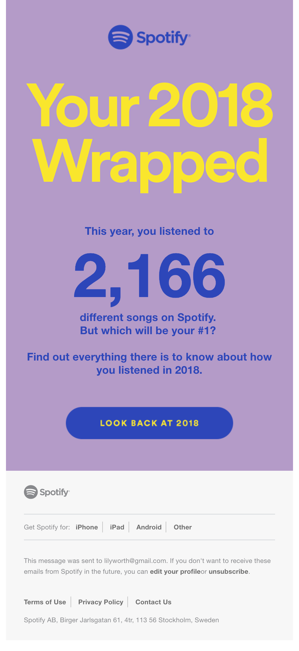
Spotify
Each year, music streaming service Spotify sums up a customer’s usage with a fantastic summary of stats and artist recommendations, and they lead customers to this content via email. This text-based design uses big, bold typography and color to get the message across quickly and drive readers to the web experience. Spotify uses a Helvetica font stack throughout the design, with the headline animated to ensure it catches subscribers’ attention.
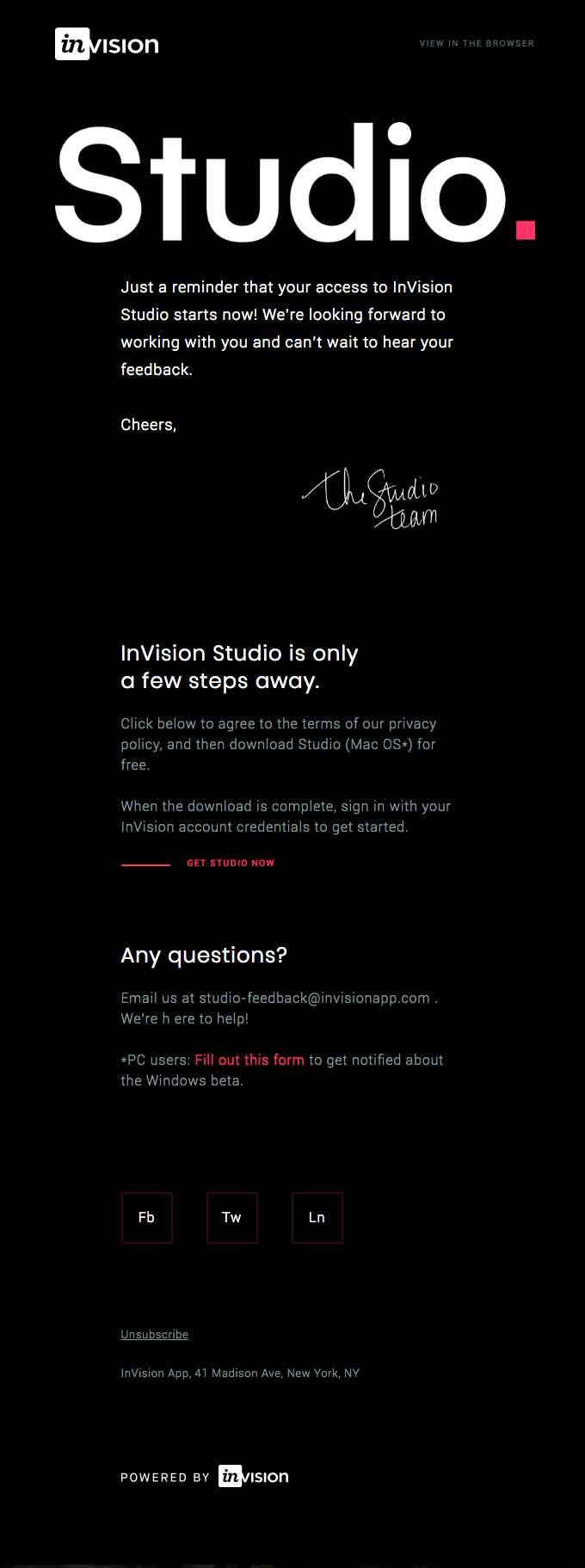
Studio by InVision
A number of design choices in this InVision Studio email strengthen the case for text-only creative. The uncommon black background with white text, a full-width product logo, and well-considered content hierarchy with beautiful, clean typography makes this email engaging. Open license fonts Poppins and Roboto complement each other throughout, and the bright pop of radical red used on links lift this almost monochrome design.
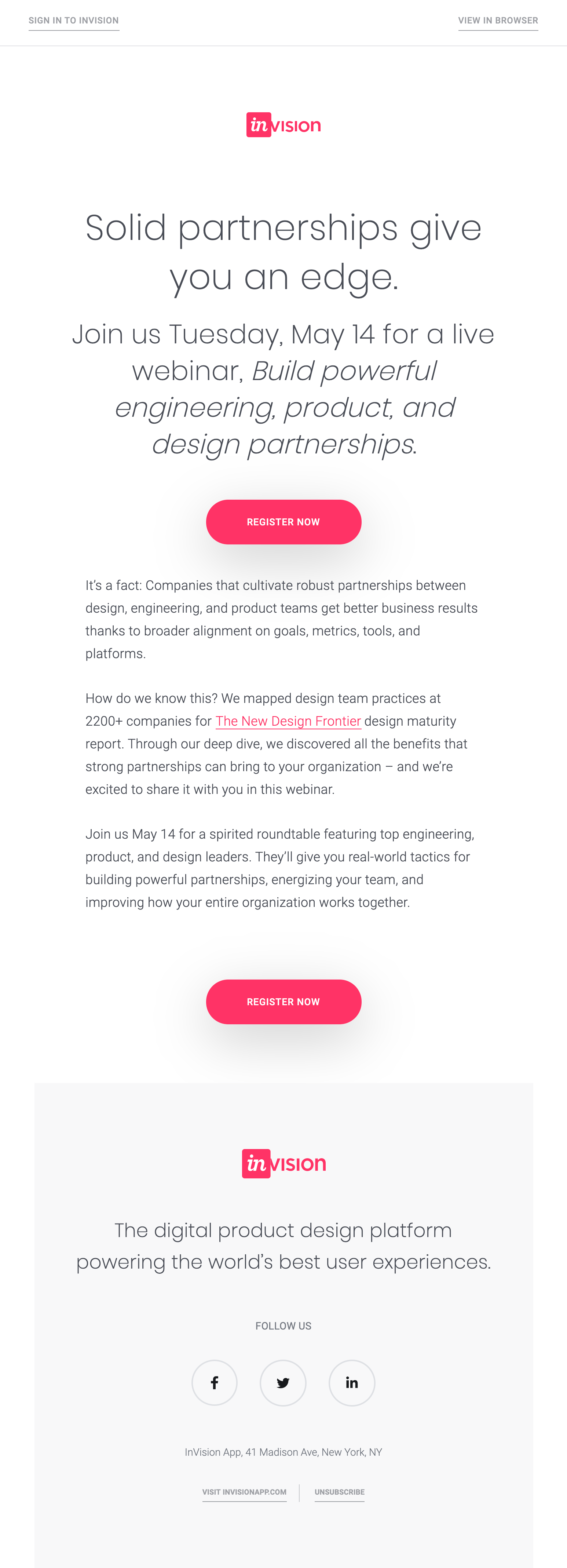
InVision
Another great example by InVision is their webinar template. The design takes advantage of different font sizes, line-heights, and italicizing to create a great content hierarchy and help draw the subscriber’s eye down the email. This is a great way to bring structure into copy-heavy emails and still get that engagement without needing to include imagery.
Lily Worth
Lily Worth was a Senior Email Designer at Litmus