
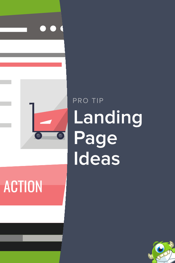
Do you want to build landing pages that catch your visitors’ attention and significantly increase your conversion rates? Getting higher conversion rates is basically the holy grail of digital marketing. In this article, we share landing page ideas that will get those conversion rates soaring.
More specifically, we’ll be looking at:
- What is a landing page (and what is it supposed to do)?
- What makes a good landing page
- How you can get killer landing page ideas from 5 terrific examples
These landing page ideas are sure to inspire you to go off and build some awesome landing pages of your own. Once you do, you’ll start seeing way more optins and, ultimately, more revenue. ?
Let’s get started.
What Is a Landing Page (and What Is It Supposed to Do)?
On your website, you likely have tons of internal pages: a homepage, an about us page, a features page, a pricing page, and so on.
But what exactly is a landing page?
A landing page is a webpage used for a marketing campaign that is stripped down to a single, hyper-focused call to action.
There are a ton of articles that use the term “landing page” to include literally any page you link to or that your visitors could land on. There have even been arguments that 404 pages count as a landing page:

Now, technically, yes… it is a landing page. And yes, there are internal pages on your site like your pricing or features page that can be used as landing pages as well.
But that’s not what we’re talking about here.
We’re looking at landing pages in the true sense of the term: pages specifically built to achieve a single call to action for a targeted marketing campaign.
In your marketing efforts, you’ve likely built a few campaigns around one product or offer from your business. A landing page reduces all other noise so your visitor’s attention is focused on that offer.
If done right, your landing page will be one of the most powerful tools in your arsenal of marketing strategies.
What Makes a Good Landing Page?
No two landing pages will ever be the same. That’s because you are promoting a product or offer to your visitors that is unique to your business.
That said, there are certain characteristics that make some landing pages better than others. Here are 8 things that all great landing pages have in common:
Note: The following tips are more “big picture.” To get into the nitty-gritty sections of a landing page, check out our article on the anatomy of the perfect optin landing page. For the best results, why not read both?
Good Landing Pages Have a Great Offer
The success of your landing page comes down to how strong your offer is. The goal is to give your visitors something they just can’t refuse.
While this can be in the form of a downloadable pdf, an ebook, or specific discounts for a product or service, the goal is to over-deliver on your visitor’s expectations. In other words, when they see the offer, your visitor should be left thinking:
“For real? All of that… for free?”
Here’s an example from DigitalMarketer’s landing page:
 - OptinMonster")
They’re not just offering you one downloadable guide. Instead, they’re offering 3 tools to help your overall marketing strategy. Trading one email address for an entire toolbox of marketing resources is hard to turn down.
Good Landing Pages Include a Single Call to Action
Remember, the goal of your landing page is to focus on a specific call to action you want your visitor to take.
That action is usually giving you their email address so you can turn passive visitors into paying customers with a targeted email marketing campaign. But you don’t always need to be so obvious about that.
A creative landing page can get visitors to take an even simpler action: just one click.
From there, thanks to the Zeigarnik Effect, they’re more likely to complete the process and optin to your offer.
Here’s a great example from Moz:

Nowhere on this landing page is a customer asked to enter any personal information. Instead, the visitor is called to the action “Try It Now!”
Once clicked, the user is asked to enter their email address to test out the software.
Good Landing Pages Have a Clear Call to Action
Your call to action should be simple enough for a third-grader to understand. Your visitors might not fit that profile, but this helps you keep your call to action clear.
Geico’s call to action from their landing page is clear: Begin a Quote.

It would be pretty difficult to misinterpret the action Geico wants you to take here.
Good Landing Pages Avoid Long Forms
When a visitor takes action on your landing page, they’ll likely fill out a form that asks for an email address and other personal information.
Before asking for an address, phone number, favorite color, or anything else, ask yourself how much of that information you really need to deliver your offer and provide value to the customer.
Just like a first date, you don’t want to scare someone away because your questions are getting too personal too quickly. Here’s an example of what not to do when it comes to building your landing page form:

This form is so long, the visitor needs to scroll just to get to the call to action, “Download the report.” We didn’t show the call to action button here because, again, the form is too long.
Since their offer is a downloadable file, they really could have just asked for the customer’s name and email address.
Ok, now let’s see what a smart landing page form looks like. Here’s an example from Daily Harvest:

Daily Harvest shows exactly what a concise form should look like. All they ask for is a Zip Code (to see if they can deliver to you) and an email address.
You can create a landing page form like this with SeedProd.

SeedProd is the best landing page builder for WordPress. It gives you all the tools you need to create landing pages with short forms that convert.
Simply drag the ready-made optin form block onto your landing page and that’s it!

If you need to collect more than an email address, don’t worry. SeedProd also seamlessly integrates with WPForms so that you can easily add contact forms, registration forms, surveys, and more to your landing page.
The benefit of these tools is that you have complete control over which fields your form includes. But remember, for effective landing pages you should keep forms as short as possible.
When you need more than just a name and email address, you should try progressive profiling which is a way to gain more information about a customer over time.
Asking for information in smaller bits and pieces feels less intrusive to the user. That way, you get everything you need without putting anyone off.
Good Landing Pages Are Designed for a Specific Segment of Your Audience
When it comes to landing pages, one size definitely doesn’t fit all. In fact, you’re likely going to need many sizes. That means you should design your landing pages based on how your visitors will find that page.
People coming to a landing page from Facebook may fit a different demographic than the customers already on your email list. And running a Pay Per Click (PPC) campaign on Google Ads may bring in a different audience than Instagram ads.
The point is that the web copy for your landing page needs to be adjusted based on where your visitors are in your sales funnel and where they’re coming from.
Good Landing Pages Are Mobile-First
If your website is not going mobile-first, you’re already behind the times. Lucky for you, we’ve written extensively on how to go mobile-first.
But being mobile-first isn’t limited to your website; it actually extends to every aspect of your online presence… including landing pages.
Be sure to test your landing pages on a wide variety of mobile devices to make sure it looks as sharp (and functions as well) as the desktop version.
Here’s an example of a mobile-optimized landing page for the MacBook Pro:

Notice that everything fits on the screen and there are no forms to fill out at this stage. Plus, there’s a clear, highly accessible call to action.
Good Landing Pages Have Killer Web Copy With Power Words
Power words are words that trigger an emotional response from the reader. Typically, they’re used by professional copywriters, but any clever marketer can take full advantage of them.
Look at how powerful the copy is from Courses That Convert’s landing page:

Beyond the common marketing words like “confidently” and “profitable,” they go on to use terms that evoke an emotional trigger down at the bottom.
They could have written something simple like, “Without getting overwhelmed and not knowing what to do next.” Instead, they chose words like “raging,” “crippling,” and “nightmarish” to create a stronger emotional response from the reader.
Good Landing Pages Show Social Proof
“Come on, man. All the cool kids are doing it.”
Ok, you probably got tired of hearing that once you graduated middle school. But the fact is that we like to make decisions with the knowledge that we aren’t the only ones doing so.
Statistics show that social proof can give a 15% conversion boost. Plus, 70% of consumers trust recommendations from complete strangers. In fact, most social proof statistics back this up.
All of this applies to your landing pages.
Add a few customer reviews or success stories to let potential customers know that other people have been satisfied with whatever you’re offering.
Here’s an example landing page created with SeedProd demonstrating social proof:

By adding one genuine customer review, a landing page shows visitors that the product has been tried, tested, and approved.
Good Landing Pages Make Use of Video
Suing video in your marketing strategy can be super powerful. Putting videos on a landing page has been shown to increase conversions by more than 80%.
Panorama9 uses video on their landing page to show a quick intro to their product. Note that they also use social proof and a simple button to get visitors to the next page (hello, Zeigarnik Effect).

Video is more easily digested than text and can encourage users to stay on your page longer. It also lets you give more information without cluttering your landing page with loads of text.
Good Landing Pages Create a Sense of Urgency
This tactic should be used sparingly. But, it should definitely be used.
Creating a sense of urgency lets users know that they have a limited time to act. The best way to do this, however, is to get specific.
Rather than saying “only for a limited time” (like you see on most late-night infomercials), let your visitors know exactly how much time is left with a countdown timer:

This shows them that they really do need to act quickly if they want to take advantage of your offer.
So, now you know what goes into a landing page, but what does a good landing page look like?
Let’s turn our attention to the top five landing page designs that you can use for inspiration to increase conversions.
Landing Page Ideas That Will Inspire You
1. Shopify

This landing page is so simple that it can’t help but be effective. Not only can you digest all the information on the page in less than 5 seconds, but the imagery funnels itself down to the call to action: Start today.
Plus, the offer is both subtle and strong at the same time: “Every great business starts with an idea” and “Turn your idea into a reality.”
This messaging triggers a sense of hope in the reader that they can become successful eCommerce entrepreneurs… so long as they start with Shopify today.
This landing page impressed us with its simplicity and its brevity.
Takeaway: When in doubt, keep it simple.
2. MasterClass

This landing page wins on so many levels, it’s not even funny (even though Aaron Sorkin is laughing at something).
First, you have the video aspect which shows a preview of the course. As we mentioned, this clears a lot of text away from the landing page itself because all the information you need will be in the video.
You also get to see an amazing offer that’s hard to resist: 35 video lessons and an exclusive guidebook “from an Oscar-winning screenwriter” for just $90. Considering that’s the price of one course down at your local improv theater, the value is hard to miss.
Finally, while it looks like there are two calls to action at first glance (“Take the class” or “Give as a gift”), they both lead to the same action: purchase the course. The visitor is seemingly given a choice when, in reality, all roads lead to increased revenue for Master Class.
Takeaway: Using video and putting a face behind the product can boost conversions.
3. Linkfluencer

This landing page made the cut mainly because of its emphasis on social proof. You’ll notice that Linkfluencer does two things to demonstrate their credibility:
First, they show a connection to widely recognizable business brands like Forbes, Fortune, and Entrepreneur (though, oddly enough, they in no way explain their relationship to these brands).
Second, they provide testimonials and photos from real human beings. Remember when we said 70% of people trust recommendations from strangers? This is that statement in action.
Finally, they take advantage of the Zeigarnik Effect by getting the visitor to make that first click without giving any personal information.
For entrepreneurs looking to find mentors and scale their business, everything about this landing page looks like an attractive offer.
Takeaway: When it comes to social proof, try to humanize your testimonials with photos of the speaker.
4. Sam Ovens

Ok, you’re probably a little sick of this guy because he keeps interrupting your YouTube videos.
He does, however, have a really great landing page.
The color scheme is simple and not distracting. He uses the power word “exclusive” to entice the reader. His call to action button (Yes! Reserve My Seat Now) doesn’t require an immediate form and is hard to miss.
Plus, if you look really closely, he provides social proof by showing that this offer has 39,000 likes on Facebook and encourages you “to be the first of your friends” to be in-the-know (again, triggering that exclusivity).
Finally, the offer is appealing. You see exactly what you’ll learn in your free training and how it can tangibly profit your business.
Takeaway: Tell your visitors exactly what they’ll be getting from your offer, and don’t be afraid to show how many other people have loved it.
5. OptinMonster

Not to brag, but we’re happy with our Black Friday landing page. The text is straightforward, easily digestible, and we added a countdown timer to create a sense of urgency.
Plus, we made sure to over-deliver. Instead of having just one offer, customers could get discounts, free prizes, or even a MacBook Pro. To be in the running, all they need to do is start with a simple click: Get the deal before it’s gone (again, creating more urgency).
Takeaway: Create a sense of urgency by showing your customers they only have a limited time to act.
Now you know what makes a great landing page…
…how do you go about building them? Fortunately, we’ve got you covered.
Check out our post on how to easily create a landing page (in under 5 minutes). It has everything you need to get going.
Here’s an example of the kind of professional landing page you can create:

But no matter how you decide to go about creating your landing page, make sure you also check out our landing page design tips. These 20 ideas make sure your landing pages are clean, beautiful, and effective.
Or, you may want to check out this article on landing page optimization (7 tips + 5 case studies).
And, if you want more great marketing tips, go subscribe to our YouTube channel or find us on Facebook and Twitter.

Disclosure: Our content is reader-supported. This means if you click on some of our links, then we may earn a commission. We only recommend products that we believe will add value to our readers.
Thanks for reading this article – I hope you found it helpful.
I wanted to let you know about our powerful Exit Intent® technology that converts abandoning website visitors into email subscribers and customers. Typically 70% of the people who visit your website will leave and never return, meaning all those marketing efforts to reach them have gone to waste.
OptinMonster’s Exit Intent® technology detects user behavior and prompts them with a targeted campaign at the precise moment they are about to leave.
You can unlock this powerful technology 100% free when you purchase our OptinMonster Pro plan.
Get started with OptinMonster today and see why 1,000,000+ choose OptinMonster to get more subscribers and customers.
Thomas Griffin
President of OptinMonster
Muy buen articulo, el contenido es de calidad y aporta valor. obligado para todos aquellos que buscan crear su pagina de aterrizaje de manera eficaz y rápida.
¡Gracias por el comentario! Me alegra que lo hayas encontrado valioso. 🙂 Tenemos más consejos sobre la página de destino aquí: Anatomy of the Perfect Optin Landing Page (Tips & Best Practices).
Hey Nathan,
Very useful article. I made use of the strategy given by you in this article-> Good Landing Pages Create a Sense of Urgency. I created a new landing page with a New Year offer through the OptinMonster; a 30% discount for my client’s website. And given the timeline of 3 days. My sales increased by 17%. I was also checking session recordings using http://www.humcommerce.com to optimize Conversion rate.
Hey Rohini,
Thanks so much for reading 🙂 And I’m happy to hear about your 17% increase! Keep us posted about further success in the coming year. Keep your eyes peeled for an upcoming post on creating a specific type of landing page (a pre-sell page).
I’ll link it for you when it’s released 🙂
As promised, here is the link for creating a pre-sell page to boost sales:
https://optinmonster.com/how-to-create-a-pre-sell-page/
Hope you enjoy!