Another year has come and gone, and although after the events of last year it seemed like the earth was about to spin off its axis, we’re still here and email is as strong as ever. It’s time once again for our annual look back at the best and worst examples of email of the past year. There are a few old favorites and a few surprises. We’ll start with that old chestnut that never seems to go away: The Bad Mail Merge.
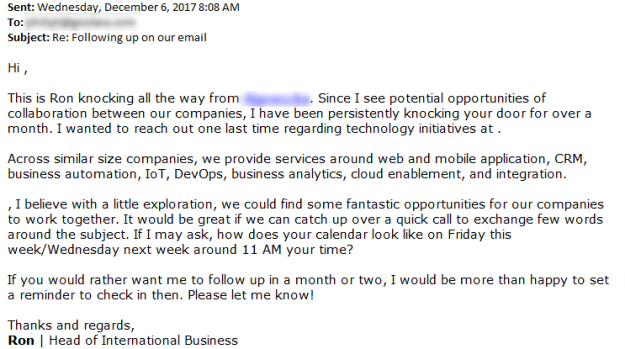
Dear your name here,
A few years ago, faulty mail merges, like those in the example above above, were the most common mistakes we saw. Attempts to sound personal suddenly have the opposite effect, pulling back the curtain and showing that the email for what it is: a pre-written script with information inserted as needed. This particular template called for both a first name and a company name, neither of which was available. The use of dynamic content instead of a merge could have avoided this problem by given the mailing other options when information was missing. It’s never good when a company that is trying to sell you on their technological prowess can’t assemble an email correctly.
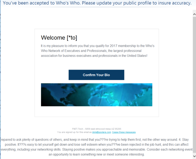
The example below is even more egregious since it purports to be aimed at a specific person. This, coupled with the formatting errors in the apparently meaningless text below the main message (see UTF-8 discussion below), sent this one on a quick trip to the Spam Folder.
While not as bad as either of the errors, another problem that cropped up in a new mailings was the repeat of my first name. Since I’m sure I never put my name in a field twice, I have to assume that the problem is somewhere in the email’s dynamic content structure.
Aw Gee-Mail
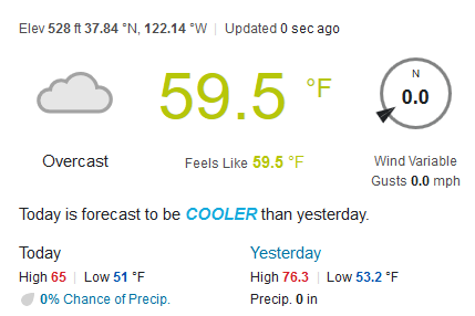
Personalization can be a great way to start an email, but it has its limitations. The example above has my name, and a shout out the weather. The only problem, here’s the weather in Moraga for the day this email was sent:
Not exactly sunny. I’m not sure if the “sunshine” comment was a dynamic insert based on some erroneous weather predictor, or simply an educated guess on the part of the sender. Either way, receiving this message on the coldest, most overcast day of the summer made us chuckle.
Time’s a-Wastin’!
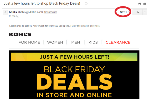
It seems like stores push closer and closer to Halloween when it comes to holiday sales. Kohl’s takes it one step further by announcing that you just have a few hours left for your Black Friday deals three weeks before Black Friday! From the content, it looks like this mailing was intended to be sent out on the 1st, but Black Friday threats simply won’t work in that case.
Musicians Who are Pushing
Gmail and other email clients like to give you a peek at what to expect before you open the mailing. You can use this your advantage with a preheader. Just make sure that when that preheader is abbreviated, you don’t end up with a different message. Musicbed made use of a preheader, but didn’t take into consideration what happened to the preheader when the window wasn’t big enough to fit the whole thing. They ended up with “musicians who are pushing,” instead of “musicians who are pushing the genre to new place.” Perhaps out of paranoia, Patrick James avoids the problem altogether by using a short preheader message followed by a long series of periods.
Amusingly, this particular problem isn’t limited to email. In 1998, a campaign in New York state to provide schools with pencils that featured an anti-drug message had to be pulled when kids started noticing that the more you sharpened the pencils, the more pro-drug the message became.

Source: http://www.nytimes.com/1998/12/12/nyregion/slogan-causes-pencil-recall.html
It’s All Ελληνικά To Me
How you code your email can make the difference between a readable message and gibberish. An email written using 8-bit Unicode characters and then coded for 7-bit ASCII is going to have some problems. Some times you see this immediately in the subject lines:
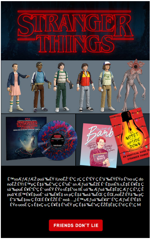
And sometimes it appears in the body copy. Normally, these snippets of code standout, and do little more than interfere with the design, but if you’ve created an email that relies directly on UTF-8 Unicode to get its idea across, you’re going to be in trouble. That’s what happened with ThinkGeek’s otherwise clever mailing:
The text below the image was supposed to be a humorous paragraph printed upside-down and backwards, as an in-joke to the Stranger Things TV show. If you look at the source code, you’ll find the original message was:
“˙soƃƃƎ puᴉɟ ll,noʎ ‘ɹǝzǝǝɹɟ ǝɔᴉɟɟo ɹno uǝdo noʎ ɟI ˙pǝʇᴉɔxǝ ǝɹoɯ sn ƃuᴉʞɐɯ ʇsnɾ s,ʇɐɥʇ ǝsᴉpuɐɥɔɹǝɯ unɟ ɟo sʇɹos llɐ uᴉ ƃuᴉʇʇǝƃ ǝɹ,ǝʍ pu∀ (˙ɥʇuoɯ sᴉɥʇ sn pǝʇᴉsᴉʌ ǝʌ,noʎ ɟᴉ pǝɔᴉʇou ǝʌɐɥ ʎɐɯ no⅄) ˙sƃuᴉɥ┴ ɹǝƃuɐɹʇS ɟo uosɐǝs ʇxǝu ǝɥʇ ɹoɟ pǝʇᴉɔxǝ ʎʇʇǝɹd ǝɹ,ǝM”
Which, when view right-side up and reversed, reads:
“We’re pretty excited for the next season of Stranger Things. (You may have noticed if you’ve visited us this month.) And we’re getting in all sorts of fun merchandise that’s just making us more excited. If you open our office freezer, you’ll find Eggos.”
Unfortunately, the email was sent without the Unicode specification required to render the sentence, turning the message into gibberish.
Email Tourette Syndrome
Sometimes you can end up with gibberish inserting itself in an email for other reasons. In the example above, it looks like the URL was accidentally and replaced with the ALT tag, leaving only the query string. In the examples below, the problem was a matter of placement of conditional comments. Conditional comments are a way to assign special instructions that only Internet Explorer will read. To everything else, they will appear as comments and won’t display. The problem is that they can sometimes show up as text depending on where they are placed in an email.
While we understand the value of conditional comments, people are beginning to migrate away from IE, in favor of better alternatives. You might want to check your subscriber base and see if you even need them anymore.
A Bad Case of Mono
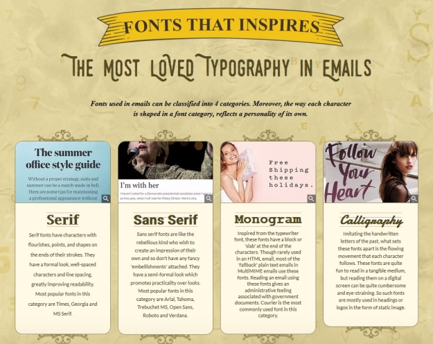
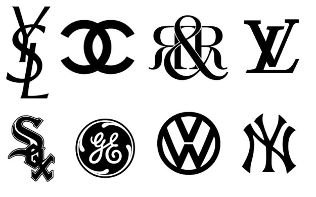
This image came in an email from the normally exceptional email marketers at Email Monks. For the moment, I’m going to ignore the grammatical error in the ribbon banner at the top and concentrate on the type categories shown. I have no problem with Serif and Sans Serif, but there’s no such type style as “Monogram.” These are monograms:
What they meant was “monospaced.” Their description doesn’t make much (if any) sense either (and one more grammatical error to boot). A monospaced font is a font in which every characters takes the same amount of space, so a lower case “i” will take as much room as an uppercase “M,” even though the two characters clearly require different amounts of space. While the fourth category (Calligraphy) is a legitimate font category, in this case I would have used the more general category of “Decorative” as the final classification (of which Calligraphic fonts are a subset).
Give Me Some Room!
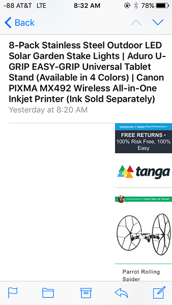
This email from Tanga looks fine on a desktop computer, and even a tablet, but reduce it to iPhone size and it suddenly turns into this scrunched up mess. Looking at the code, we see that whoever designed this is much more comfortable with HTML than CSS. The content is rife with deprecated attributes and the designer has used cells with non-breaking spaces to create margins. Either this was created many years ago, or someone needs to brush up on their CSS.
As bad as this is, at least all the content still appears on the page (albeit in a very squished format). Not so for Vibes’ webinar announcement. While it will appear just fine in most email clients. Something in its code just falls apart when opened in Live Mail. We’ve discussed the problems with Live Mail in previous year-end reviews, but now that Microsoft has abandoned it, maybe the folks at Vibes didn’t think it was worth the effort to fix.
Responsible Responsive
Responsive design was all the rage a few years ago. As we discussed in Part Four of our Responsive Email Design series, if you use a standardized template, then setting up a responsive template has advantages. It will mean a little extra work at the start but will yield dividends later on. Clearly, the folks at BangGoods didn’t read that article, because this is how their mailings appear on an iPhone:
This is a perfect layout for a responsive approach. The three columns across is fine for a desktop monitor, but it is rendered almost unreadable on most phones. Media queries that realigned the three columns and enlarged them according to screen size would do a world of good here.
The British Film Institute (BFI) takes a different approach. They do use responsive design, but they only use one column, so the main purpose of the media query is the adjust the size of the tables based on the screen size. This works well for the iPhone:
But not so well for the iPad:
They had the right idea, but set the size change at the wrong point, leading to an unnecessarily small display on the iPad mini.
Unsubscribe? Fuggedaboutit!
Until this point, most of the mistakes we’ve listed have been embarrassing at worst, but these next two aren’t simply bad mistakes—they’re against the law. CAN-SPAM requires the ability to unsubscribe. That can be accomplished a number of ways, but the most common is with an unsubscribe link. If you put an unsubscribe link in your email, it better work. That’s not the case for Proline Tools and Longchamp. In the case of Proline Tools, clicking unsub takes you to the following page:
This suggests that the problem only was temporary, but a second attempt to click on the unsubscribe link a two weeks later yielded the same result.
Similarly, clicking on the unsub link from Wengtek.com takes you to this page:
On the plus side, clicking on any link in the Wengtek mailing took me to this page, so this might simply be an ESP issue. Since the email purported to be from Longchamp, I would classify this one as Spam and move on.
tl;dr
A related problem occurs when you have too much text in your mailings. Some email clients, such as Gmail, will choose to cut off the message with the following notice:
This particular email is from Kohl’s whose list of caveats and cautions could fill a book. When this happens, the unsubscribe link is not displayed. Does that mean the email is breaking the law? Probably not, but it does mean one more step to get to it. In case you’re interested, here is the entire block of legal notices at the bottom of that email (reduced for the sake of brevity):
At least, in this case, the only thing missing besides the footer is a lot of legalese that no one ever reads anyway. Not so for Touch of Modern, whose email gets clipped like this:
Touch of Modern specializes in expensive products for gadget lovers and technophiles, and their emails are often a solid wall of these products. So much so, that they often get clipped for being too long. So how much is missing? When you click “View entire image,” you not only get the footer, but an additional 132 products are displayed as well. They would have been better off reducing the size of their email, concentrating on a few items each time, and using the website to present additional items.
The Good
This year we also saw some nice use of animated gifs and clever subject lines. The leader this year was EmailMonks, who offered games for Easter and Thanksgiving, an interactive Halloween mailings, and some clever videos and gifs. Where the email clients could interpret the code, the games could be played right there in the message. When that wasn’t possible the viewer was linked to the online version. The also get points for their clever use of poster gifs that do a good job of leading the viewer to the linked video (see Using HTML5 in Email: Video).
Cinemagraphs
One technique we were hoping to see more of this year was the use of cinemagraphs. These are the animated gifs that use animation sparingly to create the effect of a live video image. One company that put the technique to good use is Bourbon and Boots, who used a smoking cigar to draw the eye to the image. Subtle but effective, and it captures the essence of the company’s brand.
One of the cleverest uses of an animated gif came from Netflix, but they didn’t stop there. The design concept started with the subject line:
The blacked out lines and the subject matter make us slightly uneasy, but still curious. Upon opening the email, you are presented with a startling animated gif:
[Note: The original gif only goes through its animation one time, I’ve set it up to repeat to make it easier to view.]
A very clever combination of subject line and content used to create an effect.
Until Next Time
That will do it for this year. As usual, most of the errors could have easily been avoided by a little testing before sending. We were happy to that certain errors that were once very common, now only happen occasionally. Marketers are getting more email savvy and template designs are improving. As an added note, I recently heard from Jordie van Rijn from eMailMonday, who has created this pre-launch checklist you can use to make sure everything in order before you hit the send button.
Happy New Year!
