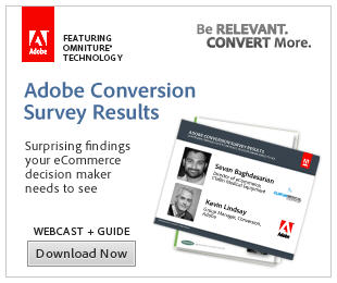
 When it comes to banner ads and online advertising in general, I will confess a prejudice for clean and simple. Multiple frames, flash animation – they may look cool but in my view they’re more often a distraction to the reader, and a crutch for copy that was too long in the first place.
So I particularly admire marketers who succeed in utilizing the banner medium for ads that eschew the bells and whistles that are the stock in trade of today’s too-cool-for-you Mac jockeys, and opt for designs that (gasp) get their message across with a minimum of fuss.
Take these ads by Adobe. Adobe has a clean, elegant brand that works effortlessly across all media, but these ads take it a step further. I’ll guarantee that during the review cycle someone in the approval loop at Adobe said: “You’re going to fit that much copy on a single frame?” but here it works. The white space, the way the text aligns very intuitively so you know what to read, and what to read next. Concise and compelling copy. A laser focus on the offer and a clear, prominent call to action (OK, I would have made the “Download Now” button red, but that’s a quibble.)

