How to Turn Mounds of Data into Usable, Meaningful Insights (2024 Guide)

There’s an unprecedented richness of data out there. Especially now, with the shift from Universal Analytics to the more complex GA4, and marketers up to their necks in BigQuery, the challenge of making sense of mountains of raw data is more daunting than ever.
But here’s the thing: Turning this overwhelming amount of data into actionable insights isn’t just a wild goose chase. It’s a journey, sure, but one that’s packed with opportunities if you know the right paths to take.
In this article, we’ll show you how to extract insights from mounds of data, cut through useless information, and make faster data-driven decisions in your organization.
- What Are Data and Insights?
- Challenges in Generating Insights from Data
-
10 Actionable Steps to Turn Data into Insights
- 1. Start With the Right Questions
- 2. Track the Right Metrics (No Vanity Metrics!)
- 3. State Your End Goals
- 4. Integrate Your Data Sources
- 5. Use Context and Visuals to Simplify Data Sets
- 6. Segment Your Data
- 7. View Data in the Right Time Frames
- 8. Spot the Right Patterns
- 9. Craft a Winning Hypothesis
- 10. Prepare to Experiment
-
Going Beyond Insights: How to Turn Insights into a Strategy
-
Turning Data into Actionable Insights Examples
- Case study #1: How SplitBase used Google Analytics to gather data for an experiment that revealed an opportunity for a 27% increase in conversions
- Case study #2: Was this free shipping promo making or losing money?
- Case study #3: Data helped Nike adjust their targeting and touch the hearts of a wider audience
-
Turning Data into Actionable Insights Examples
- Summing Up
What Are Data and Insights?
Before we get into it, let’s define what we mean by data and insights.
- Data are facts and statistics collected through observation. They could be numbers, text, images, audio, etc.
Let’s put this into perspective:
Supposing you own an eCommerce store and have Google Analytics (GA) activated, each user that navigates your online store leaves some digital footprints that GA picks up.
This covers demographic data, devices, browsers, etc. If you see these raw facts, they would probably look gibberish as they’re sometimes unstructured and without context.
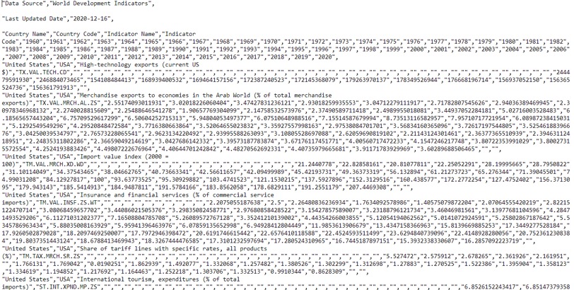
Source: World Bank - Information is a product of refining this data and giving it structure and context. This way, data makes a little more sense to the naked eye.
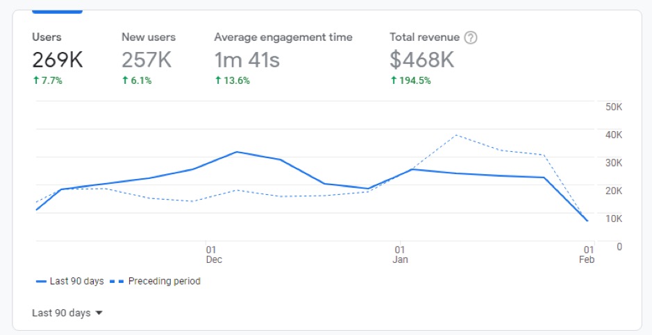
In the case of your eCommerce store, an example would be your GA4 dashboard. When all the data is put together and presented in context, it is consumable and you can draw insights from it.
Information is data you can read - Insight is valuable knowledge gained from an understanding of information. When you accurately interpret information within context, you gain insight.
In the business world, insights are crucial for understanding the inner workings of an operation through data analysis, revealing a meaningful story.
Example of an Insight
Identifying through effective data analysis that 97% of your customers find you when they’re planning their wedding is an example of insight.
On its own, this is merely information that’s cool to know.
But if this is used to craft a plan that brings tangible value to your brand and customers, that’s actionable insight. For instance, you could use this information to plan an ad campaign targeted at people about to tie the knot. You already know this audience is drawn to you; thus a high ROAS (Return on ad spend) wouldn’t be too surprising.
Before data is transformed into insights like this, they have to first be collected and then analyzed.
Various Methods in Which Data Can Be Collected
Businesses collect data from multiple sources using different methods, and each method has its own set of rules.
Google Analytics, for instance, gathers data using JavaScript and a tracking code.
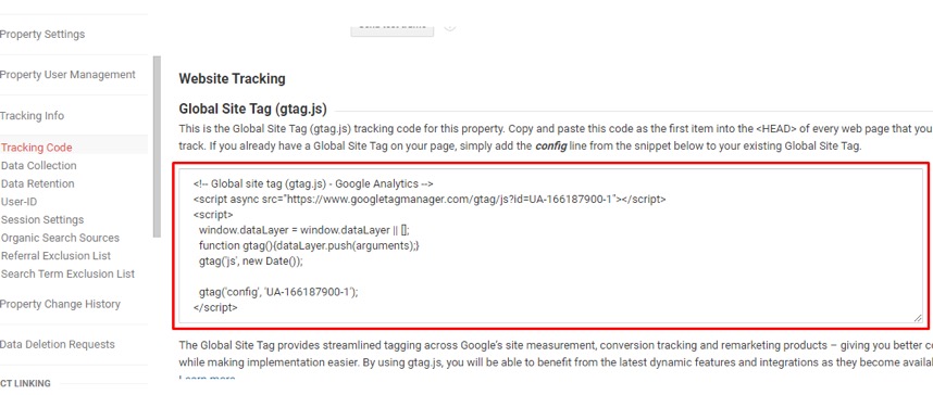
Once the tracking code is added to your page, the script sends data to Google servers. This includes page data (URL, title), browser data (viewport, screen resolution), user data (location, language), and many more.
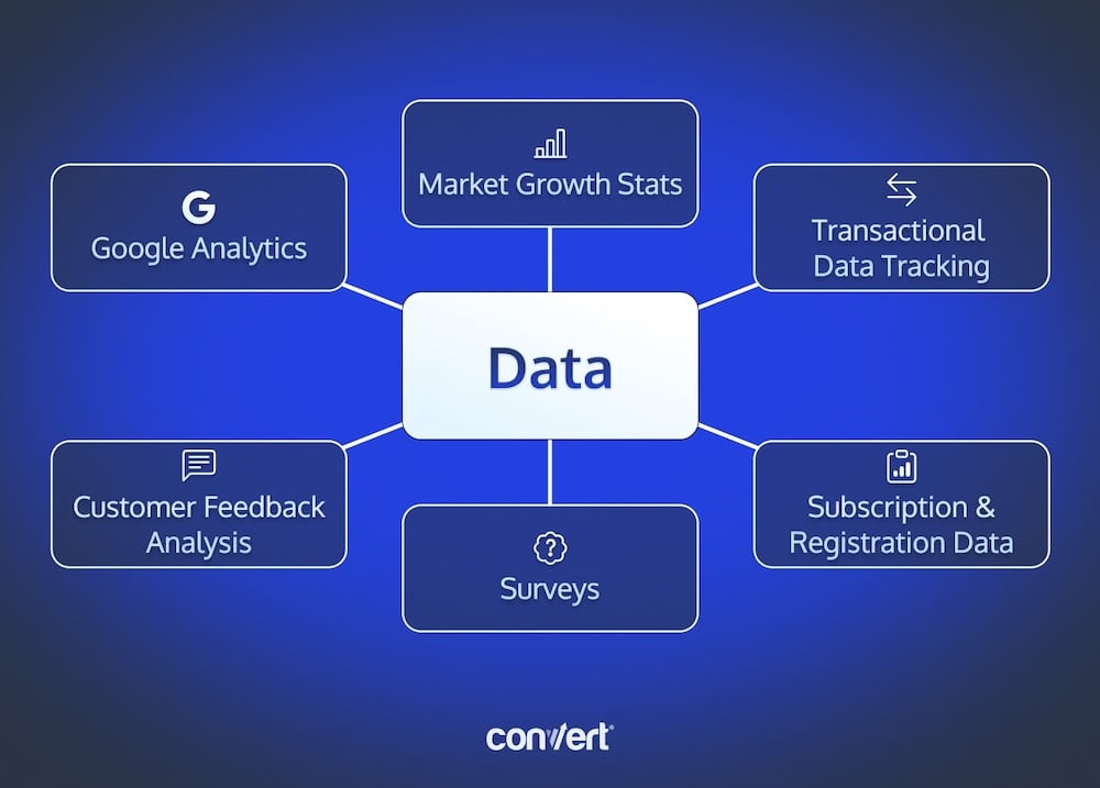
It’s similar to social media analytics on Facebook, X, TikTok, Instagram, and other sites. You can also collect data from:
- surveys
- market growth statistics
- transactional data tracking
- customer feedback analysis
- subscription and registration data, etc.
From here, data moves to the next step.
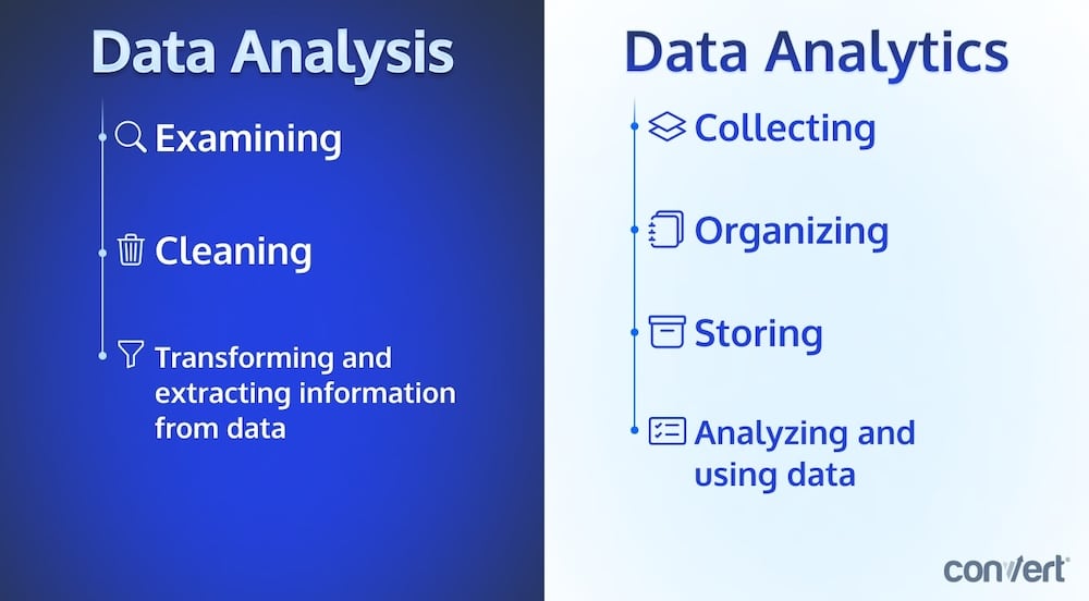
Data Analytics vs Data Analysis
Contrary to popular usage, these terms don’t mean the same thing.
- Data analytics is the science of collecting and using data. It is everything between collecting raw data and taking action from it. This includes the collection, organization, storage, and analysis of data using machine learning, statistics, and computer-based models.
- Data analysis is a subcomponent of data analytics. Data analysis is a process of examining, cleaning, transforming, and organizing data to extract valuable information and use it to inform decisions and actions.
In a typical organization, data scientists, executives, and managers are usually the only ones using data analysis to derive insights.
An efficient data-driven organization should distribute access to data and understanding of data to all of its members.
Learn what data analysis is and how it differs from data analytics in this video from Convert’s A/B testing course.
This brings us to a game-changing concept: data democratization.
What Is Data Democratization?
Data democratization means making data available to everyone within the organization without the barriers of ultra-specialized expertise. This means anyone in your organization can access data, understand it, and use it to make decisions.
The more hands on deck (data-wise), the faster the company adopts a data-driven decision-making culture from top to bottom.
But there’s a catch.
With this level of access, maintaining data security and integrity becomes tougher. There’s also the possibility of data being interpreted wrongly by someone without the expertise of a trained analyst.
Still, data democratization is a key driver in making smarter and faster data-led decisions and improving customer experiences.
The marketers at the Royal Bank of Scotland showed how efficient it could be to involve their non-marketing colleagues in the customer experience optimization process.
Challenges in Generating Insights from Data
The path from data to insights is riddled with challenges. So much so that alternatives to data-driven actions seem more attractive.
Marketers, data scientists, business executives, and other professionals who work with data on the daily seem to agree.
I ran a quick poll (here and here) that revealed data validation is the biggest challenge for 39% of them. Only 11% attributed their difficulties to the volume of data. 28% went with integrating data from various sources, while 22% cite the time and effort involved.
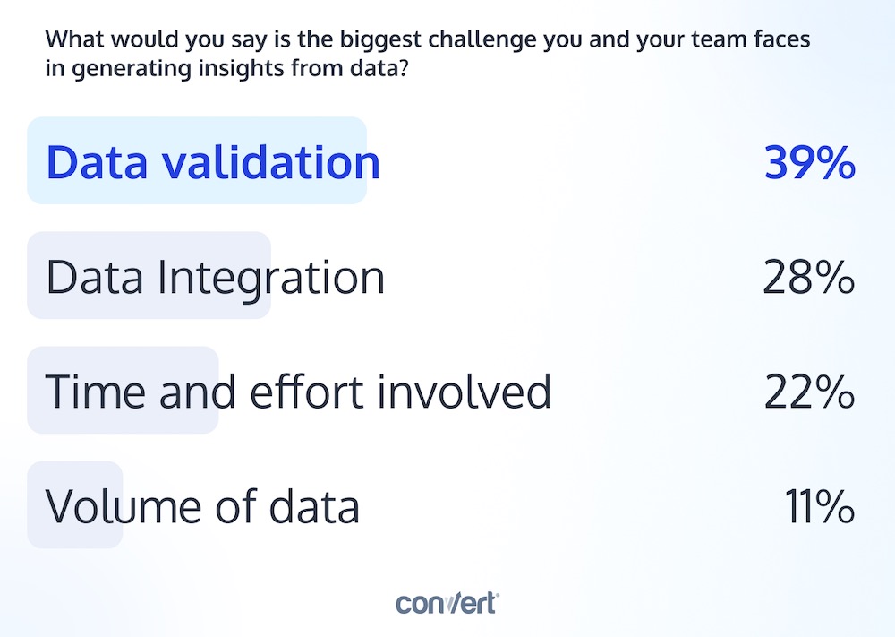
Apart from these four, other challenges with transforming data to actionable outcomes include:
- Inaccessibility of data
- Poor quality of data, and
- The pressure to deliver ROI
For Steven Alexander Young, Founder of Challenger Digital, the biggest challenge is isolating the variable behind a change in performance. Analytics data do not always tell the full story:
When traffic dropped here, was it because someone made changes to the page (and if so, what)? If the page didn’t change, did a competitor happen to beef up SEO and overtake you (and if so, who)? (…) Even when I can get a client on the phone to provide details and rule things out, they often have to go on their own goose chase within their team to track down answers. Of course, parallel to this is the ever-present possibility of Google’s algorithm updates.
Thom Ives (Ph.D.), Lead Data Scientist at UL Prospector, likened data to crude oil that needs to be refined and cleaned. He warns that data “could be dangerous when handled the wrong way.”
This makes decision-makers nervous.
As it turns out, even though 74% of companies agree they want to be data-driven, according to a report by Forrester, only 29% could act based on analytics results.
As much as data-led decisions are excellent in growing business, the mistakes can be devastating. Perhaps the possibility of making mistakes deterred the bulk of the other 71% who make decisions by experience or gut-feelings, or simply follow the status quo.
Often, this happens at the expense of tapping into our 59 zettabytes of data (that’s 59 followed by 21 zeros!) to generate business-transforming insights.
Peep Laja, CEO of Wynter, aptly summarizes it, “We’re data-rich, but insight poor.”
10 Actionable Steps to Turn Data into Insights
Metrics are easy; insight is hard — it’s one thing to collect data, but another to turn it into something useful… Thankfully, there’s a tried and tested method to get answers.
Cue in the scientific method.
The 10 steps we’ll show you draw inspiration from the scientific method and pave the way to actionable insights and recommendations.
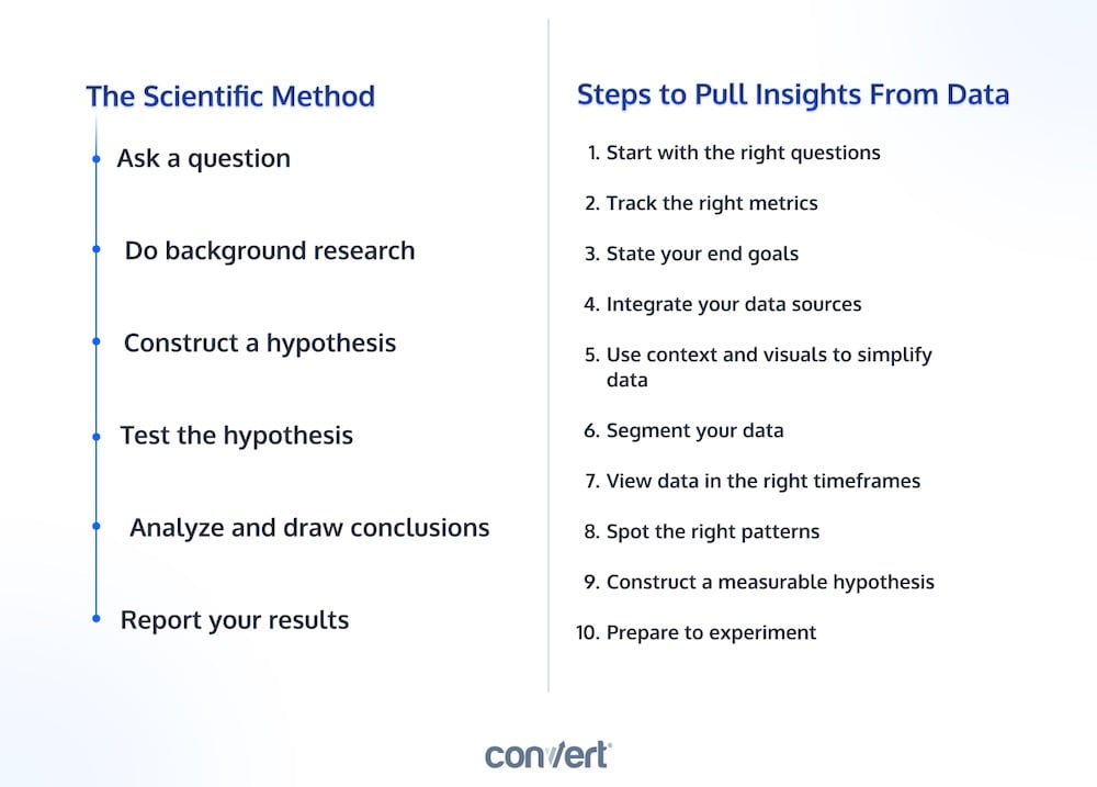
Below is a quick, two-minute overview of these ten pivotal steps that guide the journey from raw data to valuable insights.
Let’s jump right in:
1. Start With the Right Questions
Asking the right questions before you dig through data ensures you don’t spend time on the wrong things.
It’s like setting a clear destination before embarking on a trip.
Before you comb through mounds of data, figure out what questions you want your data to answer. This focused approach ensures that the insights you derive are relevant and impactful in relation to your business objectives.
For a SaaS company, those questions may be:
- What proportion of my website traffic actually matches my ideal buyer persona?
- At which stage in my sales funnel do I experience the most significant drop-off?
- What are the common issues or questions raised by customers?
- How effective is the onboarding process in getting new users to a ‘first success’ with my product?
2. Track the Right Metrics (No Vanity Metrics!)
Insights that steer the business in the right direction do not come from staring at vanity metrics. They make you look good but do not add to your insight framework. Example: page views and number of clicks.
Besides, the wrong metrics can be distracting. Having identified the key questions you need to answer in step 1, it’s important to stay committed to that line of inquiry. This means carefully selecting the metrics that are directly relevant to your questions.
Aniekan Inyang, a Data Scientist at Stears Business cautions against not accounting for industry-specific nuances:
This can lead to choosing a wrong feature to track a metric, not tracking a relevant metric or interpreting it wrongly.
Use that to beat a path to a hypothesis you can test.
Speaking of hypotheses, have you tried our A/B testing hypothesis generator yet? Use our free hypothesis generator tool or learn more about building a hypothesis.
3. State Your End Goals
You most likely have certain business goals pre-test. These have to be closely aligned with your test objectives.
From the questions you started with, you figured out what you want to track. But what are you aiming to achieve with this?
Write this down as it helps you develop a specific, measurable hypothesis.
4. Integrate Your Data Sources
The data sets you have don’t always tell the whole story because they represent only a section of the population.
Dr. Thom Ives shared:
It may have biases we don’t know about and is going to be weaker than all the data.
The key to getting a clearer, more accurate story is to collect as much relevant data as you can. You’ll find that your understanding of the data becomes much more precise when you bring together information from all your different sources. This way, you won’t miss out on any important insights about your customers.
Run your tests with an A/B testing tool that plays well with other software. Convert Experiences integrates with dozens of tools that may be in your tech stack.
5. Use Context and Visuals to Simplify Data Sets
Visuals are pretty common with data today. You hardly ever encounter an incomprehensible raw form of data. Yet, without the right context, you’re either not getting the full story or getting the wrong one.
For context, dissect your data using the 5 W’s:
- Who (audience, leads, prospects)
- What (goals, events, observations)
- When (timeframe, schedules)
- Where (webpage, social media, landing page), and
- Why, (why did it happen?)
Context makes your data jump off the screen, infusing it with deeper meaning. This also helps in reducing the likelihood of errors. When you pair this with precise visuals, the chances of making mistakes drop even further. However, remember that visuals can have errors too.
Take the bubble chart below as an example. An error occurs when the radius of the bubbles is used instead of their area to represent different values. This can lead to misleading interpretations and can significantly skew the story your data is trying to tell.
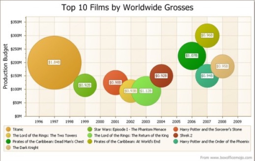
Let’s use the orange bubble in the top-left and the green one next to it to emphasize. The orange bubble looks 4 times larger than its green neighbor.
Without the actual values labeled inside, this can be misleading. The orange bubble’s value ($1.84B) is only 2 times that of the green ($0.92B).
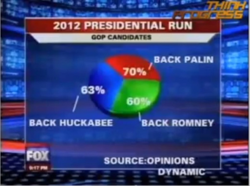
Here’s another funny data visualization blunder by Fox News:
6. Segment Your Data
Breaking down your data into smaller segments can be a great way to understand it better. Many analytics tools come with features that simplify this process for you.
For instance, if you categorize your web traffic based on certain common characteristics, you’ll find it much easier to draw out meaningful insights. This kind of segmentation can really enhance your grasp of who your target audience is and what they’re looking for.
When segmenting, try to move past the traditional categories like age and gender. A more dynamic approach is to segment customers based on their transactional worth (value segmentation) — that is, how much they’re likely to spend on products. To do this, you’ll need to dive into their past transaction data. Look at factors like how much they’ve spent in total, how often they make purchases, and the value of the products they’re buying.
Once you experience this simplicity, it quickly becomes a staple process in your strategy for understanding your customers.
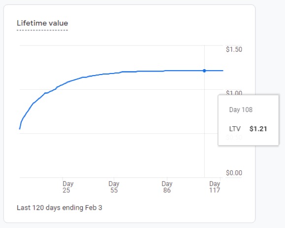
Here’s another example that illustrates the importance of proper data segmentation:
7. View Data in the Right Time Frames
Base your decisions solely on insights from a brief period, and you could be heading for trouble. It’s a frequent mistake to focus narrowly on a small snapshot of data without considering the broader context provided by historical information.
Data usually has a backstory.
To truly understand current trends, it’s crucial to consider past events and how they were shaped by external factors like holidays, seasons, and economic cycles. For example, relying solely on Black Friday sales data can mislead a retail company into overestimating regular demand, leading to excess inventory. Similarly, a company using consumer behavior data from the pandemic period risks basing strategies on temporary shifts in habits that may not persist post-pandemic.
8. Spot the Right Patterns
Climbing and falling — two of the easiest trends to observe on a line graph. This is usually how page views and engagement data are displayed in GA.
Other types of plots such as time series and scatter plots help us picture patterns in data. You can spot when there’s an upward or downward trend, visualize a correlation between two variables, and more.
They’re all tailored towards revealing the stories behind the data. A word of caution: never view patterns in isolation of their context.
In analyzing your plots, MIT Professor Dr. Rama Ramakrishnan suggests matching your plot with preliminary expectations:
Is there anything that doesn’t match? Anything that makes you go ‘That’s odd’ or ‘That doesn’t make any sense.’? Zoom in and try to understand what in your business is making that weird thing show up in the data like that. This is the critical step. (…) You may have just found an insight into the business and increased your understanding. Or you may discover that there’s a bug in the way your data has been collected or calculated (Twyman’s Law).
9. Craft a Winning Hypothesis
When you’ve analyzed your data and drawn accurate inferences, it’s time to come up with a hypothesis you can test.
In crafting a hypothesis, you are figuring out a solution to a problem that you can verify with experimentation.
A measurable hypothesis consists of 3 parts:
- Observation,
- Execution, and
- Outcome
Here’s a real-life case study coming from a Convert partner, SplitBase:
Observation: One of SplitBase’s clients faced a challenge with a high bounce rate on their flagship product’s page. They carried out surveys, polls, and usability research and found out that users didn’t understand the value of our product and trust it. Also, most visitors didn’t scroll further down the page.
Execution: To tackle these issues, they wanted to add better copy to the fold area to retain more page visitors, address the trust issues, and boost conversions on the page.
Outcome: This test was expected to lead to more visitors engaging with the page, showing increased interest in the flagship product, and moving towards making a purchase. Success would be measured by a reduction in the bounce rate, an increase in conversion rates, and a rise in revenue.
Following this strategic approach, the next step for the client was to implement and test these changes.
This example is an actual hypothesis that led to impressive results. More on this experiment below.
10. Prepare to Experiment
Once you have your hypothesis, you can do what expert conversion rate optimizers do and run a test.
Remember, until this stage, your hypotheses, despite being data-driven, are essentially educated guesses. The transition from hypothesis to verifiable fact is achieved through systematic experimentation.
This is the point where the real value of your data analysis begins to show – it’s where you start seeing a return on investment.
By adopting a scientific approach, you can turn raw, incomprehensible data into juicy insights.
There are dozens of tools that can take you through these steps. Convert uniquely integrates them, leading you to the ultimate objective — actionable insights.
Going Beyond Insights: How to Turn Insights into a Strategy
Insights fail to contribute to business objectives if they are not effectively translated into strategic actions. The critical question is: how can you leverage the insights you acquire to generate tangible benefits that have a direct and positive impact on your organization’s bottom line?
Let’s share 3 examples:
Turning Data into Actionable Insights Examples
Case study #1: How SplitBase used Google Analytics to gather data for an experiment that revealed an opportunity for a 27% increase in conversions
BestSelf Co. discovered a leak on their flagship product’s page. So they worked with SplitBase to plug it.
How did they do it?
Using various means to gather data such as polls, surveys, and heatmaps, they found the culprit.
The benefit of the product wasn’t communicated well enough, so people weren’t even getting past the fold area. From this, they crafted the hypothesis we shared earlier.
They ran a test and found they were right. The new headline clearly stating the major benefit of the product and social proof significantly boosted the sales of the product.
Case study #2: Was this free shipping promo making or losing money?
This was the question on the minds of the team running a luxury handmade glass eCommerce store.
They launched a free shipping promotion and found an increase in conversion rates. Although that meant more money, considering the costs of shipping these products to customers, was the offer enough to offset shipping costs?
Now, how they found their answer…
They called on Brave One, a conversion rate optimization agency, who came up with a plan to find out if they were losing or profiting, and by how much.
With Google Analytics and Mixpanel for gathering data and Convert for experimenting, Brave One compared the site without the offer to a version of it with the offer.
Running the business with the offer brought in $16,000 more than running it without in the same time frame.
Case study #3: Data helped Nike adjust their targeting and touch the hearts of a wider audience
When Nike wanted to launch a campaign called ‘Find Your Greatness’ at the start of the 2012 Olympics, they dug into their data and found this:
Most of their target audience wasn’t professional athletes. They were people who admired the pros and wanted to be like them.
What did they do with this?
They adjusted their targeting.
Nike usually goes after the pro athletes. But this time around, they decided to inspire everyone regardless of their fitness level to push their limits.
One of the videos of the campaign had more than 3 million views.
And it doesn’t stop there: Adidas spent millions of dollars to get an Olympic sponsorship, yet Nike enjoyed that same level of exposure with less than half of that marketing budget.
This video from Convert’s video course explains the three types of data insights and how to determine if they are valid.
Summing Up
Experimenting shouldn’t mark the end of your optimization journey.
It should be a continuous process because we are never always spot on with our insight.
Also, remember… in case you lack the skills to conduct in-house data analysis, you can always rely on the know-how of data experts.
Dr. Thom Ives suggests that as more data comes in, we have to refine the inferences we made with the old data.
And the good news? This way, we continue to approach insight that’s more representative of our audience and make much more precise predictions and decisions.