Introducing: Parse.ly’s 2020 U.S. Election Dashboard
Many of us at Parse.ly are political news junkies, but not only out of civic duty. During the last round of debates among the Democratic candidates for president, we found ourselves glued to our Internet network trends product, Currents, to see how many articles were published and how much traffic (our proxy for “attention”) the candidates received days after the debates. Beto O’Rourke, for example, got a ton of attention…just not for the best reasons.
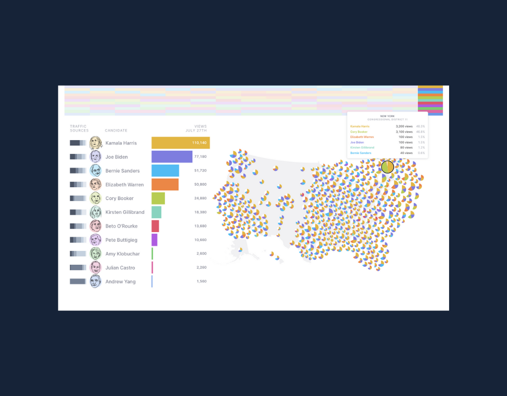
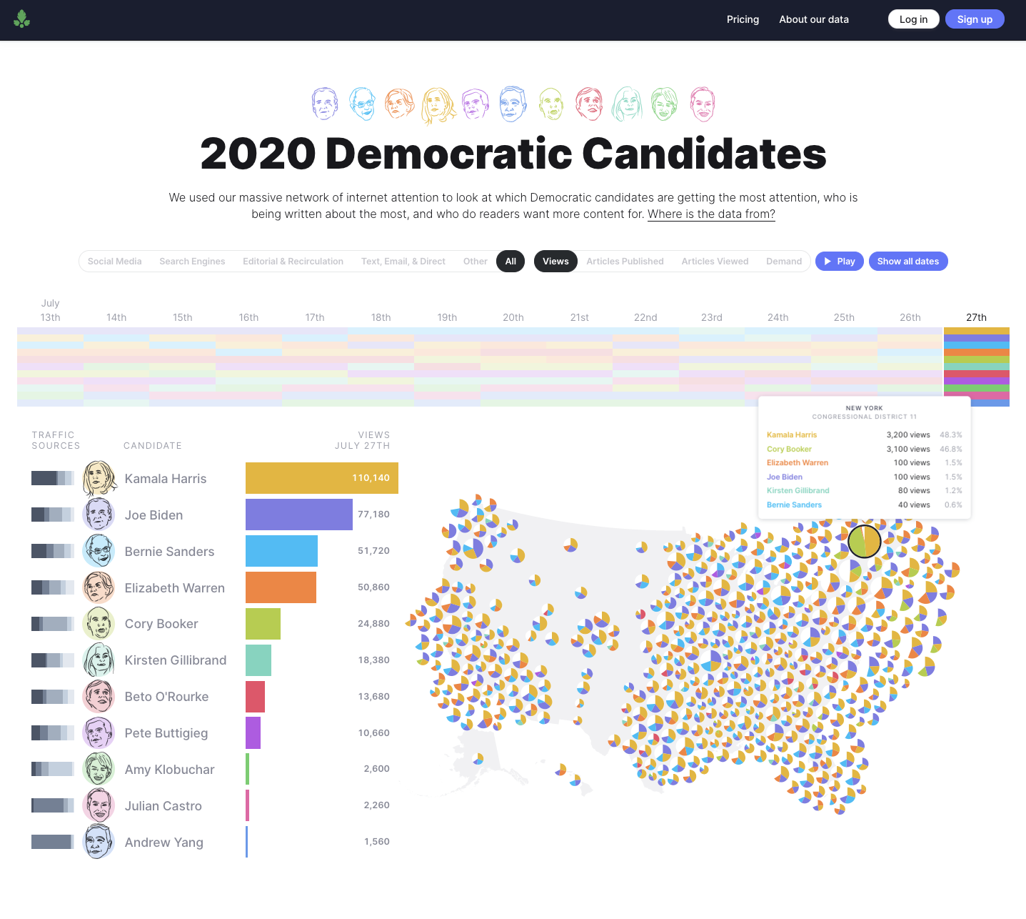
What voters read can influence how they vote, and Currents provides an unprecedented view into the coverage of and attention to the candidates across a network of 3000+ sites. So today, just in time for tonight’s Democratic debate, we’re happy to announce the launch of our 2020 U.S. Election Dashboard.
What does the dashboard measure?
For those of you who aren’t familiar with Parse.ly, we’re a content analytics firm that helps tons of companies make sense of what kind of content works and why. Companies like The Wall Street Journal, Conde Nast, and Bloomberg install a tracking code on their sites that pings our servers when a visitor reads an article, which we can then anonymize and aggregate to analyze industry-wide trends. We also use natural language processing to extract any named entities in an article (e.g. political candidates). When we combine these two data sources, we get a 30,000-foot view into the number of articles published or viewed about each candidate and the total amount of traffic those articles received.
There are five basic things the dashboard measures:
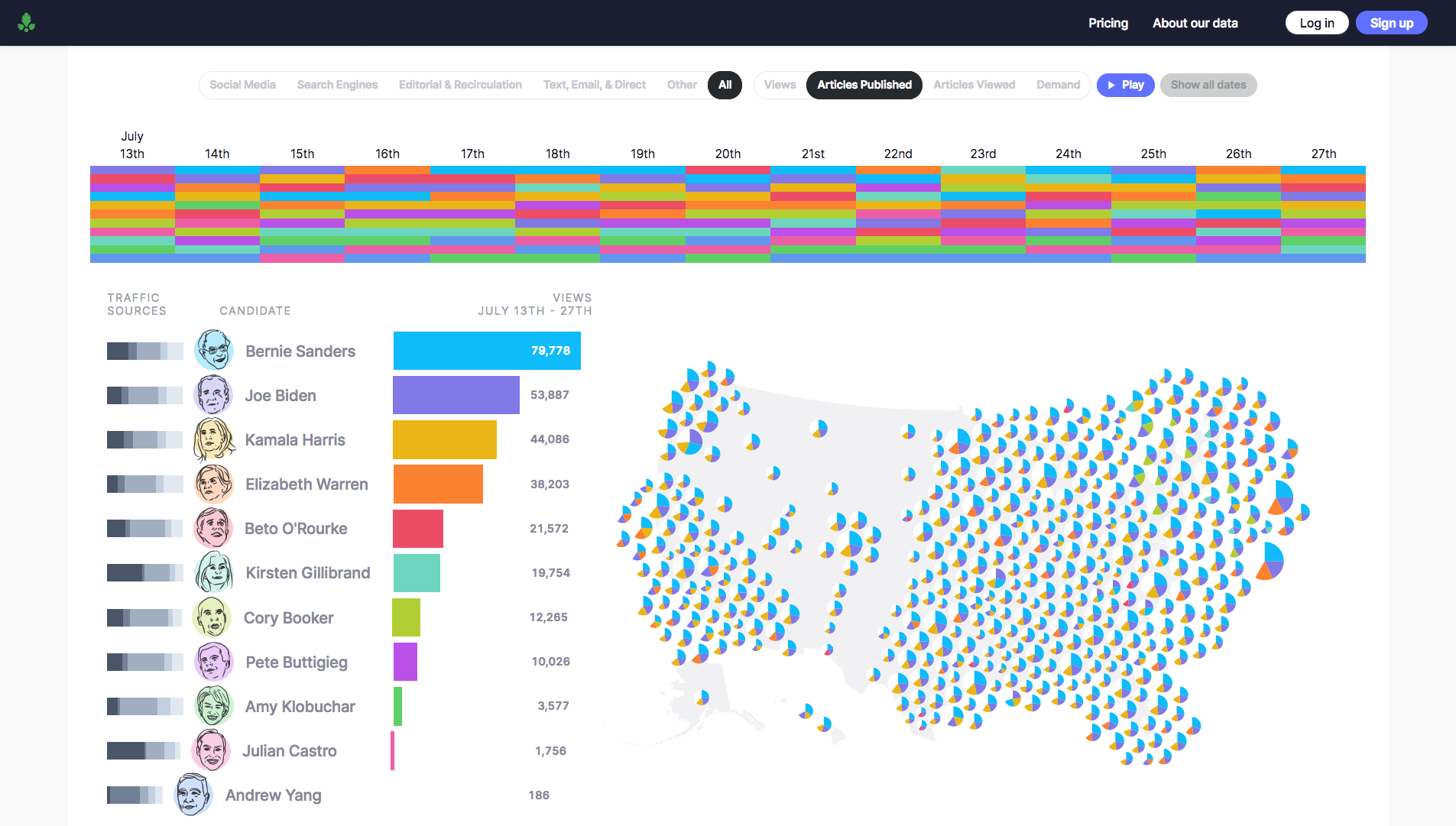
- Coverage: the number of articles published about each candidate
- Attention: the number of pageviews to articles about each candidate*
- Demand: the ratio of attention to coverage, or the average number of pageviews per article about each candidate
- Location: where visitors were when they read these articles (inferred from their IP address)
- Traffic source: how visitors found articles about a candidate
*Note: articles can mention more than one candidate at a time. When that happens, each candidate gets credit.
What can I do with this dashboard?
Glad you asked! Here are some of the questions we’ve used the dashboard to investigate.
Who gets the most attention online?
The landscape is more volatile than you’d think with the rankings changing almost daily. Lately though, Senators Joe Biden, Bernie Sanders, Kamala Harris, and Elizabeth Warren have consistently held their positions in the top four most-viewed candidates. At the top of the dashboard, click the blue “Play” button to see the rankings shift over time.
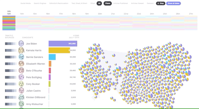
Who gets the most coverage?
The media seems to have converged on the top five most popular candidates, but recently, much more has been written about Bernie Sanders than his contenders.
So which comes first? Audience interest in the top five candidates, or the press coverage about them? It’s hard to say definitively, but considering the influence heavy coverage has on polling data, measuring an increase in coverage could be a leading indicator of eventual popularity.
The inverse is also significant. Our data shows that Andrew Yang has received the lowest amount of overall traffic, but he’s also had the fewest number of articles published about his candidacy and policies. It’s hard to become popular if no one is covering you.
Who is in greatest demand?
Here things start to get more interesting. Demand is measured as the average number of views per article written about each candidate. Therefore, high demand might signal the need for more information around a candidate; there are fewer articles, but more attention paid to each. Low demand may signal low interest, but may also signal the over-saturation of coverage.
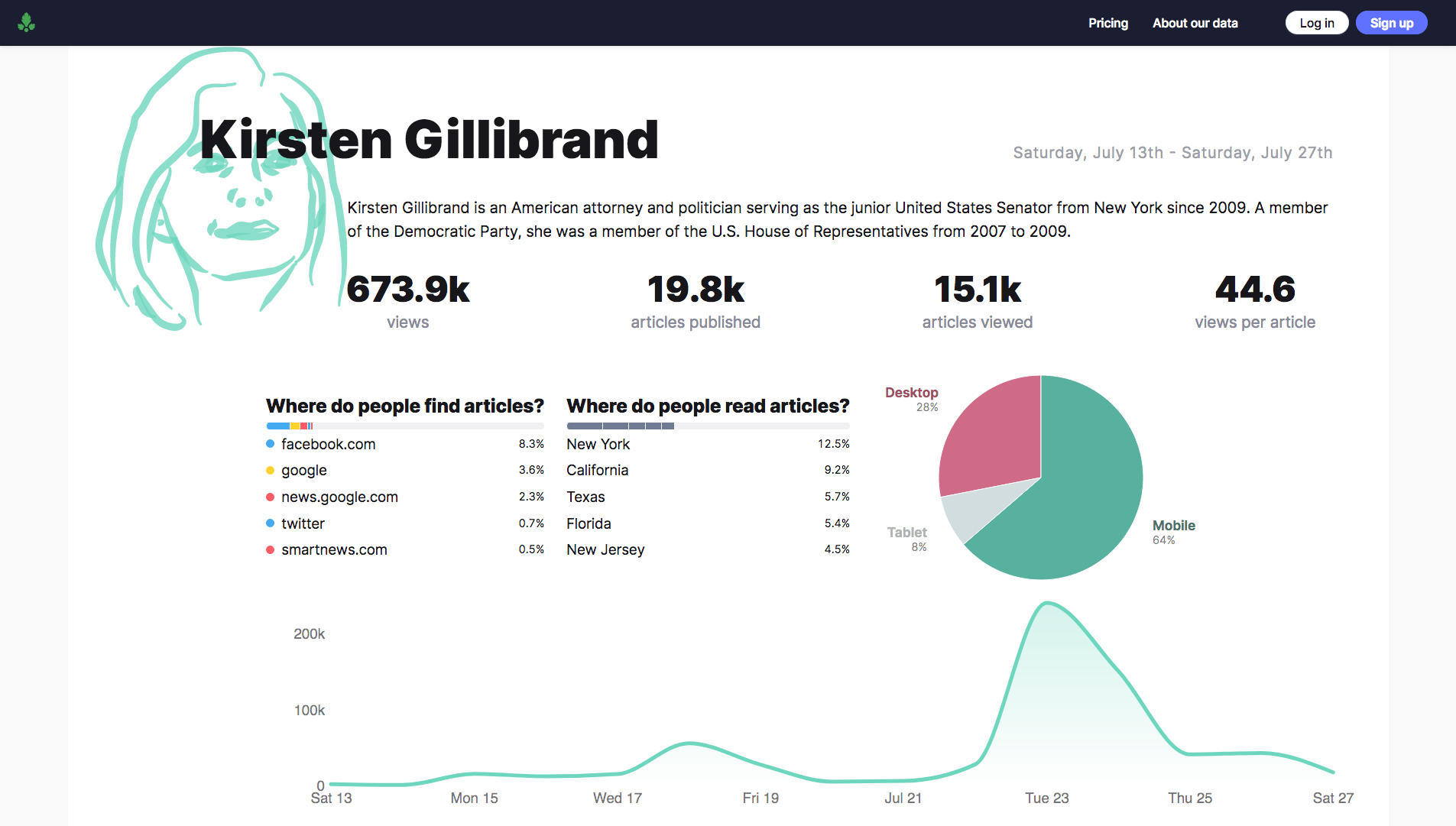
From July 13-27th, articles mentioning Senator Kirsten Gillibrand received the highest number of views per article. At first this seems like good news for New York’s junior senator, but a closer look at the jump in traffic on the 23rd reveals the cause of the sudden interest.
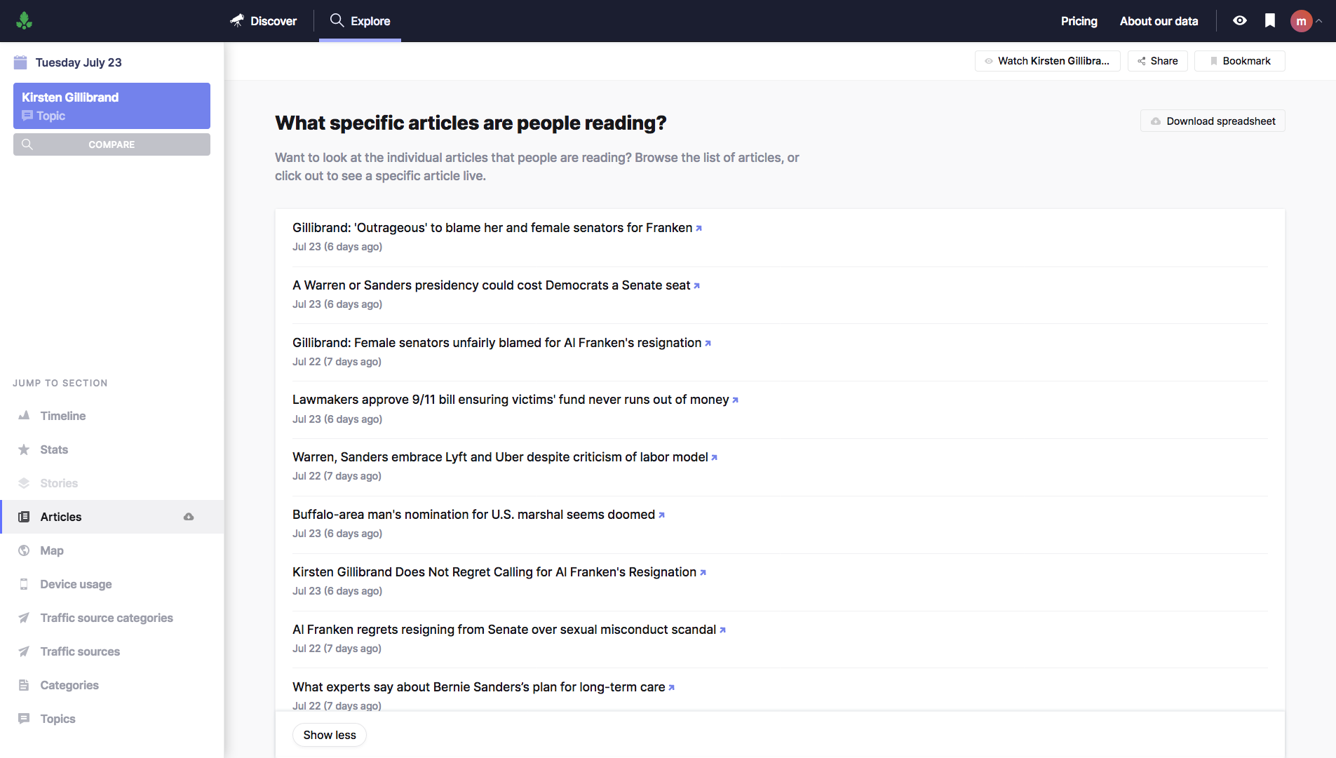
In just a couple of clicks, we can see the specific articles that led to the candidate’s popularity during that period (note: you’ll need a Pro account to look at historical data). Turns out, the recent boost was due to articles regarding the resignation of Senator Al Franken in early 2018, not her policy proposals or candidacy. Gillibrand was a leader in calling for the Minnesota senator’s resignation over allegations of sexual impropriety.
We want to hear from you
How a candidate is covered in the media, and how much press they receive has far-reaching implications.
For each democratic presidential candidate and the people on their campaign team, this period is about striking a balance between capturing and sustaining the public’s attention. The short-term benefits around a breakout moment don’t always translate into consistent media mentions.
The data within this dashboard (and Currents as a whole) is unique in that we aren’t looking only at Google searches or social media shares, we’re looking at what folks stop to read.
The days following tonight and tomorrow night’s Democratic debates are a great opportunity to understand the complex interplay between digital media and politics, and to see the impact it has on the candidates. We hope our new U.S Election Dashboard helps you explore exactly that.
If you want to dive deeper, sign up for an account that’ll give you access to more data and even daily or weekly digests on each candidate. If you have questions we’d love to hear from you, reach out to us at currents@parsely.com.