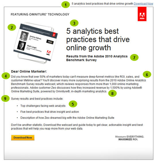
I’ve praised Adobe’s marketing design before in this space, and the email below is yet another example of how a well-constructed brand standard can work equally well across multiple media. In this case, an invitation to download a recorded Webcast, Adobe combines a clean email design with clear, concise selling copy that gets to the point quickly and with a minimum of fuss. Here’s what I like:
1. Use of optimization copy means even on a smartphone the reader will see the primary selling message first. In addition, a minimum of graphics (note the headline in HTML) means, even if images are turned off, the reader loses very little.
2. Including photos of the two speakers adds credibility and makes the offer seem more “real.”
3. Using numbers in the headline, as in: “5 analytics best practices” sets the expectation that there’s something specific and tangible to gain from listening to the recording. (The phrase “best practices” is almost always a sure-fire winner, whether in subject lines or headlines.)
 4. Normally I’m not a fan of yes/no questions (“Did you know …”) but here the question serves to sell the offer and highlight what the reader will learn in the Webcast.
5. Additional benefits are highlighted in bulleted form, making them easy to scan at a glance.
And here’s what I’d change:
6. More specificity. I don’t really know this is a Webcast until I read the body copy, and even then it’s not entirely clear what I’m being asked to do. I’d add a little more detail, even if it’s just the length of the event. For example:
“You’ll discover many more surprising results when you listen to a 30-minute Webcast highlighting results of the 2010 Adobe Online Analytics Benchmark Survey …”
7. Introduce the call to action earlier. Here it only appears at the bottom of the email. The slide image at top left is a live link, but you wouldn’t know that intuitively. I might add a YouTube-style “play” icon to the slide, and a CTA to the sub-head:
“Results from the Adobe 2010 Analytics Benchmark Survey. View the Webcast Now.”
8. The Webcast includes a customer case study, but the way in which it’s introduced in the first paragraph — along with a prominent mention of the Adobe product — seems premature, making the event seem less informational and more of a sales pitch. I’d delete the last sentence (“Adobe customer Zeo …”) entirely and instead, incorporate the same information into the last bullet point, minus the product pitch:
“* How Adobe customer Zeo increased revenue by 1,500% utilizing in-depth marketing analytics …”
9. The bullets could use an introduction that better sells the event:
“In under 30 minutes, you’ll hear highlights of our recent survey and discover best practices for making the most of your Web analytics, including:”
Too often with B2B email campaigns, the natural temptation is to invest time and space “setting the stage” for the selling message. Here, it might be have been a paragraph discussing the importance of Web analytics, or more detail on how and when the survey was conducted. Were either needed? No. Instead, Adobe gets right to the point and they have a more effective campaign because of it.
For more email design tips, download a free copy of our white paper: “Top 10 High-Tech E-Mail Marketing Mistakes.”

Very clear and practical advice, Howard.