Taking on a branding project for a small business can be a valuable opportunity for agencies and freelancers to develop experimental creative work without the intense pressures and restrictions associated with larger accounts.
While big businesses often have multiple decision makers with very specific ideas and guidelines to keep their existing brands consistent, smaller companies are usually more open to exploring new creative directions, and can move faster to implement them.
If you need some more convincing that working with small businesses can result in some stunning creative work, we've put together a list of 15 small business branding examples to get you inspired for your next project.
15 Examples of Small Business Branding
1) Elo Soap
When traditional Greek soap manufacturer Elo needed a fresh look for their new Greek god-inspired line of olive oil soaps, they turned to designer Mike Karolos at Smirap Designs to create something that would stand out in a sea of touristy Greek gift shop items.
"The biggest goal was to be different, unique, and eye catching," Karolos said in an interview with The Dieline. "Although the Greek god theme in tourist shops here in Greece is very common, by using my illustration signature style we managed to give a different take on an overused theme. The result was a modern, fresh, and at the same time kind of traditional packaging due to the theme we chose."
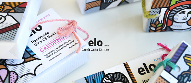
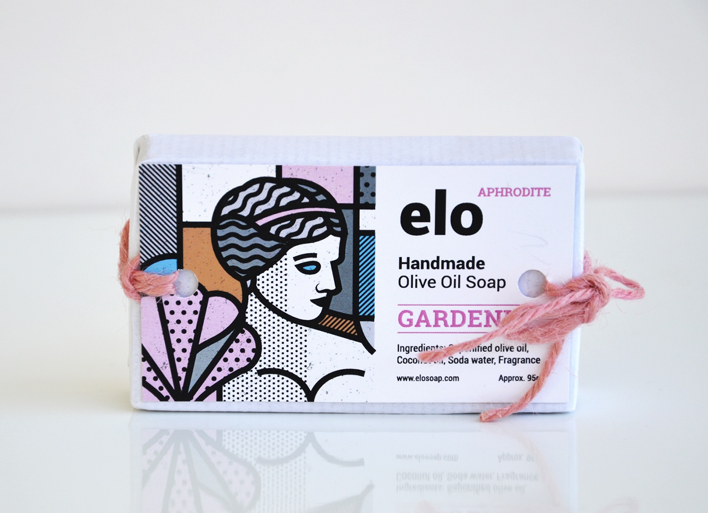
Images via Mike Karolos on Behance
2) AND UNION
These craft beer cans from German brewery AND UNION balance minimal design with a complex, unexpected texture. The team at AND UNION designed the unique cans in-house with the goal of breaking through the idea that only cheap beers come in cans.
"There is still that stigma, even though many craft brewers before us have done such a great job in educating the consumer, we want to do our bit too," co-founder Rui Esteves said. "We wanted to create a can that you hesitate to throw away after you’ve had the beer. I end up leaving stacks of these empty cans in my kitchen because I feel bad throwing such a beautiful thing in the recycling."
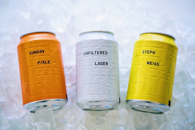
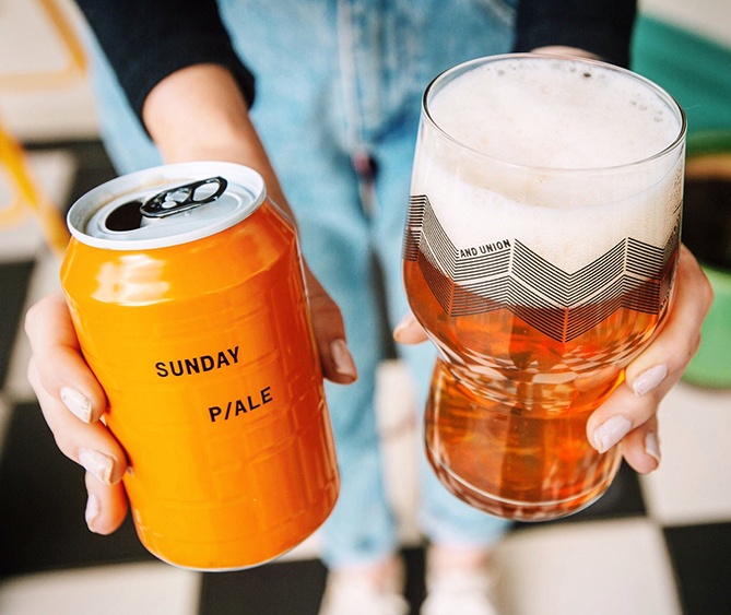
Images via The Dieline
3) Folklorious
Barcelona-based designer Quim Marin developed this stunning branding for online accessories boutique Folklorious. Marin incorporated excerpts of classic artwork, illustrated design, and photography with modern graphic elements and typography. The end result is an eclectic, stylish, and truly unique brand identity.
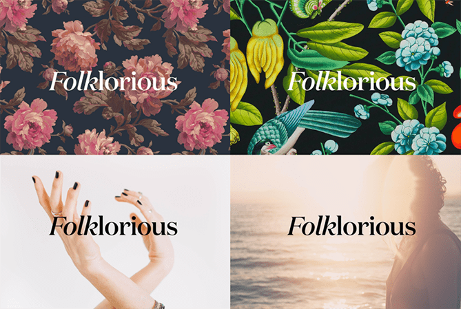
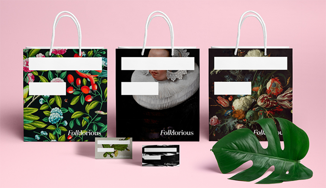
Images via Quim Marin on Behance
4) EAT MY SHORTS!
EAT MY SHORTS! (Yes, that's an intentional Simpson's reference) is an independent, gender-neutral clothing line by fashion designer Malena Blas, who worked with Mexico City-based designer Tomás Salazar to create a contemporary brand identity and packaging solution.
The company's shirts are packaged in pastel-colored metallic pouches with no reference to gender, and the trendy cotton candy hues are used throughout the brand's promotional materials.
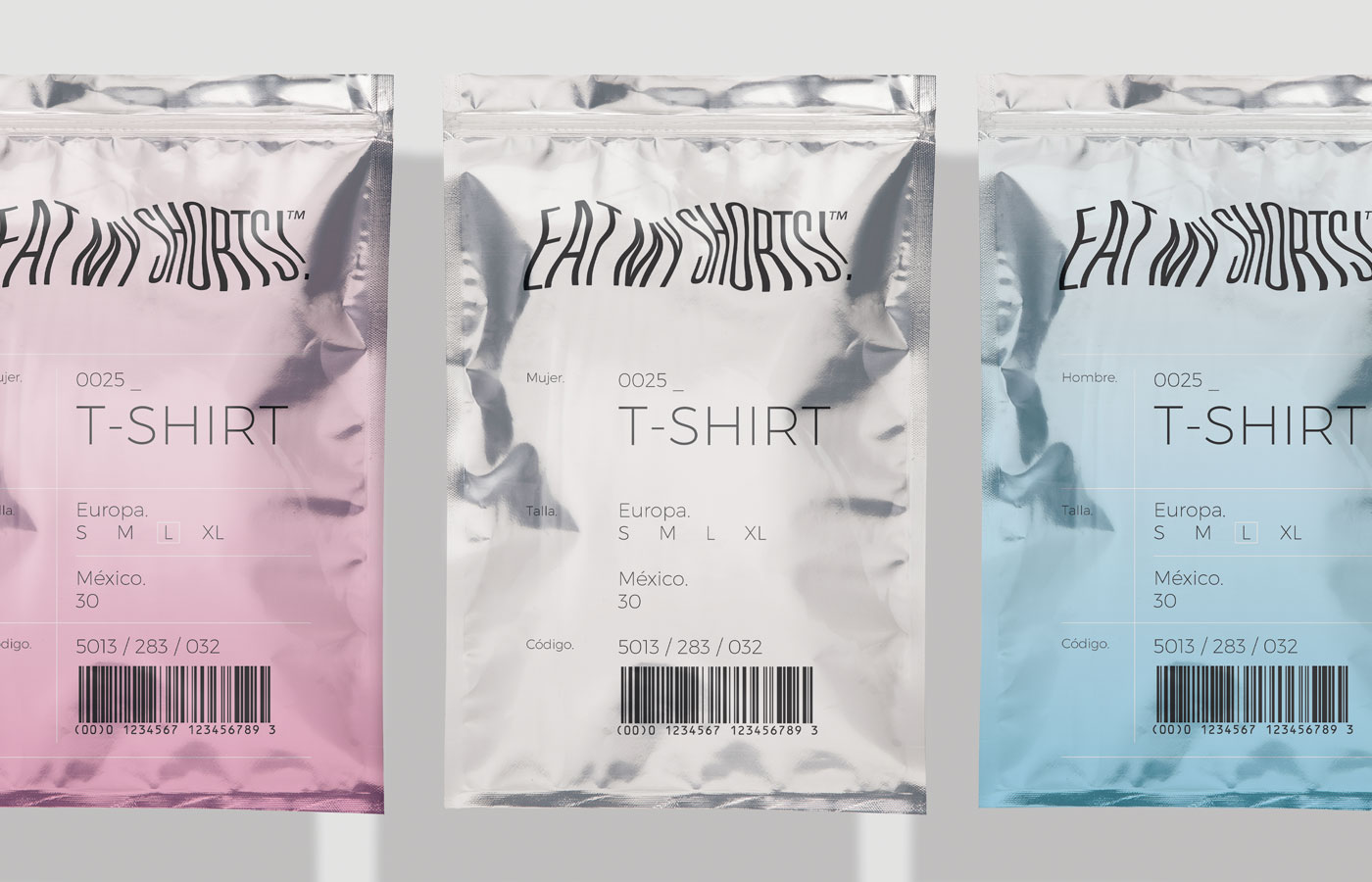
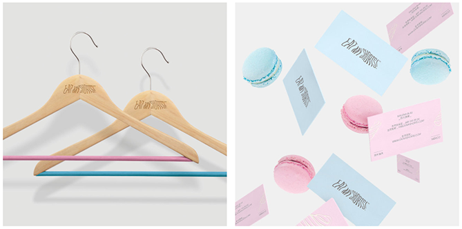
Images via Tomás Salazar on Behance
5) Zonzo Estate
Swear Words, an Australian design firm, was tasked with creating a sophisticated, energetic rebrand for Zonzo Estate, a winery, restaurant, and popular wedding destination in Melbourne's Yarra Valley.
The redesign is surprisingly modernistic for a rustic winery. The work is centered around a versatile, floating-letter logo that looks classic in gold foil, and youthful and fresh when printed in outline on a menu cover.
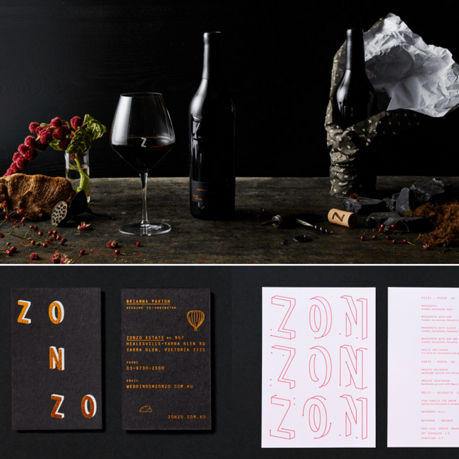
Image via Swear Words
6) Qoñi
This small artisan community in Peru was branded head-to-toe by Leo Burnett Design, the design department of Leo Burnett's Canadian branch.
"We created the brand’s identity from top to bottom, giving it a name, wordmark, brand story, lookbook, promotional material, and retail tags," the Leo Burnett team writes on their website. "Qoñi, meaning warmth in the region's native language, was perfectly suited to the brand’s line of cozy alpaca goods."
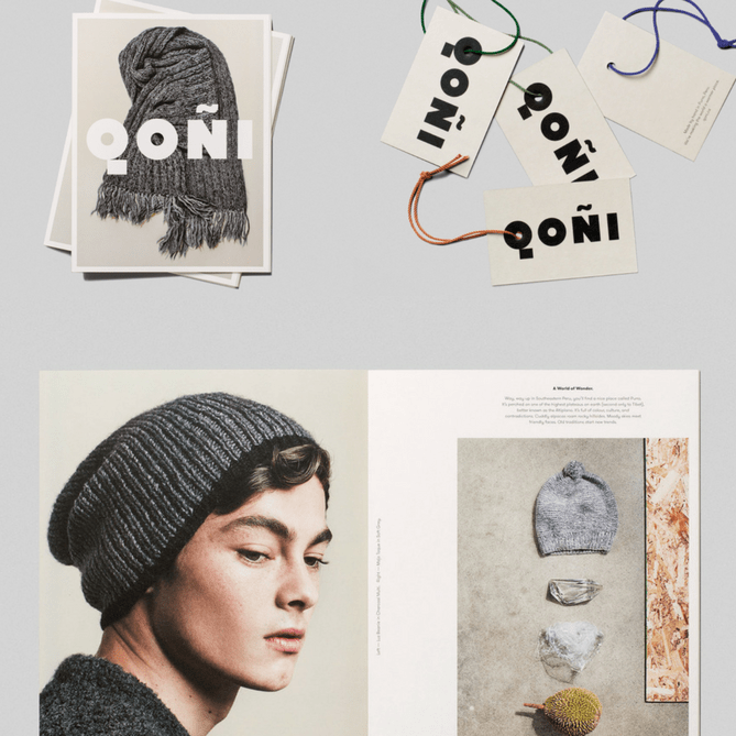
Image via Leo Burnett Design
7) Lune Croissanterie
Lune is a futuristic bakery with a serious, scientific commitment to perfecting their signature pastry. It makes sense then that their branding -- developed by Melbourne-based agency A Friend of Mine -- combines science and baked goods in the form of a croissant-tailed spaceship logo.
"The packaging we designed features diecut 'hyperdrive' ventilation slots in a galactic theme (taking cue from the name Lune) which acted as ventilation for the pastries, paired with a subtle glitter print for a further cosmic touch," writes the team from A Friend of Mine on their website. "We also redesigned their much loved rocket motif, and we couldn't resist adding a little croissant in our update."
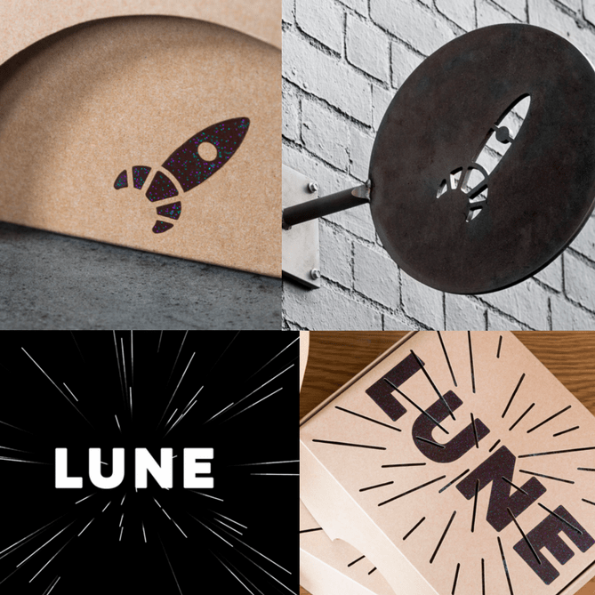
Image via A Friend of Mine
8) Tenth Muse Botanical Fragrance
Thanks to Studio MPLS, this botanical fragarance startup has a charming, Victorian-inspired brand identity that still manages to look modern. Tenth Muse creates custom perfumes from natural, sustainably sourced ingredients, and their packaging and promotional materials elegantly "combine[s] clarity and beauty with intrigue and mystery."
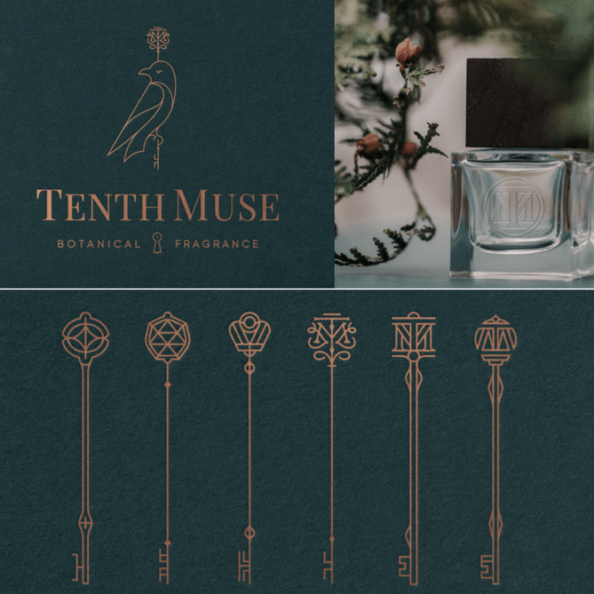
Image via Studio MPLS
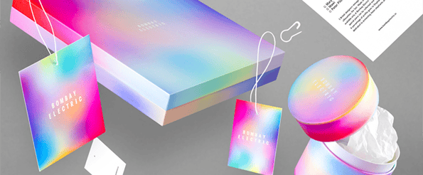
9) Bombay Electric
Bombay Electric is a upscale fashion select store located in Mumbai, and their vibrant, kaleidoscopic new branding was created by Paris-based designer Michael Thorsby.
"When approaching the work to put a new image on the company I knew that there was no way around colors and vibrancy," Michael writes of the project on his portfolio website. "Framed by a rather minimal typography and grid, the intense color gradients are drawn to look like blurry abstract photographs, as if taken inside an Ann Veronica Janssens installation."
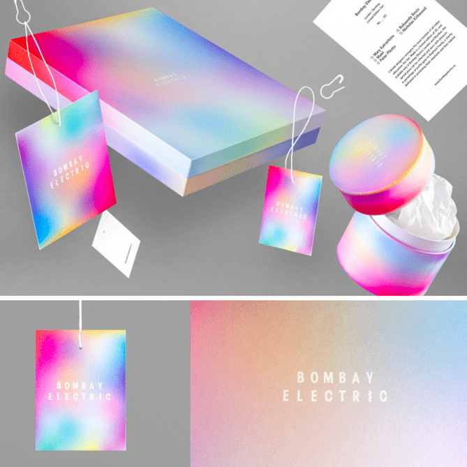
Image via Michael Thorsby
10) Glorioso Super Nutrients
These seed packet-inspired supplement packages from Spanish superfood company Glorioso Super Nutrients are simple but delightfully whimsical, each featuring an abstract circle motif representative of their contents.
Glorioso's entire brand identity, which includes a range of colorful business cards, was developed by Barcelona-based agency Requena. The circle motifs are used throughout the brand's website and other promotional materials.
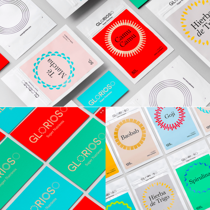
Image via Requena Office on Behance
11) Notel
This decidedly unconventional hotel demanded some especially bold branding choices, and agency Self Titled definitely delivered. Notel consists of six reconditioned Air Stream trailers parked on a roof, and Self Titled was brought in to provide art direction and develop a strong brand concept for the entire operation.
As the agency explains on their website: "The name and logo explicitly express the idea that this is ‘not a hotel’, with a subtle nod to the slashed 'no symbol'. Celebrating the best of Melbourne, reframing both high and low culture, Self-titled created the brand positioning -- 'reflecting and reframing Melbourne'. This helped inform the reflective surfaces, cut-out logo and a website design which reveals and reframes layers of content."
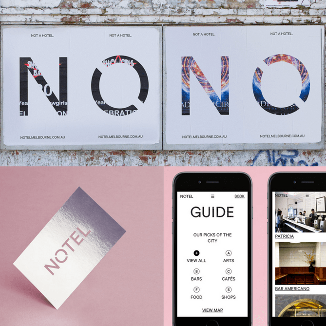
Image via Self Titled
12) Marte Estudio
Classical art, bright colors, and modern design elements come together in the branding for this Mexican hair and makeup studio. Created by design agency Bienal, the eclectic physical space and promotional elements were developed to reflect the bold, vibrant personality of Marte Estudio's creator, Mariana Abraham.
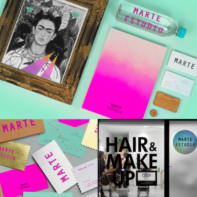
Image via Bienal
13) Robinson's
When you think of an auto body workshop, great branding probably isn't the first thing that comes to mind. But thanks to agency Parallax, Robinson's Accident Repair Center has a sleek, retro-inspired logo, minimal branded materials, and interiors to match.
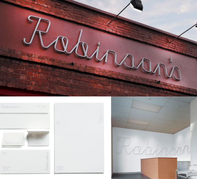
Image via Parallax
14) Sneaky Veg
Mandy Mazliah created her blog Sneaky Veg to chronicle her family's experiences eating healthy food. When she needed some clever, stand-out branding for the blog, designer Vicki Turner cooked up these designs.
"I was asked to create Sneaky Veg's brand identity that captured the sneaky yet good intentioned methods of making wholesome fruit and veg recipes into firm kid favourites," said Turner on her website.
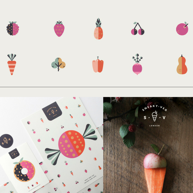
Image via Vicki Turner
15) Doctor Manzana
Doctor Manzana is a technical support shop for smart phones and tablets located in Valencia, Spain. They wanted a way to attract a new audience for their services and products, so they reached out to the folks at Masquespacio Design to create a new brand identity.
The Masquespacio team explains on their website: "A brand was designed to attract different kind of customers from fashionistas to geeks, traduced here into several kinds of colors through a brand image that plays continually with the angle of 54 degrees formed by the reflection of the mobile phones' screen."
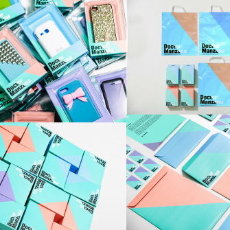
Image via Masquespacio Desig


![Want to Be a Better Marketer? You Should Be Keeping Up With The Kardashians [Video]](https://blog.hubspot.com/hubfs/kardashians-450-million.png)