
The following is an excerpt from our free resource, How to Create Beautiful Infographics. If you'd like to download the full guide, click here.
Chances are, if you’re reading this, you’re creating an infographic to use on social media or a marketing campaign. If you’re creating the infographic for marketing purposes, you’ve got one more step, and that’s promoting it.
After all, there is no point creating content if no one sees it, is there?
Here are some methods on how to promote your infographics:
- Make it into a blog post and share on all your social channels.
- Send out an email newsletter. (Check out how to make emails more engaging with infographics here.)
- Ask your advocates to share explicitly.
- Post it on social discovery sites like Stumbled Upon, Reddit, Imgur..etc.
- Outreach – find bloggers who will benefit from sharing your infographic.
If you’re not a big brand with a large following, you’ll get limited mileage on most of these methods without determined effort on outreach. Outreach is an unavoidable necessity. It’s like cold calling and door to door selling. It works, but usually not how you would expect it to. You have to start at the bottom of the influencer pyramid and work your way up.
With so much content on Pinterest, how do you make your infographic stand out? What are the characteristics of highly-pinned and liked Pinterest infographics?
To answer these questions, Venngage looked at over 200 popular Pinterest infographics and evaluated them based on a series of qualitative and quantitative characteristics. The results? A comprehensive guide to what types of infographics get more “likes” than others. Based on their research, five factors were identified for a great Pinterest infographic.
1) Topic
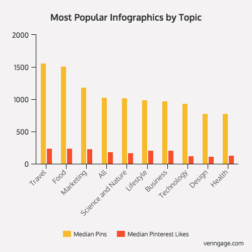
Does the topic or subject matter of your infographic matter? Yes, it does. On Pinterest, the top topics were travel, food and marketing. This is not really surprising if you use Pinterest regularly. Travel and food images do extremely well on Pinterest given the demographic of their users. These three topics performed a lot better than all the other topics.
2) Mood: Funny, Challenging, or Useful
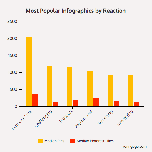
One of the most important aspects of any content is the reaction is garners from its audience. Did the content leave an impact on the person, whether it was a good laugh or something useful they could use in life? Venngage looked at our sample of Pinterest infographics and coded each one with what they thought would be the reaction the infographic produced.
The results are consistent with a lot of other literature and research on content. The winners are infographics that are funny, challenging or practical. These infographics have the highest pins.
3) Simplicity of Information
One of the biggest misconceptions out there is that you need to have a lot of data and a complex infographic for it to be shared and liked a lot. Venngage’s research shows that simple infographics, such as informational and text based infographics, perform the best. Simple = Win.
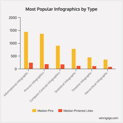
The other characteristic examined was the dominant style of the infographic. Venngage classified IG style into one of five styles -- text based, image based, illustration based, or a combination. The results showed text based infographics performed the best.
5) 2-3 Colors
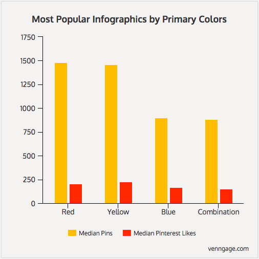
Colors have an effect on people. Marketers know this and have been using it to increase sales and conversions for a long time. It turns out when we looked at the number of colors used in top infographics and which primary colors are dominant, we see a very distinct pattern.
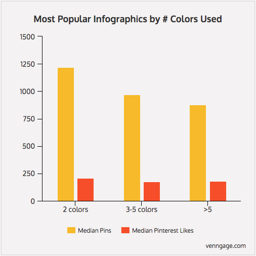
Less is more. Infographics with only two colors performed the most. Infographics that have more than five were the worst. [Click to Tweet]
5) Longform vs. Shortform
If you group the infographics based on their length to width ratio -- a ratio is used since infographics have varying dimensions -- and chart the distribution, you’ll notice that while shorter infographics do well, the ones that performed really well had between 5-9 length to width ratio (the infographics’ length were 5-9X longer that its width).
I guess that is consistent with other longform content such as blog articles. But too long is not necessarily a good thing -- as you go beyond the 9X ratio, the performance drops. So don’t over do it.
Want to learn more? Download How to Create Beautiful Infographics here.
![How To Create An Infographic In PowerPoint [+Free Templates]](https://blog.hubspot.com/hubfs/Untitled%20design%20%2885%29-2.png)
![How to Create the Perfect Project Timeline [Template + Examples]](https://blog.hubspot.com/hubfs/project-timeline-example%20%281%29.jpg)


![6 Ways to Use Icons in Your Infographics [+ Where to Find Free Icons]](https://blog.hubspot.com/hubfs/infographicicons_8.webp)